|
|
|
|
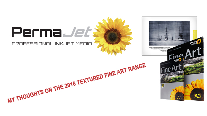
by Graham Daly
Fifteen years ago the photography and fine art printing communities were introduced to the incredibly popular Permajet Fine Art paper range which gained great recognition and success. Now fifteen years later, Permajet has adopted new technology to enhance the range for exceptionally high quality prints produced with modern printers and inks.
***DISCLAIMER***
In this article my aim is to provide an honest, balanced and critical review and assessment of these papers. And while Permajet were gracious enough to send me a free A4 Test Pack in order to conduct the review, the article itself is in no way sponsored or pre-approved by Permajet. All the content written hereafter are strictly my own unbiased opinions and personal feedback after running a few sample test prints using these papers with one of my own images.
What papers are in the Textured Fine Art range?
Before we start getting into the review of the individual papers themselves, let's discuss and talk about the actual product lineup.
The new Permajet Textured Fine Art paper lineup for 2016 includes the following papers:
Museum Heritage 310
Gallery Etching 310
Artist Watercolour 250
Several papers from the original lineup were discontinued and are no longer contained within the Textured Fine Art range and these include the Papyrus 300, Parchment 285, Double Sided Portrait 300 papers respectively. Permajet's recommendation for previous users of the now discontinued Papyrus and Parchment papers is to switch to the new Museum Heritage paper.
Museum Heritage 310
The first paper that I was greeted with in the Textured Fine Art test pack was the Museum Heritage 310.
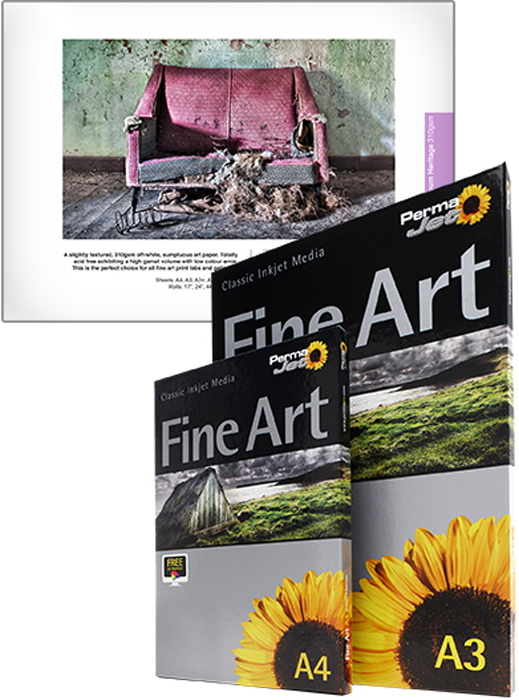
This is a new and custom product for Permajet that consists of a 25% cotton and a 75% alpha cellulose base which features the same surface as the original Museum 310 paper but comes complete with a new coating that provides increased image and shadow detail.
The new coating also has improved ink retention to avoid the "rub-off" that was present with the original Museum 310 paper.
On first hold of this paper it provided a nice feel and overall great presence. The 310 weighting certainly helped attribute to this nice feel, as did the actual texture of the paper. The texture on this paper is the lightest and the most subtle out of the three papers provided in this range.
The textured pattern is nice and visible without being overpowering. It is rather subtle when viewing up-close and blends in very nicely to the image when viewing further away.
Compared to the other two papers in this Textured Fine Art range, images printed on Museum Heritage 310 appear to be very sharp. For a textured paper, I was actually really surprised at just how the sharp the printed image was.
This paper is a lot brighter (whiter) than the other two papers in this range which does help the overall whites to pop off of the page and the high DMAX of Museum Heritage 310 helps to provide nice deep blacks. The combination of bright paper surface and the high DMAX provides a nice contrast between the whites and the black tonal values throughout the image when printed.
One aspect that I really liked about the Museum Heritage 310 paper is that it certainly does provide nice shadow detail despite the fact that it has a high DMAX value. Sometimes papers with high DMAX ratings can lose a bit of detail within the shadows areas because of the increased absorption of the black inks but this paper manages to maintain the shadow areas quite well while simultaneously providing deep blacks.
Gallery Etching 310
The second paper that I tested from the new Textured Fine Art paper range from Permajet was the Gallery Etching 310.
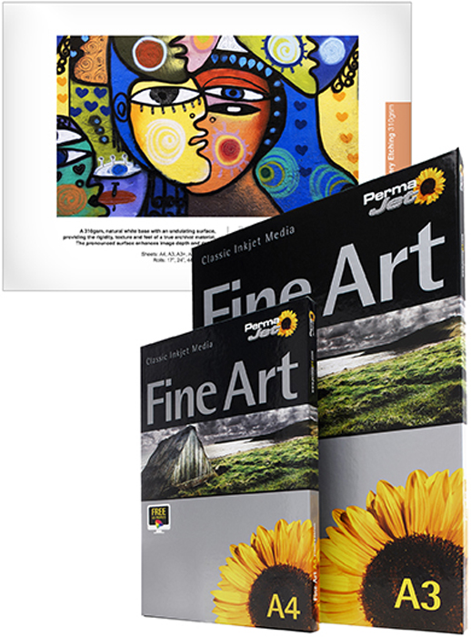
This particular paper consists of a alpha cellulose base and which has a 310 paper weighting. This new surface revitalizes the textured range. It's surface is suitable for fine art photography and takes PermaJet into the popular art etchings business sector.
Just like the Museum Heritage 310, this paper has a very nice feel when holding it in your hands. The pattern of the texture is a lot more visible and noticeable than compared with the Museum Heritage 310.
The Gallery Etching 310 paper comes with a warmer base tone than the Museum Heritage 310 paper which some people may prefer whereas others might see that as a negative. Personally, I like my papers to be a brighter shade of white.
I like the colour rendering of this paper and while the DMAX is not as good as compared to the Museum Heritage 310 paper, it certainly is still a pretty good DMAX and displays some nice black tonality and contrast between the blacks and the whites.
I must admit that I prefer the lighter texture pattern on Museum Heritage 310 over the pattern on this paper but at the same time I can easily see how some people would love the heavier pattern on this paper for their work. I think it would suit pastel style images and watercolour images really well.
The one major negative for me regarding this paper is that I personally found it to lack the crisp sharpness that the Museum Heritage 310 paper offered. Again, I understand that this might not be a deal-breaker for everyone and different photography genres but personally for me, I like my Landscape images to be tack sharp. Or as sharp as possible. This paper definitely fell down a little for me on the sharpness area.
Artist Watercolour 250
The last paper in this range that I tested was the Artist Watercolour 250.
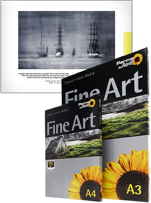
Out of the three papers in this range, this particular paper definitely has the heaviest and most visible textured pattern. The paper consists of a Alpha Cellulose base, has a similar warm tone to that of Gallery Etching 310 and has a lighter weighting of 250. This is a New product with an improved weight. According to Permajet "it is a more appropriate surface for modern fine art reproductions work".
On first glance the paper is clearly a very heavy textured paper. It is both visible to the eye and also very obvious to the touch when holding the paper. The paper almost feels like a light Canvas paper.
I find that the heavy texture works really well to add some depth and a real feeling to elements such as rocks and so forth that might be found in the foreground of Landscape and Seascape imagery but for me the texture definitely comes off as being too strong in the sky portions of my images. The texture is too obvious for my liking.
I would class the heavier and more pronounced texture as a negative for me and my work but that is just down to my personal preferences and taste. I am sure that there are plenty of other photographers out there who would disagree with me and really fall in love with the heavier texture. Different strokes for different folks I guess! One of the positives of this paper for me though over the Gallery Etching 310, is that the DMAX is greater so you get richer black tones but at the same time it retains shadow detail really well. I would definitely favour this paper over the Gallery Etching 310.
Final Thoughts & Conclusion
All three of these papers are great and offer something of great value to the different photographers that are out there. They all have their own pros and cons, advantages and disadvantages. And of course these will differ based on the individual user as selecting paper surfaces to suit your own style of photographic work is a very much a personal and very subjective matter.
But for me there was one clear and outright winner and for me that was the Museum Heritage 310. I found that this paper ticked more of the boxes for me and I really enjoyed the renditions of my images on this amazing paper surface. I can honestly say that I will most definitely be adding this great paper to my own personal stock of printing papers.
All of the above comments are strictly my own personal opinions that I derived from my own personal observations and first hand experiences of using these papers. There will be plenty out there who might agree with me and some who will disagree with me. I would love to hear some other people's feedback and personal opinions concerning these papers by leaving some comments on this blog post.
Thanks once again for taking the time to read this and I hope and trust that it was both useful and beneficial for people out there.
 | Write |
 | Yvette Depaepe CREW I only experienced the high quality of the Permajet Oyster 271 paper. After reading your interesting review of theTextured Fine Art Papers, I definitely will give it a try, Graham. The lab where I make my latest enlargement used the "Gallery Etching 310" and the warm base tones were perfect for the subject. Thanks for this "useful and beneficial" article, my friend! |
 | Graham Daly Glad you found it useful Yvette :-). As noted in the article, I personally preferred the Museum Heritage 310 paper but at the end of the day there is no right or wrong / better or worse paper. It all comes down to personal choice which is rather subjective and whether the paper enhances the image in question in the eyes of the artist or not. My recommendation to everyone would be to test out as many papers as possible across a range of their images and they will then be able to identify which papers work best for their needs and for their images. In a follow up article I will look at Permajet's "Smooth Fine Art" range and in another article I will be getting some expert advice and insights from a great photographer in Ireland with respect to "How to produce competition winning prints". |