|
|
|
|
This narrative is a continuation of my thoughts about BW or at least about a possible way to look at a BW picture with attention given to the main issues that can be raised when composing, editing or shooting.
As in the previous chapter, these lines do not intend to be some kind of a lesson. They are just some loose thoughts about BW processing reflecting my personal approach. As said above it´s just a way, among thousands, to “see” and “look” at BW. I'm hoping these thoughts have value and will be useful.
If you missed “Some loose thoughts about BW: Part 1” and you want to take a look, click here.
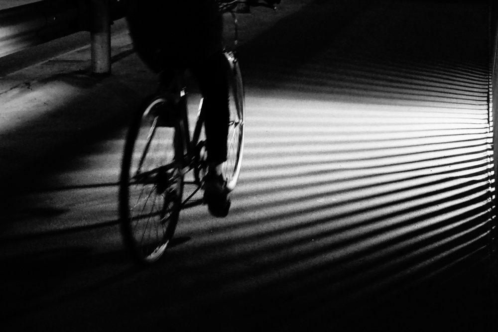
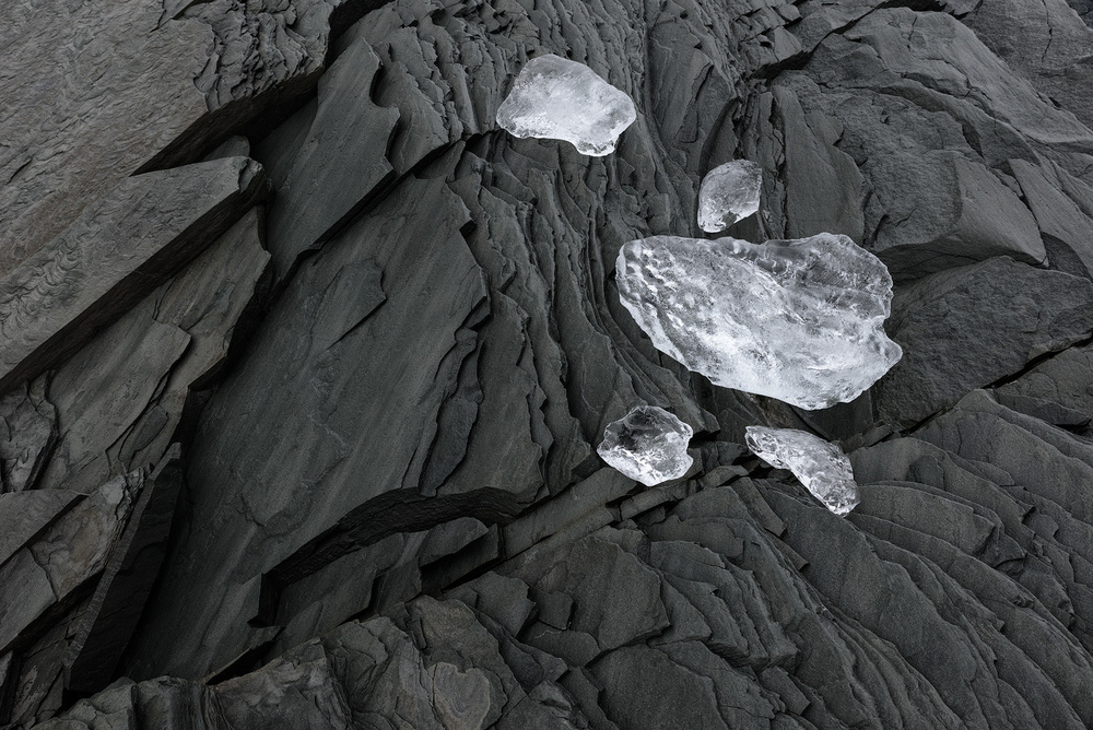
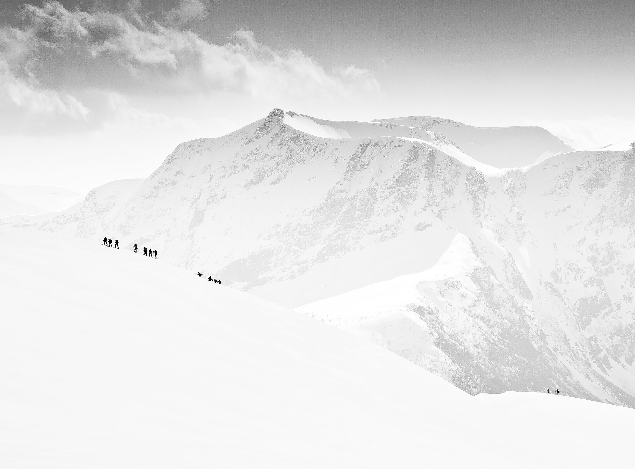
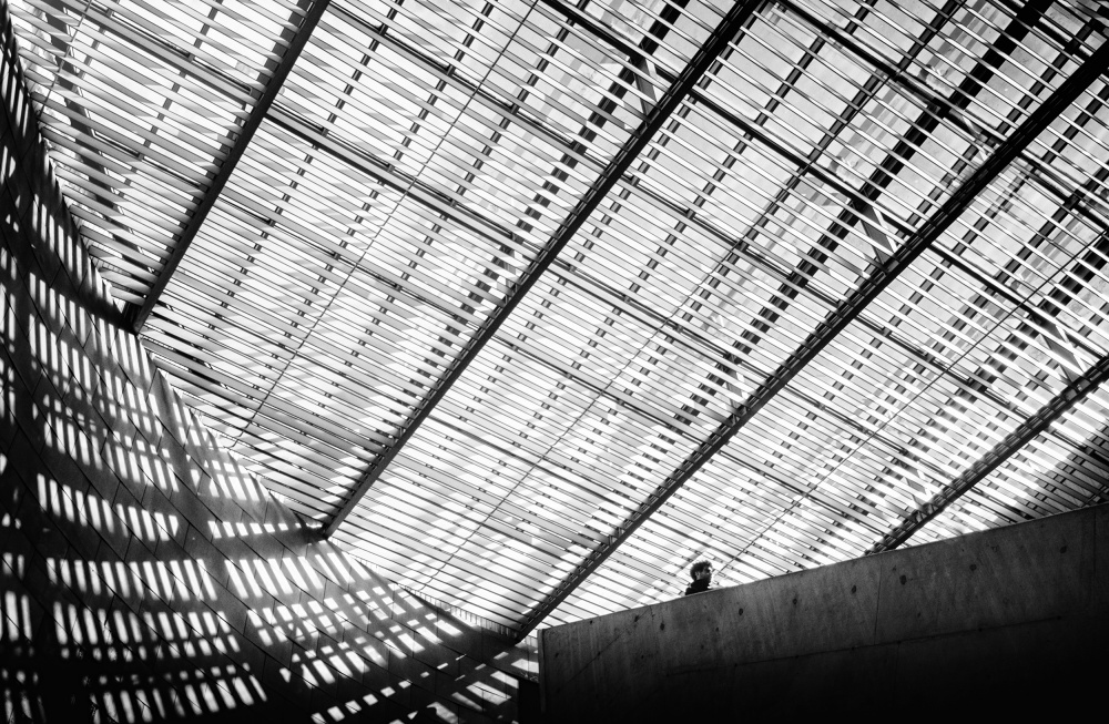
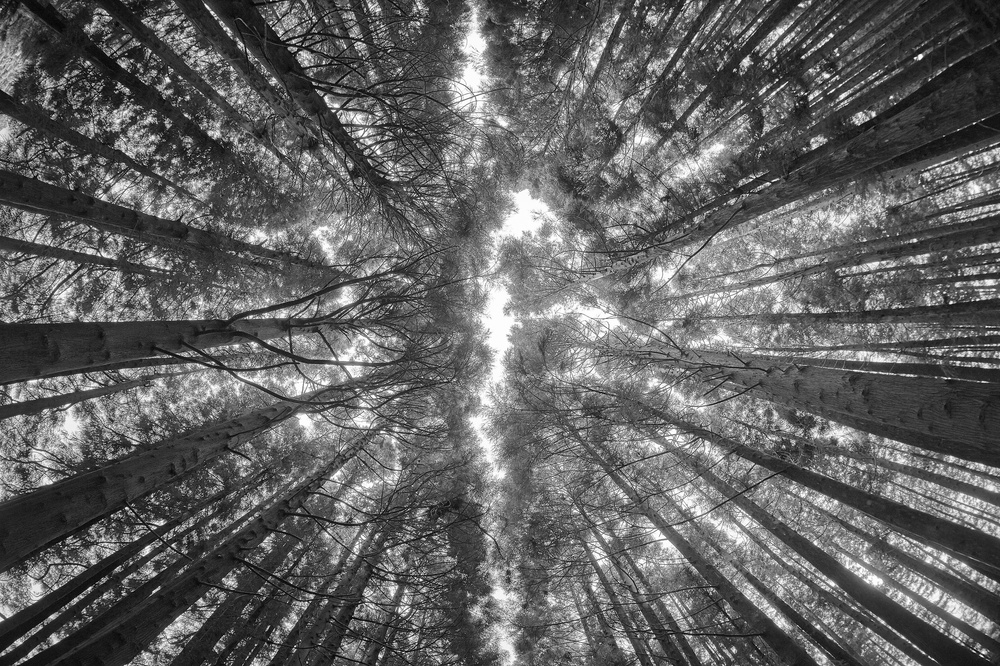
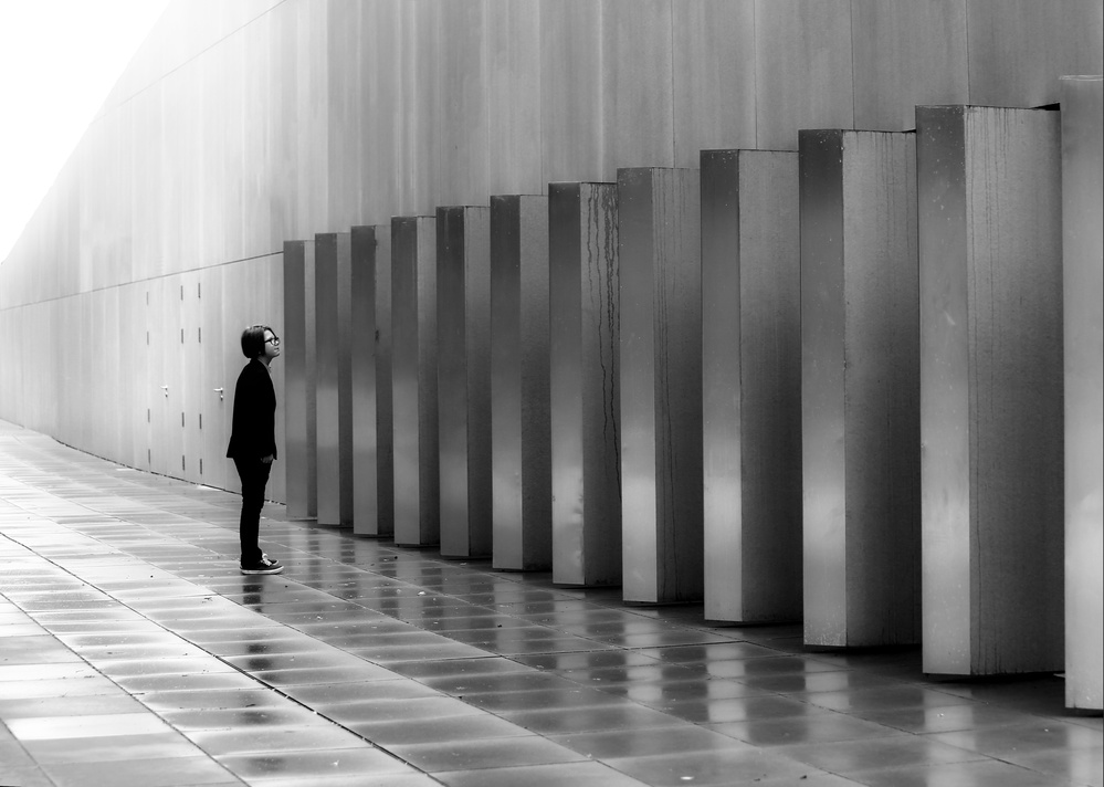
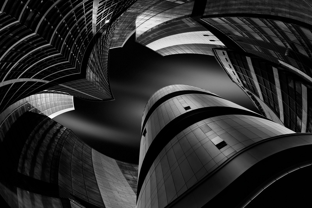
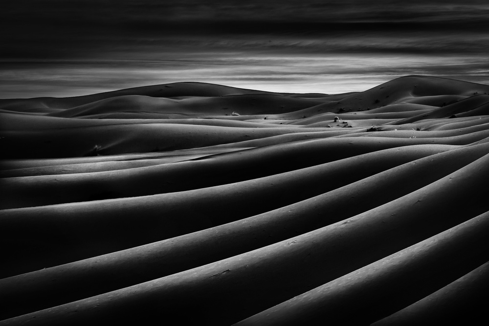
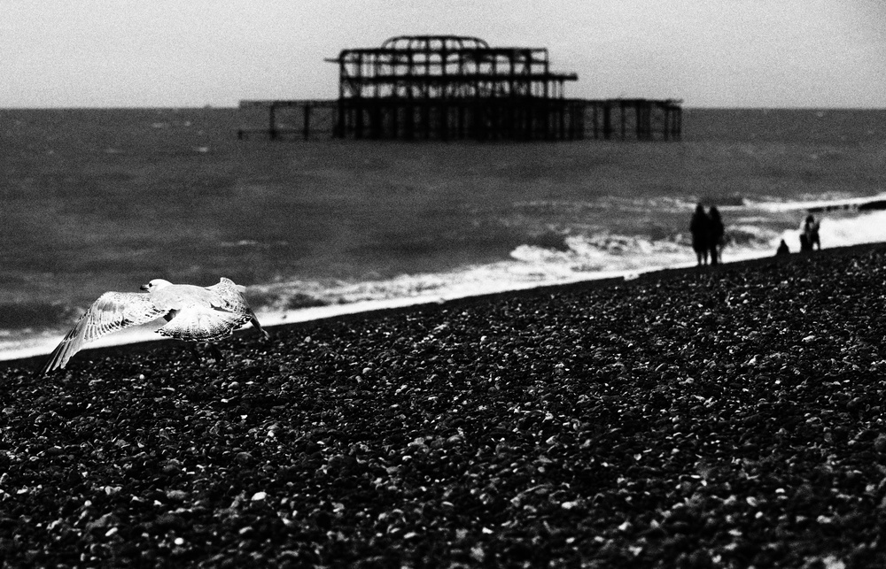
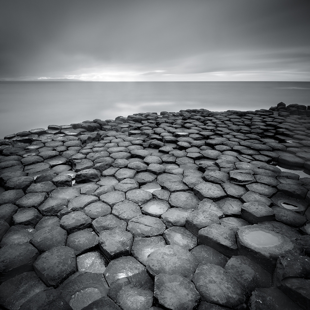
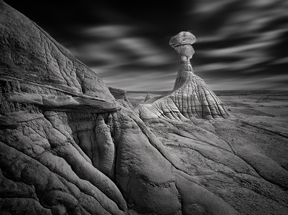
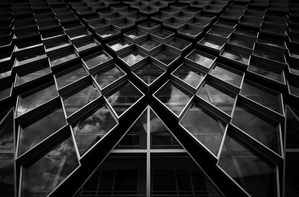
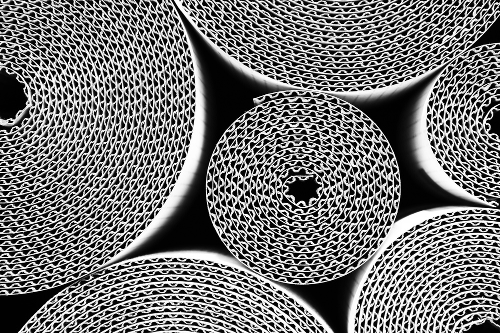
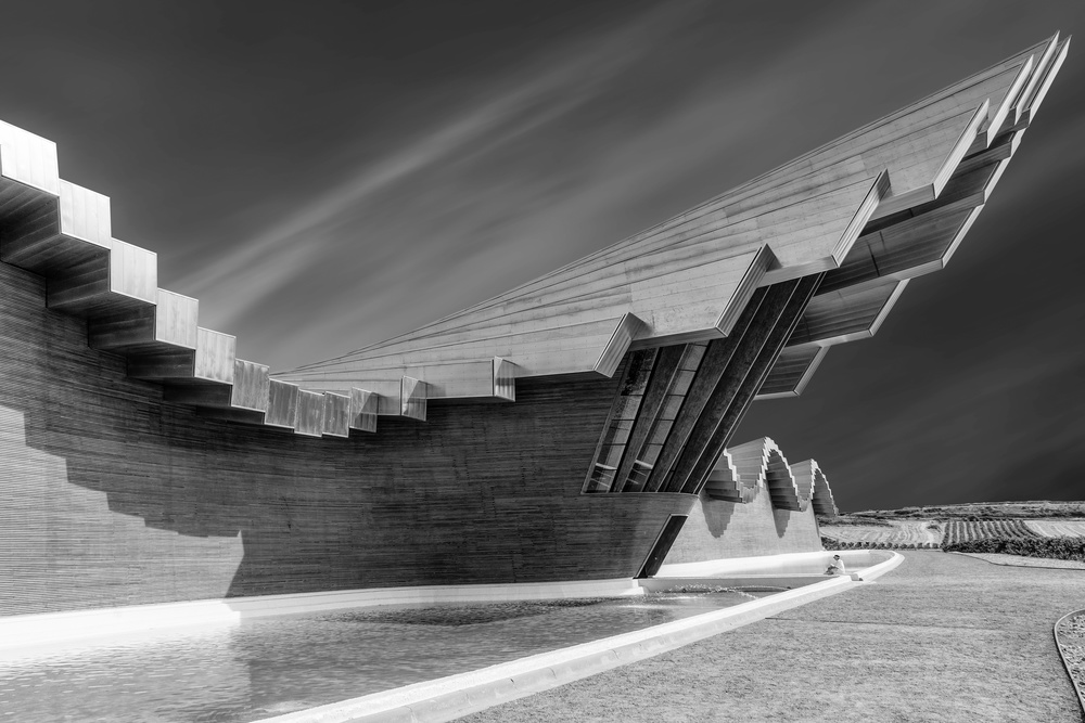
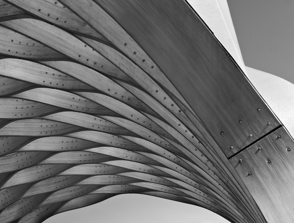
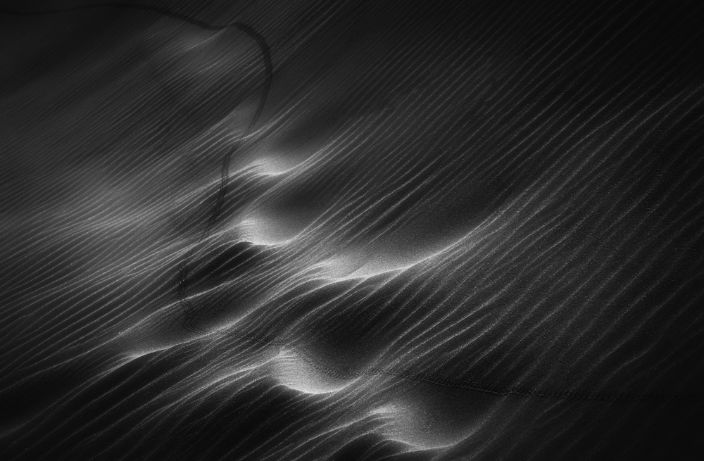
Capturing and incorporating textures and patterns in black and white pictures.
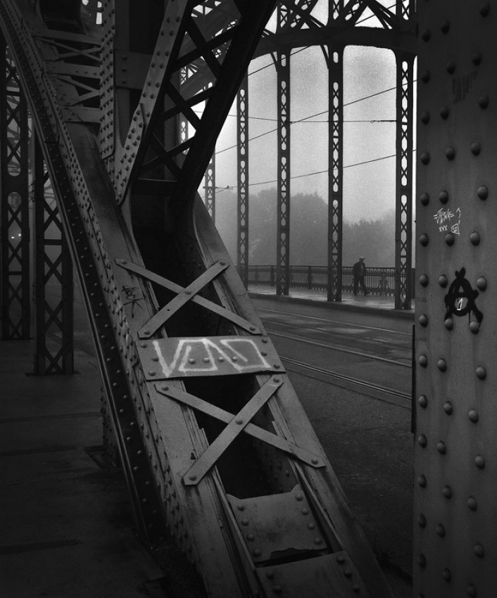
Patterns and textures are, by nature, awesome and great but at the same time very dangerous and risky stuff to include in BW photography and I think in any kind of photography.
They are a natural and powerful magnet for all photographers but, experience will teach us that while very attractive they are very tricky as well.
Of course in any book about BW you can buy, they use litres and litres of black ink calling the readers attention to the beauty and great subject that textures and patterns can be for a BW picture.
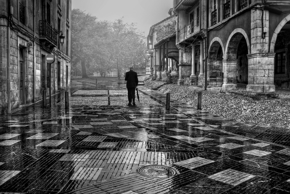
But almost none of the narratives in all those books actually calls the reader attention to another important aspect: it´s the answer to a simple question – what exactly is it that we want to highlight in the picture…? If the texture or the pattern is the main subject, we are “good”, just because the subject matters are there.
But, if the picture is not about textures and patterns maybe we are in trouble or maybe we have some equation to solve in the composition, because if too visually dominant they can become disturbing and can pull us away for the main subject.
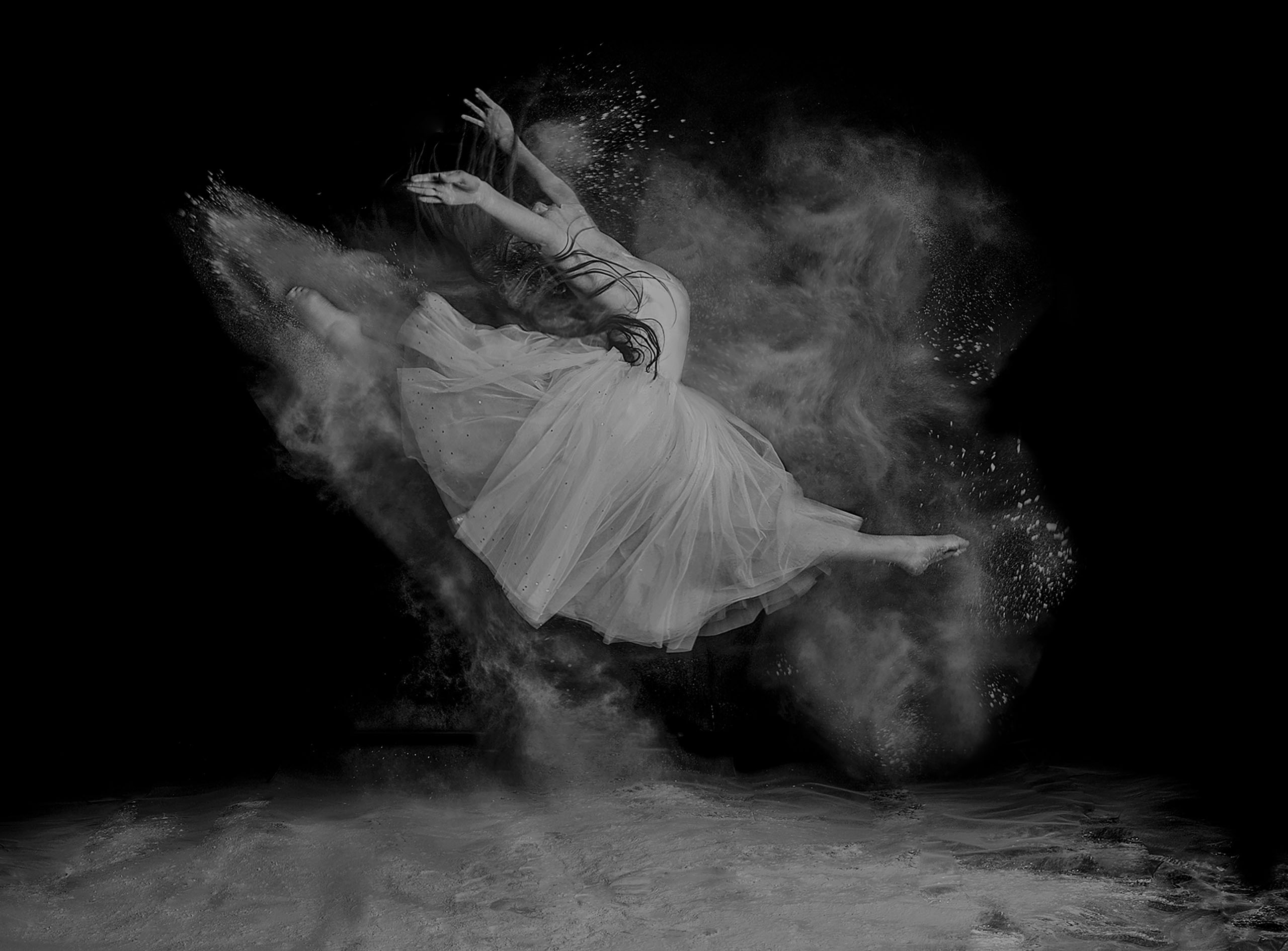
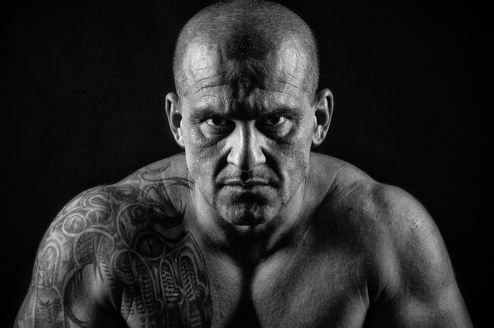
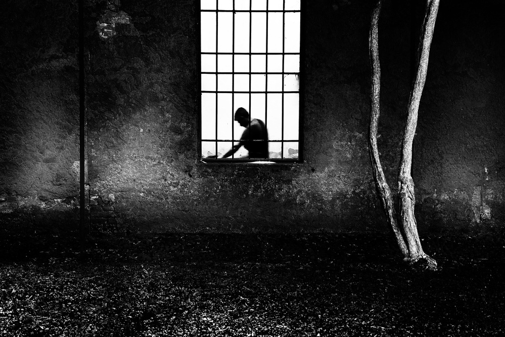
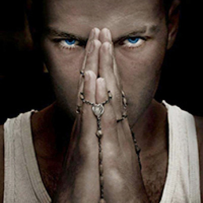
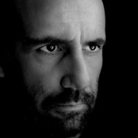
The usual example to illustrate this thought is just a portrait in BW: what do we want to show in the portrait? The expressive and emotional eyes?
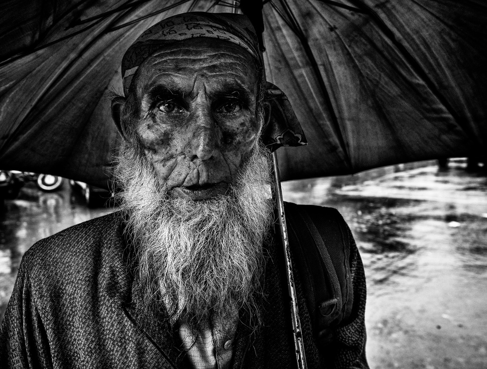
If so, pulling out all the skin texture on the model's face could be a poor decision, because that particular portrait is supposed to show the emotion and feelings through the eyes and not to make the viewer wonder what medical dermatologic diagnosis the model my have, just by looking at the picture.
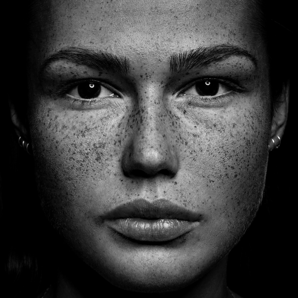
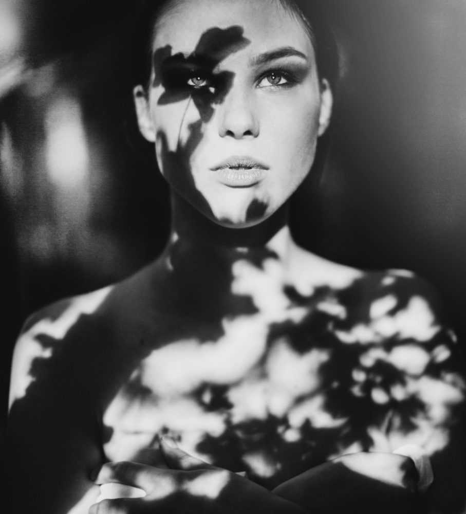
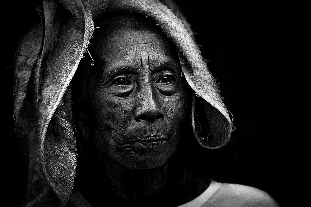
If the idea for the portrait is to show all of the “life lines” in the face of some old person, then maybe I have to show a little more of that life imprinted and carved out in the skin but, even so, there always will be a calling for an aesthetic decision: the right amount of that part of the subject I want to show.
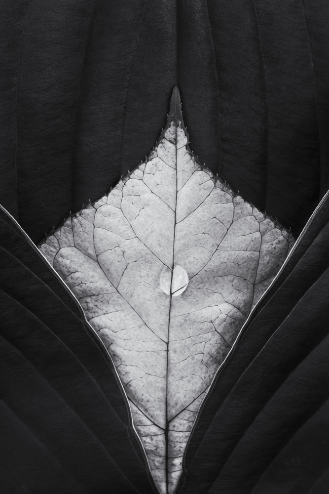
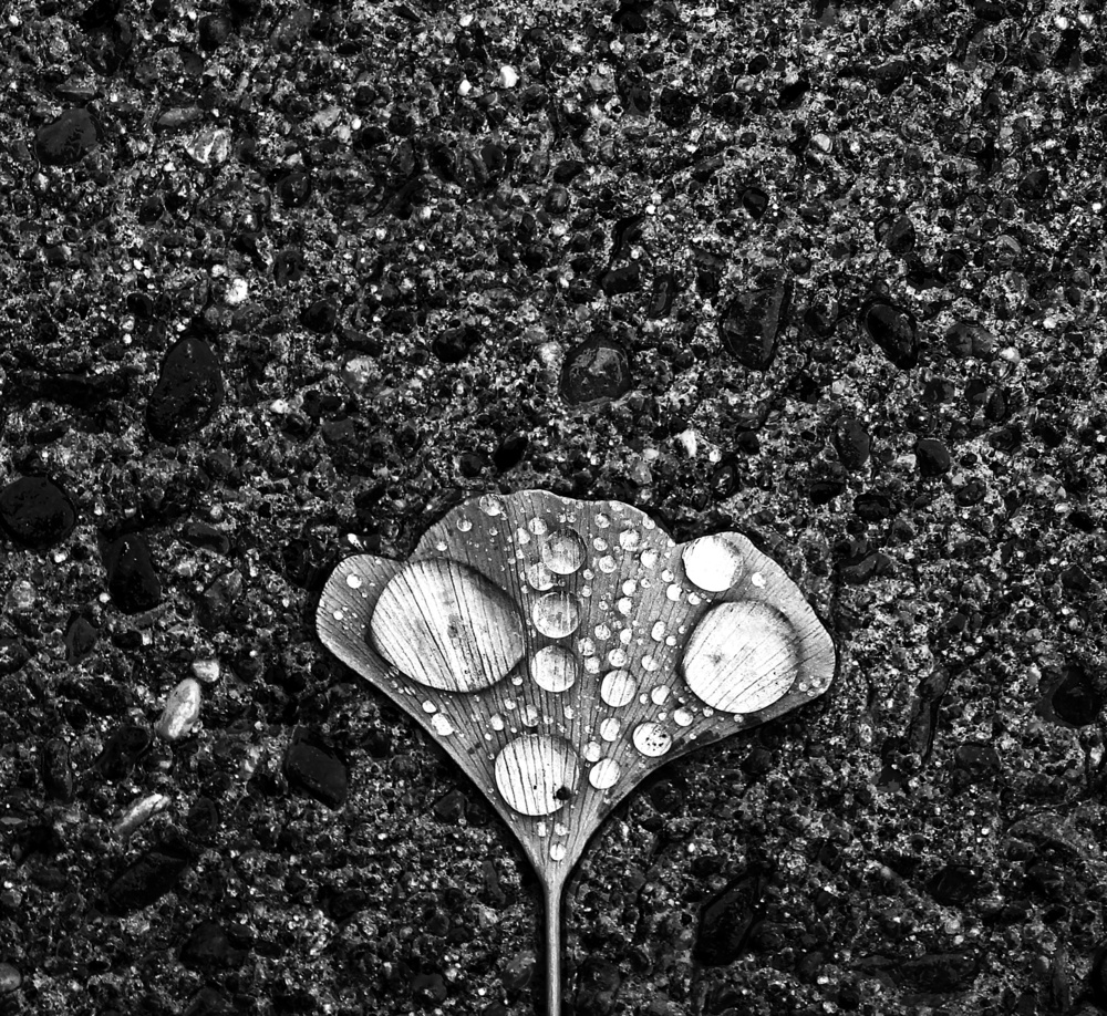
The way I like to see it textures, themselves, are patterns. In the end they are just small patterns so I treat them as such to simplify the analysis.
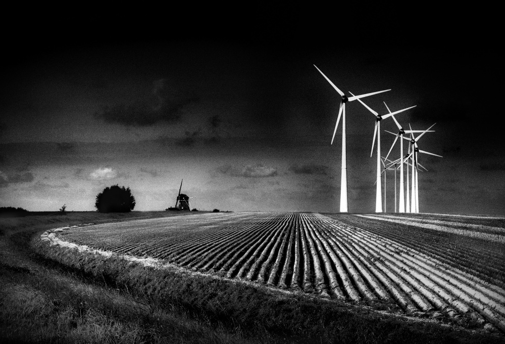
Patterns are great to include in a frame and to compose with, and that´s a fact. Nevertheless, the danger is that many times we end up with a composition just about patterns when we wanted to show something else. This is because we fall in love with the patterns while on location and we forget about the main supposed subject. We shoot the pattern but include the “main” subject as well, trying to give both issues the same relevance. The end result is often a unbalanced composition that fails to show either the pattern itself or the main subject.
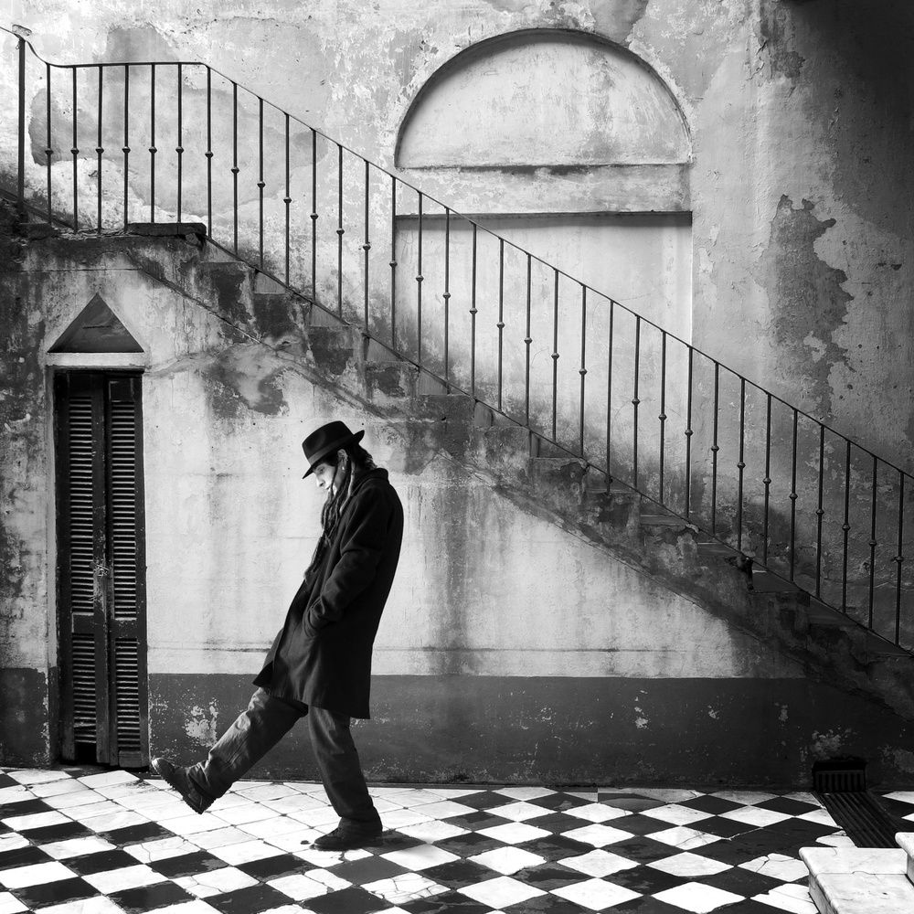
The solution in my humble opinion, would be to once more treat patterns and textures like an element of the composition from the beginning keeping in mind and never losing sight of the main subject. You will find a discussion about this solution in the first part of this of this article, previously published.
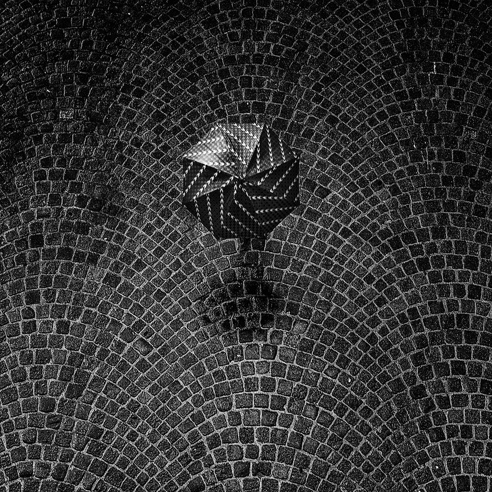
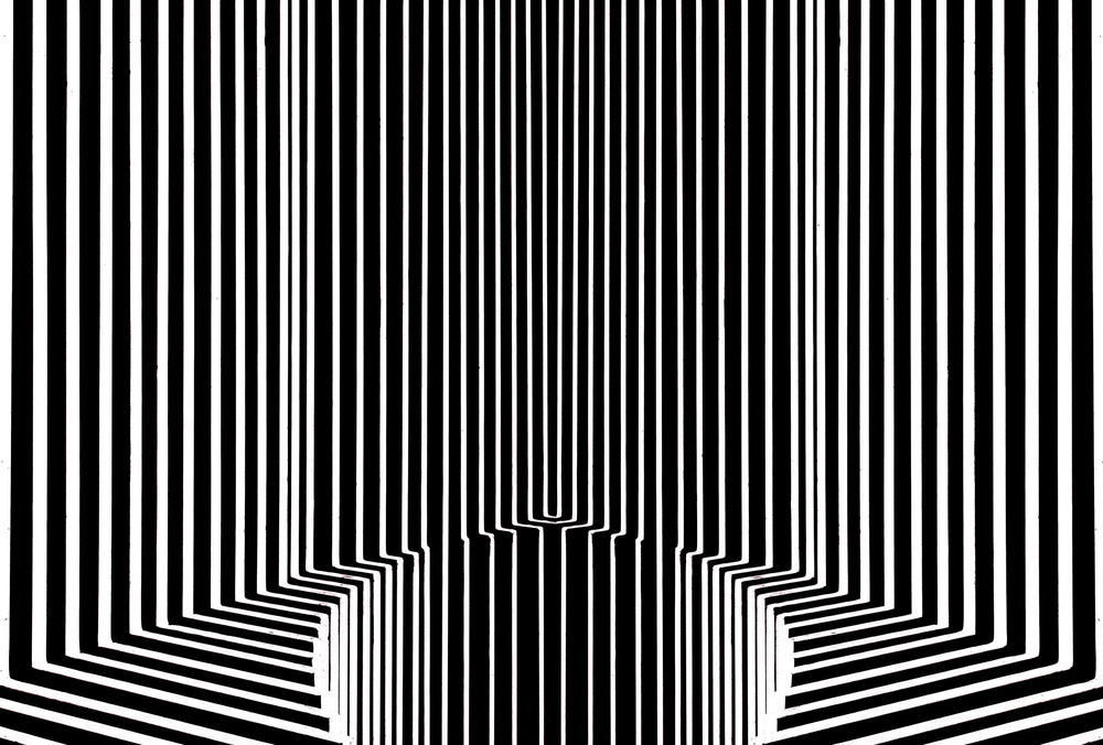
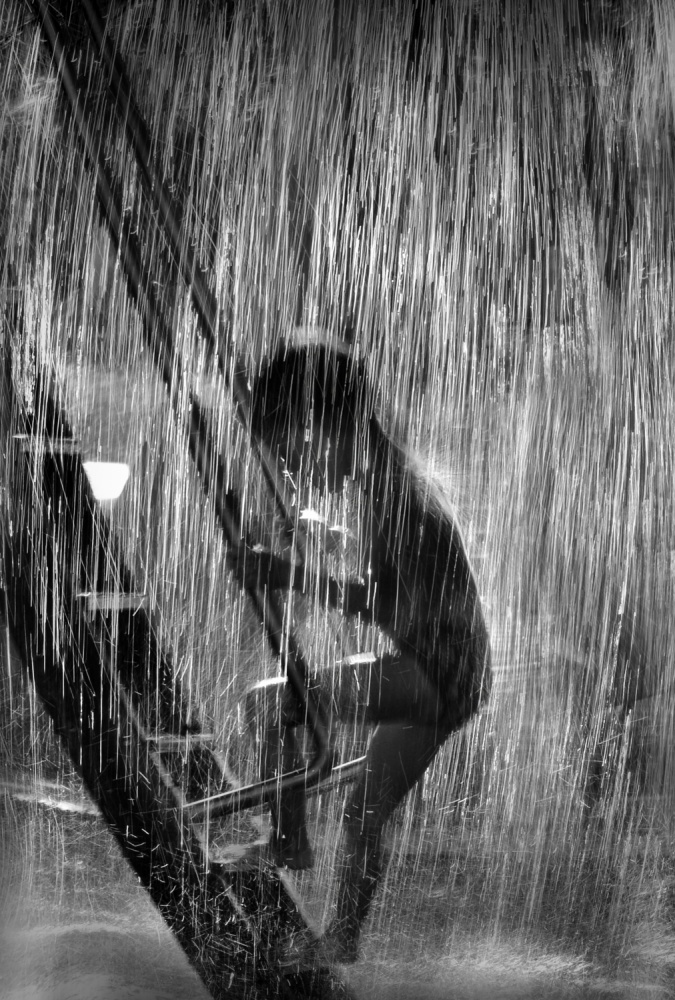
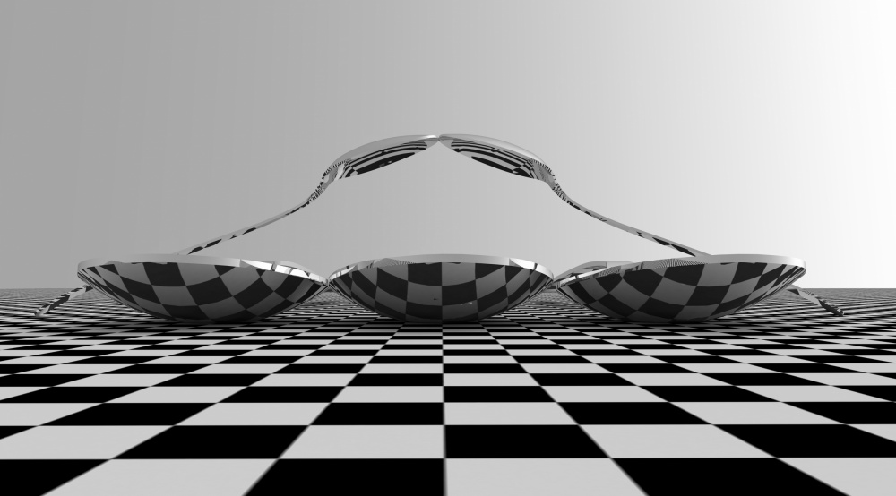
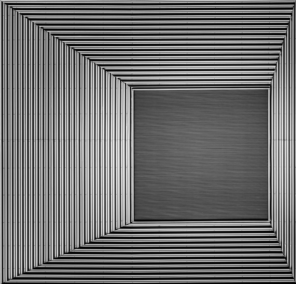
What kind of patterns/textures do I see?
Is there a specific visual rhythm?
If so, in what direction? Towards the main subject or going the opposite way?
In the composition, is the visual rhythm working with the main subject or against it?
Is the rhythm horizontal, diagonal or a vertical one?
Does it lead my eyes to some specific place in the composition where it complements/frames the main subject (for a person, an important geometric angle, for a dominant shape) or does it draw the viewer outside the frame or in the opposite direction we want him to look?
These are major questions to consider about patterns in a composition and it could be a great idea to always try to answer them when shooting and processing our BW's.
If we keep this in mind on location when composing, the chances of being successful are much greater by choosing the angle, pov, dof, etc., and patterns will be, as they always are, amazing subjects to shoot and to compose with.
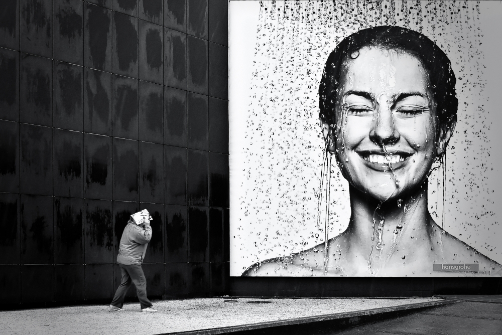
The same narrative above goes for textures: they are just amazing subjects to shoot. If I play with textures and shapes I always try to pay attention of the issues I wrote above adding one more: a texture can also be a very powerful eye-stopper. If it is to beautiful or to dominant we run the risk of having a picture only about “a texture” and nothing more. The viewer´s eyes will be parked there and will not move around the frame or will not go where it´s supposed to go. It can be very distracting and at the same time very powerful in the visual design of the composition.
Working with patterns and textures in BW is just a part of “the magic” but a major one.
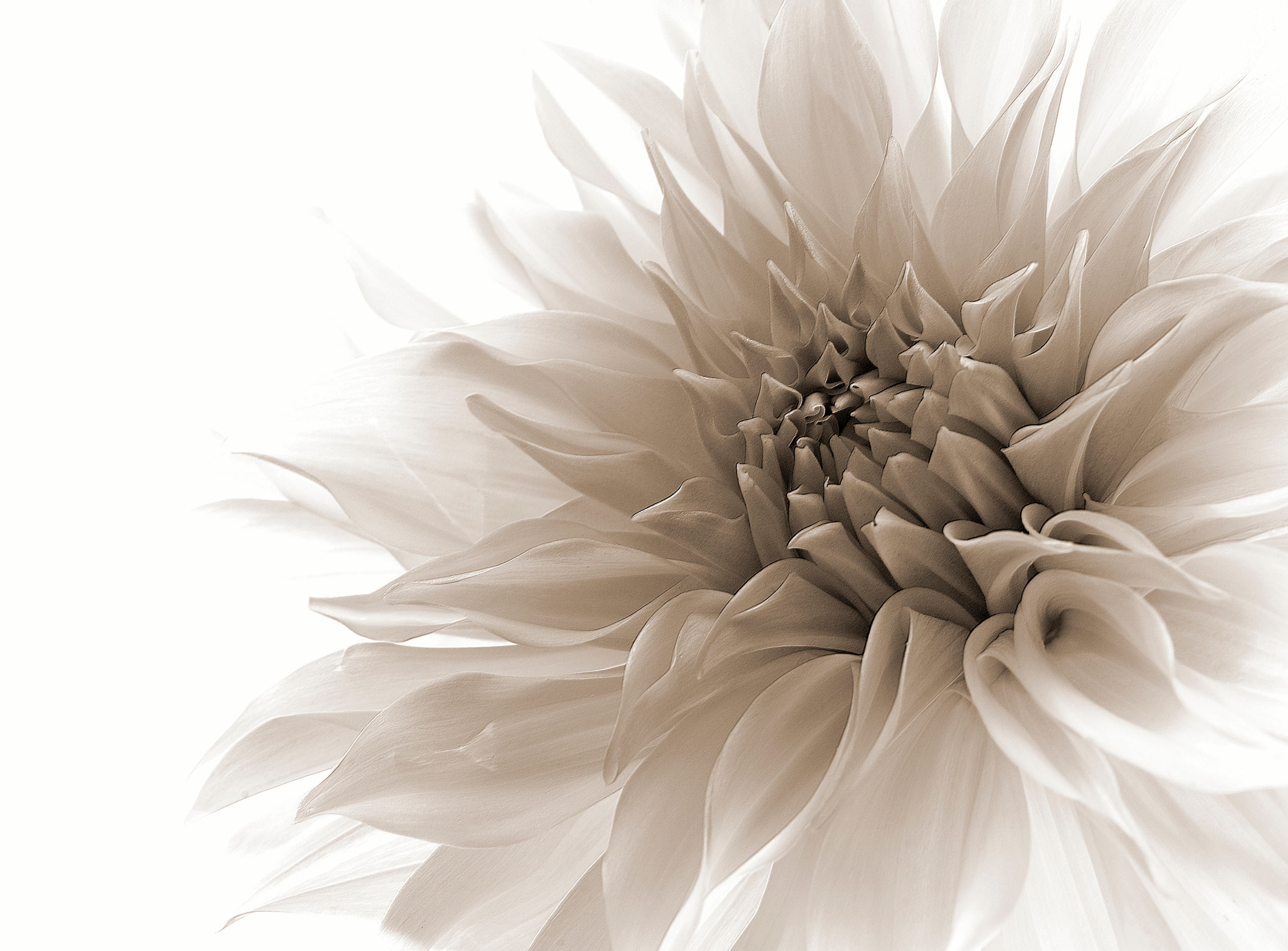
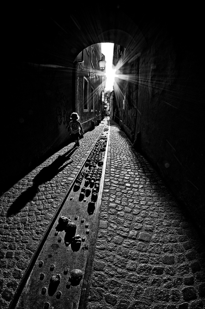
Because we are talking about BW we are not tied up to reality and the important tool in BW is always tonality, in fact there is no other major tool to work with (blur may be another one, but is itself under the rule of tonality) and the light itself is always a tonal variable so it also remains in the tonal equation. Saying this is just to suggest that all those problems and advantages brought by textures and patterns can also be worked and tuned by the tonal equation in a specific frame, giving them more visibility or less visibility, taking advantage or not, of their orientation, disposition, heading, rhythm, scale, etc. – it is the same in both film and digital processing.
If I want to make a pattern the main subject in a composition, perhaps I should consider using a dominant BW tone. By dominant, I mean in relation to the absolute remaining BW tonal palet there is in a histogram and also in relation with the other tones I want to apply in that particular frame (and that´s why a middle scale grey tone can actually be the dominant tone in a bw picture).
If I want that a pattern to be just a subdued part of the composition I must do the same tonal exercise.
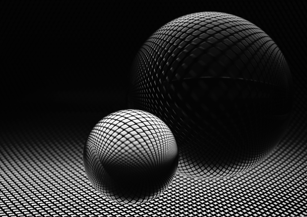
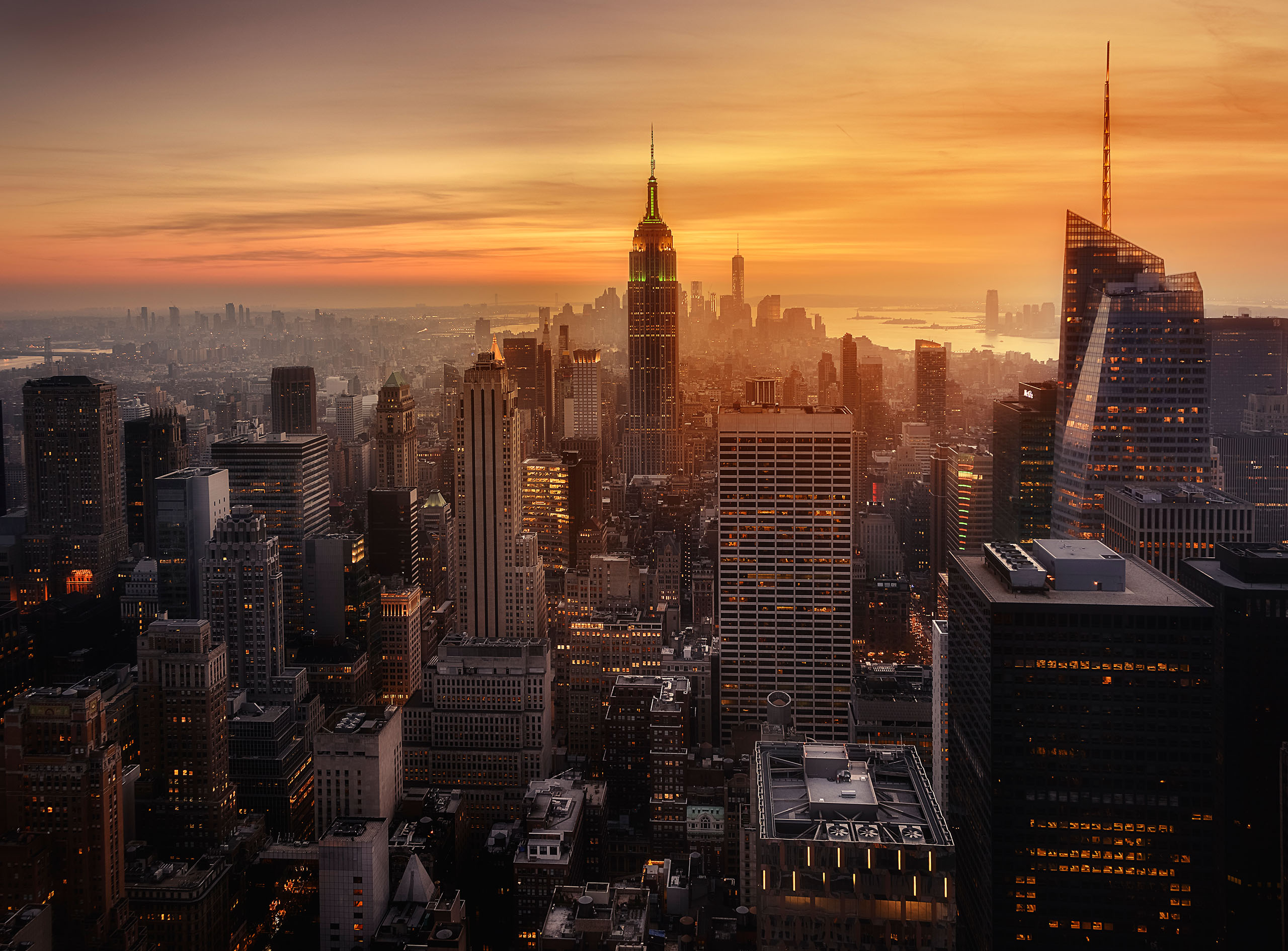
The same for textures: if their presence in the frame is too visually aggressive and this is not the goal of the picture, maybe I should consider the use of a smooth neutral tone with the purpose of taking away some detail and hiding their presence in the frame. If they are next to the main subject and I want to draw the viewer's attention there, I would accentuate a little more that area's processing and even use that texture as a visual anchor. The options are just huge, but the main key here is that I always consider patterns and textures like a part of the geometric and tonal equation, no matter what picture is about, street, architecture or even portraits. The basic working BW rules - if there are rules - are just the same.
In the end, the ideal situation would be to try to answer all these questions with the light play on location and using the tonality play in processing. But because we don´t shoot in an ideal controlled environment and because, like they use to say, “street is not a studio”, these solutions and these “loose thoughts” can be a great help to achieve a more pleasant and rewarding picture in processing.

 | Write |
 | elias Thank you. Your art, your sharing your inspiration, process, and eye have helped me to learn to feel light and its effect on the medium. Good light. |
 | Paulo Abrantes PRO you are welcome, Elias. Regards, Paulo |
 | Antonyus Bunjamin (Abe) PRO I like this arcticle..all picture are motivation to get the best result in BW. Thanks a lot Paulo for sharing your thoughts and illustrating them with a great selection. Thanks so much to Yvette too.. Best Warm Regards Always, Abe. |
| Paulo Abrantes PRO many thanks, Abe |
 | Fernando Alves Happy to see one of my picture included in this excellent article. Thank you very much dear Paulo and Yvette. |
| Paulo Abrantes PRO muito obrigado, Fernando. abraço |
 | Luc Vangindertael (laGrange) CREW Great stuff Paulo, black & white is hot .... it forces you to see the essence of forms. Thanks for sharing your thoughts and illustrating them with a great selection. |
| Paulo Abrantes PRO thank you very much, Luc |
 | Stephen Clough PRO An excellent article Paulo!!! Thank you very much! No pressure but can't wait to read the next one :)
|
| Paulo Abrantes PRO thank you very much, Stephen |
 | Vangelis Makris (Mc Ris) Some times you see a picture, you like it ( or not ) and you don´t know why ... Your article answers to that in many ways. Well done Paulo, excellent. Its a great honor for me that you used one of my pictures for your examples. Thank you so much Paulo, thank you so much Yvette. |
| Paulo Abrantes PRO thank you very much, Vangelis |
 | Lara Kantardjian CREW Excellent article and great photographs you have selected here yet again Paulo. All the images you have chosen illustrate your thoughts perfectly. I had read Part 1 so was very happy to see Part 2 published today. |
| Paulo Abrantes PRO thanks a lot, Lara |
 | Marc Apers CREW Happy again to see my picture included in this fine article, thanks Paulo and Yvette ! |
| Paulo Abrantes PRO thanks a lot, Marc |
 | Jian Wang It is an excellent article. Very helpful considerations. Thanks Paulo! |
| Paulo Abrantes PRO thanks a lot, Jian |
 | Julien Oncete PRO Good afternoon,dear Yvette and many thanks for this wonderful article.Many thanks also to Paulo Abrantes and to all of you for your amazing work!
Kind regards,
Julien |
| Paulo Abrantes PRO thanks a lot, Julien |
 | Carmine Chiriacò CREW congrats to all... stunning works!!! |
| Paulo Abrantes PRO thanks a lot, Carmine |
 | Joxe Inazio Kuesta Garmendia PRO Thank you very much for this great article and work, Paulo. Thank you Yvette for the publication. Have a great day. |
| Paulo Abrantes PRO thanks a lot, Joxe |
 | Yvette Depaepe CREW As enriching, inspiring and well thought as "Part 1", Paulo! Both articles are so excellent.
A "Must" to read them. I hope the readers will enjoy them as much as I did. Thanks for the terrific job you did. Cheers, Yvette |
| Paulo Abrantes PRO many thanks, Yvette. my pleasure |