|
|
|
|
Published by Yvette Depaepe in collaboration with Alfred Forns , Head of the Senior Critic team
1x has a unique feature the founders are very proud of: the photo critiques . All members can submit pictures to a team of knowledgeable senior critics. Their feedback is useful, interesting and enriching even for the best of us.
Critique on the photo “Classic Beauty” submitted by Teryani
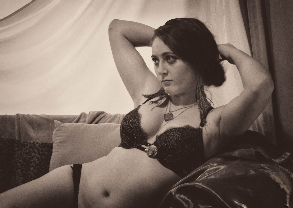
I was allowed to tag along as a few of my photographer friends dressed for Boudoir photos. There was no lighting to speak of and I was still working off my kit lenses, but I did get a few photos I enjoy.
I'm just wondering how the quality reads to others. Does this photo work for you? I edited it in a classical fashion as it seemed to fit her style and the fact that I didn't have squat for lighting.
Senior Critic José Hernán Cibils
The atmosphere of old times is well achieved. The posture and gesture of the model are the adequate. I like her look. Her body is "classic", not very slim, not very trained.
I think that she could be a belly dancer, I don't know why...
The photo has a proper and decent erotic aura.
Allow me some suggestions. I did some try in PS and find that a simple cut (from the left hand till more or less one centimeter before the cushion) could improve a lot the picture and enhance even the sensual appearance of the girl.
Maybe because the left part of your image is too empty and the right leg of the model too long. With my suggested cut your picture could become more attractive, I think.
Besides two other things: the armrest on the right is too brilliant in comparison with the rest of the picture, it could be distracting.
What I would try to do (if you have more pixels below) is to show more of the lower part of the body. Now it is abruptly cut off (in my opinion). It seems that somebody has "censored" the photo...
At last, I would eliminate a small white point on the chin and try to make the armrest less brilliant, working with the healing brush.
Teryani
The "spot" on her chin is actually a bit of the background peeping through...I've been torn as to what to do with it. The armrest was VERY reflective and I've spent a fair amount of time reducing its brilliance. (The healing brush wasn't much of a help here...)
Senior Critic José Hernán Cibils
You could also try using "Viveza" from the Nik Collection for the armrest. The point on the chin is very easy to solve.
I think this image depicts a lovely mood; the combination of the processing (sepia, grain, tonal values), model's expression, and the props (clothes, sofa, hair) work together to yield a sense of going back in time.
I agree with just about all of Ivo's comments below, and also wanted to chime in about the composition (always subjective). I feel as though the camera is a little too close to the model; I would have preferred to see more open space on the left (the gaze is interesting, but by providing more negative space you would call more attention to whatever she is interested in), and more of the body below. I like the expression on the model's face; it suggests (to me) both an uncertainty and a specific interest in something going on outside the frame.
I think this image depicts a lovely mood; the combination of the processing (sepia, grain, tonal values), model's expression, and the props (clothes, sofa, hair) work together to yield a sense of going back in time.
Senior Critic Ivaylo and Teodora
The way you saw and processed it grabbed my attention so I took my time to take a good look at it.
Some things I really like and about some I could suggest a few options so hope you stay with me - everything I write is just positive and of course, strictly subjective :) Starting with the things I like - the styling and the processing are pretty strong. Maybe one less medallion could be also a good choice. The toning is good and well chosen but you have marked this too. Good nuances and shadows, well controlled the light. The shutter speed was quite slow so also a good work. The noise carries a feeling of old time work, the accessories are also in the retro boudoir mood. What I find the biggest issue is the exact moment you captured - seems like the middle of a gesture, unfinished movement o preparation for something that will follow to me. The pose is good, the composition is a little strange. Not that I find it wrong but something slightly disturbs me and if me editing here I would probably crop a centimeter from the bottom of the image. Now, looking again I just cannot say for sure if this could please me enough - now it seems that the upper part of the body is too big in the frame and cutting from the bottom of the image could harm even more... I just miss more of the body. Still, you could check your other images and see if there is a different compositional option. The right side of the image - the Sofa seems to have some leather and there is one strong reflection that pulls a little the attention. The background is quite bright but I do not see this as a trouble, just a little detail around the right arm could increase the fluent perception of all elements in the picture. Also a slight detail development in the darkest part of the hair could be something - considering the bright background now it just feels a little like spot to me. Finally some brightness on the face and especially in the eyes :)
About the bright blown out spots you will need some practice with masks and layers, that's how I would try to correct there. If you are not sure about how it works, youtube is full with tutorials.
Here is one link.
 | Write |
 | Theo Luycx PRO Again a nice presentation and promotion for our team., Thanks Yvette and Alfred. |
 | Yvette Depaepe CREW Thanks for your appreciation, Theo! |