|
|
|
|
Published by Yvette Depaepe in collaboration with Alfred Forns, Head of the Senior Critics
1x has a unique feature the founders are very proud of: the photo critique. Members can submit pictures to a team of knowledgeable senior critics. Their feedback is useful, interesting and enriching even for the best of us.
Critique on the photo ”Icy Wave” submitted by Marc Pelissier
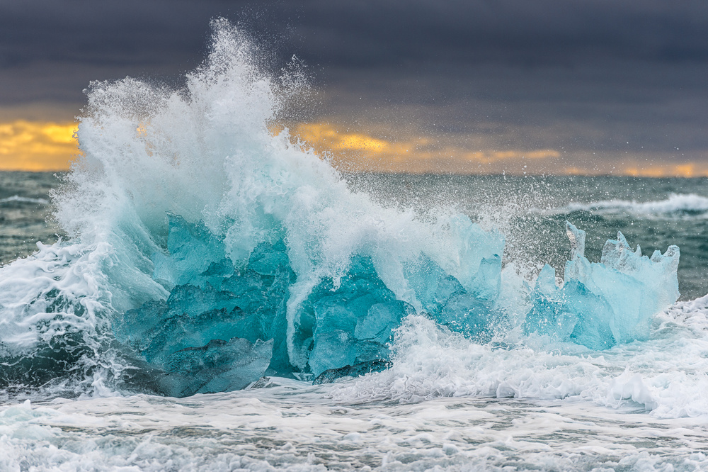
I'm in doubt on the framing of this picture. This was shot on a winter morning on the well-know black sand beach of Jokulsarlon glacier Lagoon in Iceland. I wanted to also do something else than slow motion picture with ice and water lines and spotted that big blocks crushed by waves. I used a high speed with the telelens and low aperture to keep the sky background (sunrise under a heavy cloud) blur. It was not sunny so I miss probably a bit of light to capture the wave details. I wanted viewer to be able to see the wave details as well as the ice structure so I may have cropped to much ? would you expect more air around ?
I also lower the ice lighting to get the ice blue. Would you find this a bit too much or acceptable ?
Senior Critic Alfred Forns
This capture looks beautiful, powerful and impressive, no question.
What I see with the narrow depth of field is being able to attain a close up look at the ice, wave and power but I keep wanting to see more all around it. As if something is missing?
I am sure you will get different points of views regarding the lens used but all of them will be personal preference and there is no right or wrong way to go about it.
I like the favourable conditions you got being able to have some colour and always like the darker skies.
For this situation, using a reverse graduated ND filter would help the image. Will give you help with exposure above the water level, obtaining a better density. This is about the only place I have used that filter on a regular basis.
Marc Pelissier
Will check what I have more around the shots. Indeed during this trip I had only "classical" graduated filter and understood the use of reverse graduated one. Yet here with the block in front I don't know if it would work and not see a dark line on the iceberg then ?
Senior Critic Greg Barsh
I really like the treatment of the ice and the waves (colour, exposure, structure), but I wish there were a bit more room on the left, and a bit less room on the bottom.
Also, I think using a wide aperture to blur the background works best when there's already not much detail or interest in the background to begin with, but in this case, I think the background sky is part of the visual story. Depending on how far away you were, a narrow aperture might have done the trick, still focusing on the waves. (A focus blend with two exposures is another approach, but tricky in this situation because the top of the wave and the water droplets overlap the background sky).
Marc Pelissier
Will definitely try to get more on the right and re-frame. Need to check other view but might not have more focus on the background to check.
Member Michael Castellano
I think this an excellent and well crafted and composed image. Personally, I like the freezing and sharpness of this image, and usually find blurred water shots boring.
I think the crop you selected is also a very good one, as is the relative short depth of field.
Marc Pelissier
It's good to know that the crop works for you. I will still give a try for a wider one just to see if in the end it can work better.
Member Mike kreiten
Since so many things were said already and you had two direct questions, I assume you're interested in multiple opinions about these two uncertainties.
I very much like the picture, having been in Island this is for sure something I wanted to have but did not find (but tons of other fantastic motives). I can't tell if the blue is too intensive in the ice. I would guess so, but I did not see much ice in April on Snaeffelsnes. It works, it draws attention, so it's a guess the blue is a bit overdone. It bothers me more that it does not correspond well with other green/blue tones in the picture, maybe you could re-think saturation and tone of the clouds? They're going in the direction of purple, while the ice is rather a bright cyan. For your thoughts about the crop I would agree if I may. It's a bit tight on the upper part, a 10% more in height would be beneficial, leaving the same space on the left and top. I would also like to see a few centimetres more on the right, not to "squeeze" the main subject. The subject is so obvious, it won't get lost in the surroundings.
Marc Pelissier
Thanks for this very detailed feedback and additional tracks for improvements that were not given before. I will look for a less cropped view as I believe that I do have space in the original view. I will check on the blue and moreover, your comment on the cloud tones is really interesting as I believe they were more dark grey than purple. So I definitely need to revisit saturation. Will do some rework with previous remarks and yours.
 | Write |
 | Marc Pelissier PRO Thank you so much Yvette and Alfred for selecting my picture and highlighting the indeed extremely useful critique feature.
This allow me to give a warm thanks to the senior critics team, who did provide great feedback and ideas to make this picture better and closer to what I wanted to share.
That did actually help a lot as you often need other eyes to view some elements to fix. They are obvious then when said but only then ;-)
This is an additional incentive/reminder to participate ourself to the critique writing
Marc |