

|
|
|
|
Published by Yvette Depaepe in collaboration with Alfred Forns , Head of the Senior Critics.
1x has a unique feature the founders are very proud of: the photo critique.
Members can submit pictures to a team of knowledgeable senior critics. Their feedback is useful, interesting and enriching even for the best of us.
Critique on the photo ”The millionaire maker” submitted by ting tai meng .
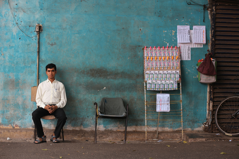
This picture was taken during a recent trip to Calicut India one afternoon just before I went for a lunch with some friends.
The image just presented itself to me and all I needed to do was just frame and click. I was very happy with it, I thought it’s one of the best I have captured from the entire holiday.
I think it really had some ‘soul’ in it. The lost looking young man who’s probably tired of the mundane job (reminds me of my own career too!). The rich earthy tone textured background, the empty seat, the lottery tickets on rustic display etc. It looks like a story telling painting. I did some minor colour adjustment to enhance the main source of light but kept the subdued tones suiting the young man's stoic expression. Funny thing is that he had the exact same look when I shared the picture with him, unlike the others who always respond expressively.
I have been an art director for the past 20 years. Think I am able to judge a good picture from the bad one. But a really excellent one from a pure photographic point of view is probably what I lack and that is the reason I joined this site. Thanks in advance for your input.
David Mc Cracken
Submitting a photograph you obviously love for critique is a brave thing to do. You risk having the image shot down in flames adding to your disappointment. I like your comment. "Think I am able to judge a good picture from the bad one." I think I have that skill too but I have also long known that I am never a good judge of my own photographs.
We tend to treat our own photographs like children. We love them and expect the rest of the world to love them too.
I like this picture. However, to my eye there are a few things that don't look right.
I understand the character in this image is not posed but he does look overly posed. There is something not right with the lottery tickets. The 'pegs' holding them up look overly saturated as do the tickets themselves. The shutter to right does seem to be superfluous to the image although I can accept it. If you insist on including part of the shutter, I might liked to have seen more of the wheel or slightly less of the wheel.
These are my observations. It would be good to read what others think.
Senior critic Greg Barsh
First of all, I like this image a lot, even more after reading your introduction and thoughts. There's a visual story as well as a poignancy that is easily appreciated.
With regard to decisions made by the curators, I enjoyed the recent comments by John Fan , in which he underscores the subjectivity of the curation process and the importance of creativity.
Personally, I think this image is very creative, and if it were mine, I would ascribe the curation decision to subjectivity rather than a fundamental problem with the image.
What about a critique? Well, I have two sets of comments suggestions. Compositionally, I think the image is complicated, precisely because of the underlying visual story. You have two primary subjects (the man and the lottery tickets), both of which draw the viewer's attention; to appreciate the image, the viewer needs to see and think about both of those subjects, as well as the empty chair and the expression on the man's face, and not let the two subjects, at opposite ends of the image, compete with each other. I wonder about reactions (mine, yours, curators) if the subject had been seated next to the lottery tickets? More accessible, perhaps, but less meaningful and, of course, no longer documentary.
Technically, I have some simple suggestions--perhaps you've already considered and rejected those ideas but here they are. I would remove the bicycle wheel, perhaps by cropping right at the edge of the wheel, keeping just a bit of the brown door and door frame. As David suggests, I would decrease the saturation on the ticket "pegs", and also raise the shadows on the left side of the man's head and body so that his expression is easier to appreciate. I would also consider removing the power line in the upper left corner. Finally, I would adjust the overall luminosity so that is more even, left to right (not so bright on the left).
Senior critic Steven T
Thank you for posting this photograph in Critique, and for including the EXIF data. Knowing the shutter speed, aperture, focal length, and ISO is often very helpful when analysing the image - and we all learn from it too.
I like the photo. It is very straightforward, and it tells a story. Here is a neatly dressed man selling lottery tickets on a well-worn street. His expression and body language tell us that he's not enthused about his job. We can imagine that he spends many hours each day in that same chair.
The story I find is about hope colliding with reality. Expectations against disappointment.
To improve the photo, I suggest two things.
First, to remove the bicycle wheel from the right side. Some detail from higher up on the wall could be cloned over it. It's just a bit distracting because it's so sharp and bright in the corner, and I don't see that it adds to the story.
Secondly, and more importantly, I think if the whole image were de-saturated a little -except for the display of lottery tickets, it would add to the contrast of 'winning and losing'.
The pink, orange, and green colours of the display are bright, happy colours. I'm sure they were chosen deliberately to represent hope and promise, and encourage people to buy the tickets. I think those colours should be the brightest in the image so that we see the appeal they represent contrasted with the dull tones of the everyday, real world.
The title, 'The Millionaire Maker”' is fine, but I think if it were my photo I would use 'Waiting My Turn', or something like that - to suggest that the man is patiently waiting for fortune to smile on him.
Senior Critic Lyn Hungerford
My comments are just to keep you encouraged! I find it brilliant and would not change anything in the image. This man's expression certainly speaks of the way he has lost all enthusiasm for life... but somehow he has a very balanced pose, he is well dressed and clean... what does he think about all day in between selling one ticket and the next?
What I think makes this image a great image is: the toning, the natural light, the man and his expression of course, the wonderful distorted lines... in the wonky chair and the ticket display... but also the precision and order of everything being in its place.
Another thing that makes this a great image is that everybody is looking at it writing comments... very few images put up for critique get this much attention!
I feel this image has quite a story... as many others before me have perceived. It also has a small mystery: I am left wondering who sits in the other chair... obviously somebody because the cover on the back shows the imprint of a person.
Just one last comment... I know the bicycle wheel is right on the edge, but quite frankly I feel we all go overboard with perfection at times (even this guy with his pegs!!! so I'm sure he had a reason for parking his bicycle right there!): this is street - pure and untouched.
ting tai meng - author of the submitted photo
Thanks for taking time and interest to study, feedbacks and encouraging words for the picture. Especially detailed and insightful comments from Senior critics Steven T, Greg and Lyn. Much appreciated. The learning here is I guess all down to subject matters, what to enhance and let go to bring up the main idea. My regret here is that I should have put a bit more thought and options during the shooting before I rushed for lunch. But you can't blame me, M Grill of Calicut India serve the best Indian food I have ever tasted : )
 | Write |
 | Jian Wang Like all of them, the picture and the comments. Great work, Yvette! |
 | Yvette Depaepe CREW Fine review on a unique street shot! Cheers, Yvette |
 | ting tai meng PRO Dear Yvette, sincere apology for my negligence. didn't know there's a comment section end of article till I saw Hans-Wolfgang Hawerkamp's review. Many thanks for taking the interest of this picture and I must say am learning well from the critic team. keep up the great work. cheers! Regards, Ting |