|
|
|
|
Published by Yvette Depaepe in collaboration with Mike Kreiten, Head of the Senior Critics
1x has a unique feature the founders are very proud of: the photo critique . Members can submit pictures to a team of knowledgeable senior critics. Their feedback and different suggestions are useful, interesting and enriching even for the best of us.
Critique on the photo ”Dark forest” by Michel Romaggi
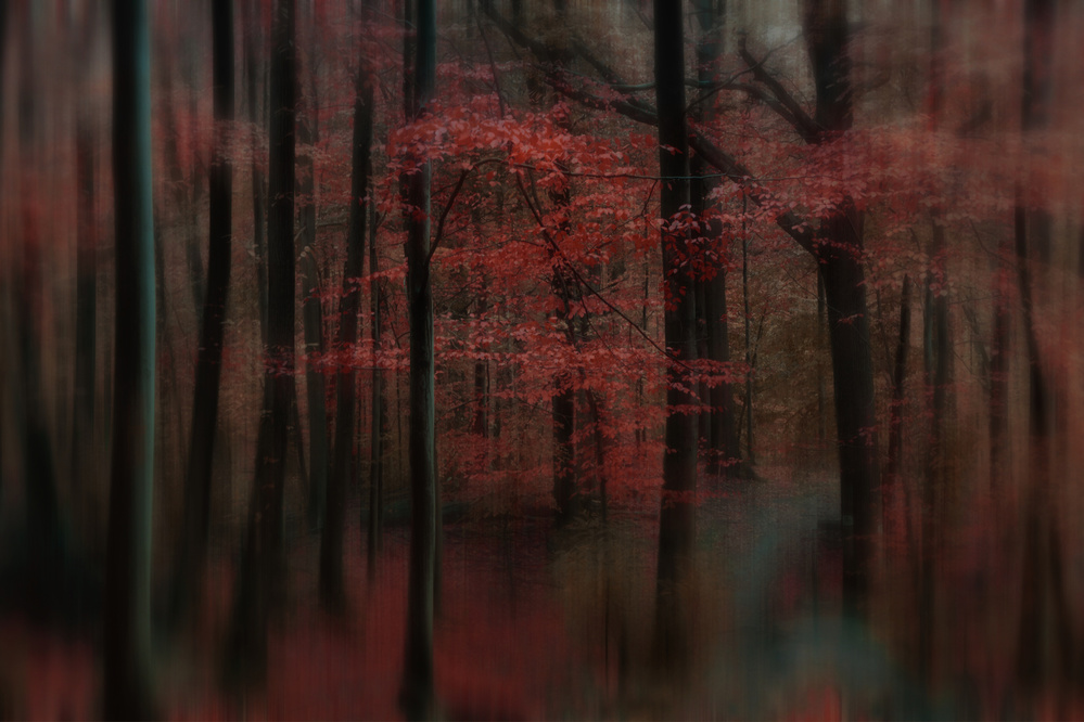

I have always been enjoying autumn colours. Through pictures, I try to "draw paintings" which shows the beauty and the enchanted look of the forests at this moment.
Aiming this, I take a picture (Sony A7 II with 24-70 f4 on a tripod to get a maxi aperture f22) and work on it with PS but also several applies (distressed, mixture, snap seed) .
I am really satisfied by this one, but it was not published though it seemed that many people liked it.
I would be very interested to hear the opinion of the Senior Critics how to improve this image because it was not published.
__________________________________________________________________________________
Senior Critic Darlene Hewson
I like the colours in this lovely shot!!! Although I can't speak about why it was not chosen for the front page, I can offer you my thoughts on the image.
First, my eyes were drawn to the two trees in the front (left side). They became the focal point to me. But I feel like the leaves should be the focal point. I'm not sure, you'll be able to do much editing on this image to achieve a different focal point. This may just be something to keep in mind when out shooting such scenes.
If you wanted to clean this image up a bit, I would suggest you clone out the red spot on the bottom near the right 1/3 section. I would just clone it with the surrounding blue. Perhaps a tighter crop, eliminating the tree closest to the left side of the image would help also.
I hope I have been of some help, Michel.
Michel Romaggi
Thank you very much for your advice, Darlene. I will do my best to improve my picture the way you and Martin are telling me.
__________________________________________________________________________________
Senior Critic Martin Zalba
Thank you very much for sharing your work with us.
I like photography a lot. We must bear in mind that we start from the difficulty of making a good frame in patterns with trees. It is extremely difficult! From my point of view, and after looking carefully, I must tell you that I like the composition, I think everything is well placed (I refer especially to the trees that are on the outside of the frame of the photo, the most difficult to place all right)
I like the atmosphere and the ethereal of the blurs. My recommendation goes rather for light and colour.
I have captured your photo and in lightroom I have simply gone to the tone curve. There I raised the light a little and darkened the dark very little. I think the image gains quite as much in colour as in depth of light and shadow. If you like, do the test, you might like it.
Michel Romaggi
Thanks a lot, Martin. As I said previously under Darlene's critique, I will do my best to follow your advice to improve this image.
__________________________________________________________________________________
Senior Critic Mike Kreiten
It's quite a common theme, the last red leaves in a blurred environment. Yours is different because you have so much colour in your frame, most photographers have the autumn leaves singled out.
I find your blur confusing not a typical DOF bokeh. Some elements, closer by, are sharper. The background is somewhat sharp too, but the elements in between are not. The question is if you need to lead the viewer's eyes to the branches, unfortunately in the middle. This is rather a week position within a landscape frame.
My suggestions for a change would be to make your title true. A strong s-curve in a Curve correction layer, like Martin suggested. Let the leaves pop out of the dark.
I sharpened the frame (have my own method you can find in my profile) and cropped 15% away from the right to have a better sorted frame.
I also "burned" the bright sections on the upper edge right and left, to have more focus. As a viewer, we are led by brightness, sharpness, leading lines or colours, and at hot spots we see subjects easier. That was my take on your work, lead by colour, sharpness, and remove distraction of brightness...
I hope you'll enjoy critique, your work has potential. And I prefer "not selected" over "rejected", it's not a judgement of your work when it isn't taken. Maybe other photographs were just better the day your work was decided on. We all feel pushed back often, me included. You were published many times, with a huge variety of work. That invites visitors to have a look at your other works, and I'd keep this - or the re-edit - in portfolio. It's lovely.
Michel Romaggi
Thanks a lot Mike. I will keep on trying to improve my picture, following your advice.
Senior Critic Mike Kreiten
Whether the advice of the Senior Critics are an improvement or not, that's totally up to you. We only suggest what we think might be stronger.
__________________________________________________________________________________
Senior Critic Norman Gabitzsch
You have a number of fine works in your published collection. I especially like "Enchanted Forest" with the wonderful dynamic range in Forest light and colours. I think that this image also has nice potential, but is not yet as strong as "Enchanted Forest".
I will cut to the chase and say that this image lacks an element to draw me in.
The red leaves, of course, are the dominant element, but they lack the punch to capture me. I would suggest that you try brightening the yellows and reds on the more sharply focused leaves.
The second thing about the principle element is that it has an almost dead centre. The right side is blurred and could use one sharp element ... or ... you could crop out some of the blurred right side to pull the principle element to the right of centre. Then stretch this image horizontally a little and I think you will have a more pleasing composition.
Finally, I find the bottom edge to be a bit "nervous". It almost looks like you have pulled it up off the bottom edge. I would consider not blurring the trees out so strongly along this bottom edge.
I did not say much about how much I like this image (and I really do like the potential it presents). I think with a little more work you can strengthen the "Draw" of this image.
Critique is also open to all members, and we learn together here. If you see an image you'd like to comment on, your words would be welcome.
 | Write |
 | Adam Dauria ☂ PRO Hmm. To be honest, I like the original picture more than the second one... in my opinion the second edit is too aggressive, too sharp, too bright. It looses the soft and dreamy mood of the original version. The first one is great as it is, it should have been published to the front page :) |
 | Peter Davidson CREW Have to agree with you here Adam, the second 'improved' version is indeed visually harsh and brittle and not in keeping with what should be a soft mood for the scene. Which the original has imho. Ah well, goes to show 'You pays your money and you makes your choice!' |
 | Theo Luycx PRO A nice presentation Mike and Yvette.
|