|
|
|
|
(Part Two)
by Editor Lourens Durand
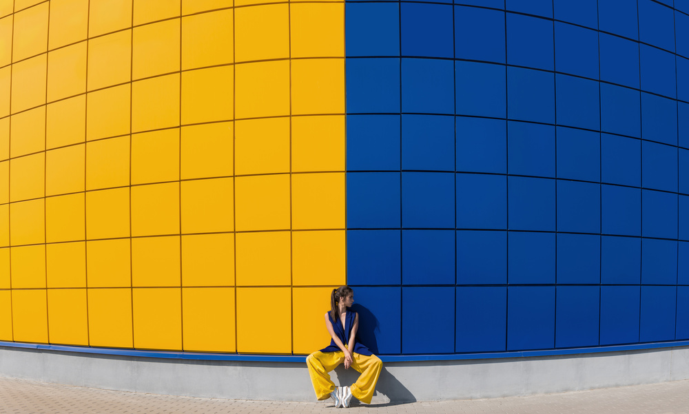
'yellow and blue' by Anna
Part One of this article covered aspects of balance, unity and focus as applied by the old masters of painting, and how they may be useful in photographic composition.
In this new segment I will look at some of the other elements of art and principles of design that may be useful in photography
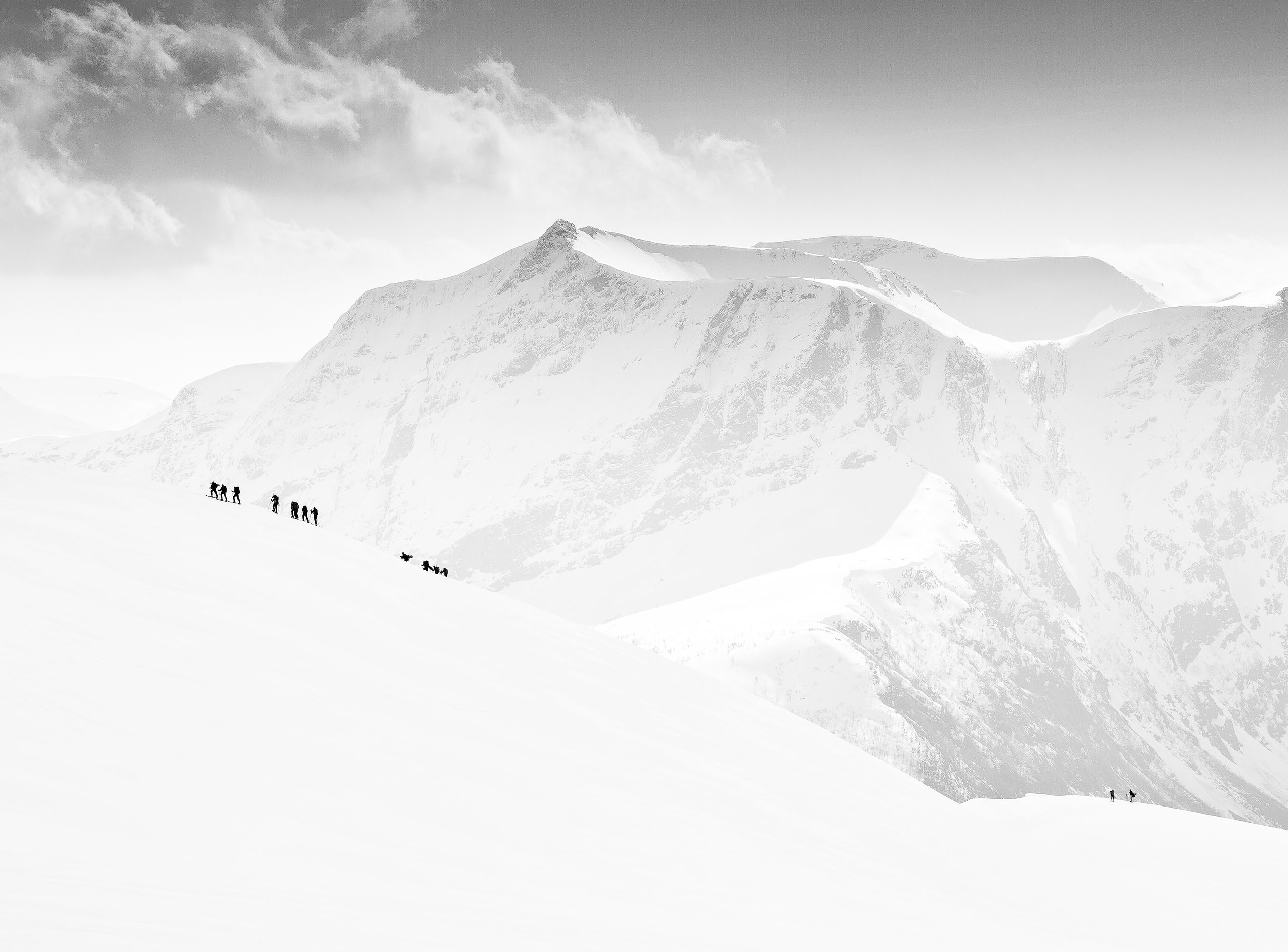
Rhythm and Patterns
Patterns are everywhere, man-made and natural, and can suggest harmony and rhythm. Examples are windows of a building, a row of crops, the weave of a basket, zebra stripes, a basket of eggs, bird feathers, lizard skin, skyscrapers…
If you purposely break the pattern, it can create tension (and is often used to get a message across).
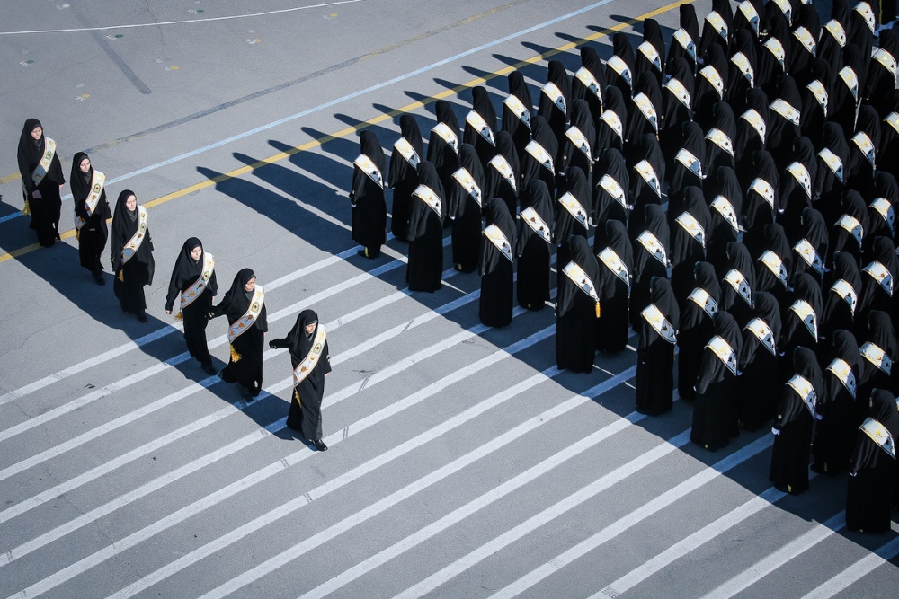
'Army of Women' by Foad Ashtari
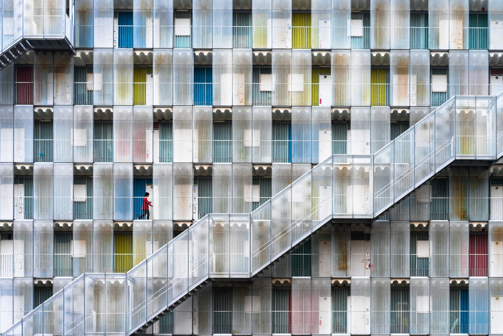
'Colorful apartment' by Tetsuya Hashimoto
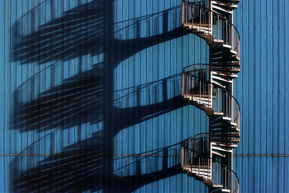
'Spiral Staircase and shadows' by Hans-Wolfgang Hawerkamp
'Men' by Petri Damstén
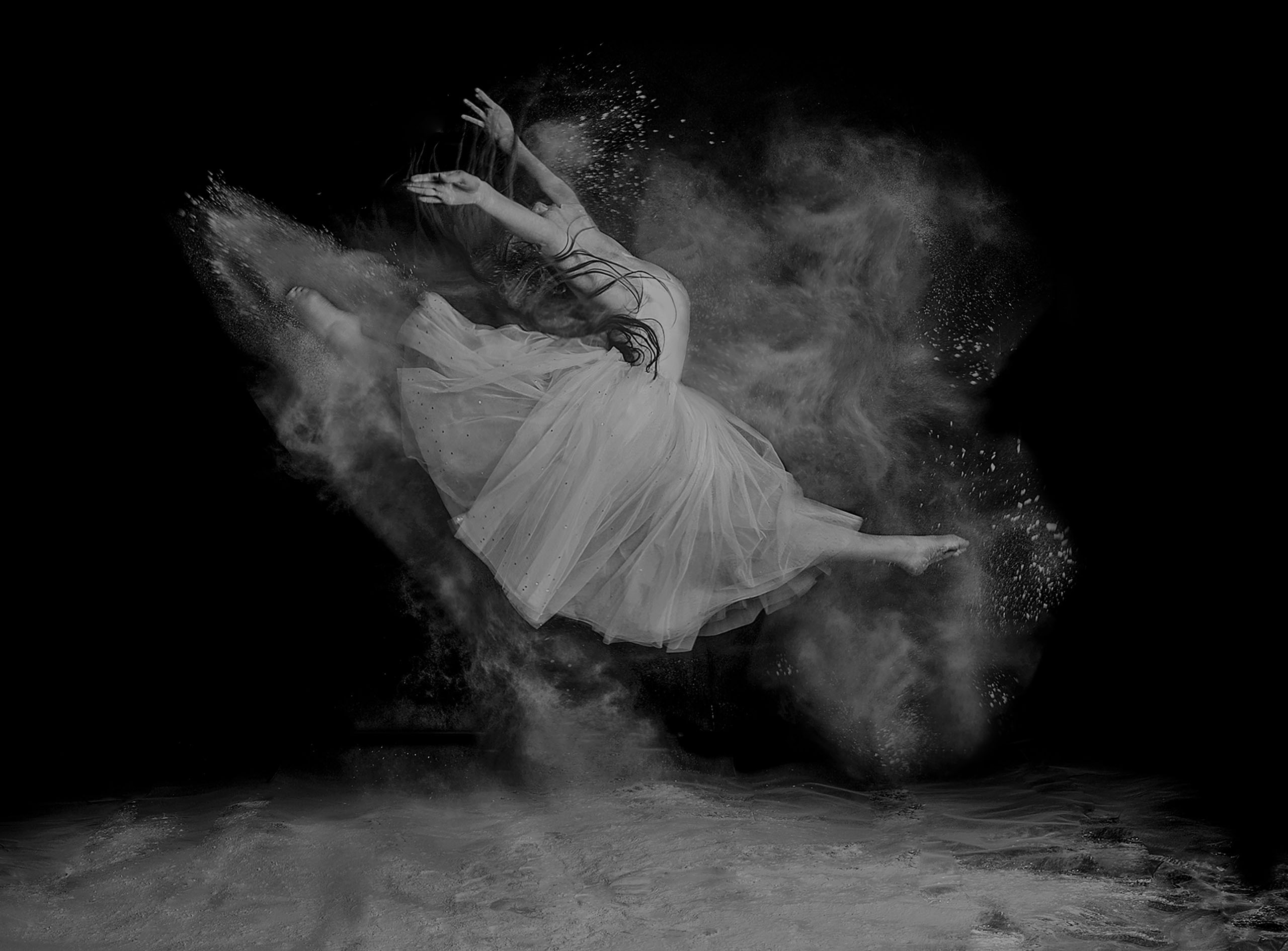
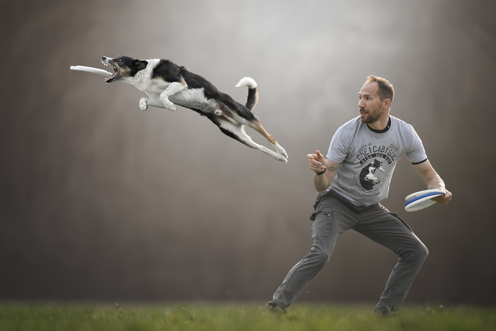
Movement
In art, movement refers not only to a subject that is moving, but implies the movement of the viewer’s eyes when looking at the picture – from the leading lines, the converging lines, the shapes, the balance, the light and shade, before settling on the subject, and wondering where it is moving to or not moving at all. (This is achieved by a successful arrangement of the elements of art and design.)
Actual movement of a subject in a photograph can be:
- Implied, as in many sports photographs
- Achieved by panning with the subject, making it appear stationary against a blurred background
- Achieved by not panning and by using a slow shutter speed, which yields a static foreground or backgrounds, with a blurred, moving subject
- Achieved by using a slow shutter speed, giving blurred motion
- Implied, by making the subject from left to right, rather than right to left, as this appears to make the subject be moving faster.
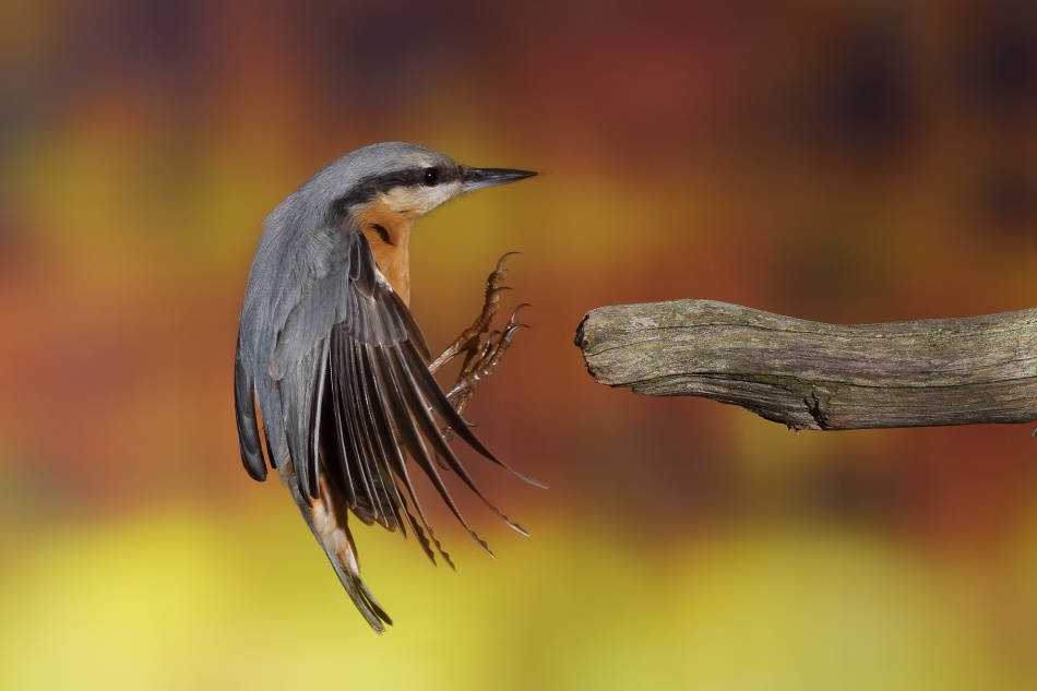
When photographing something in motion the background is often distracting. In these cases, it may be helpful to select a position where the background is suitable and set up your camera here, focussed on a small area, and wait for the action to come into the frame before shooting.
This works well when photographing:
- Nature
- Motor racing
- Athletics
- Cycling
- Birds in flight in nature. Birds often return to the same perch when hunting, so it is better to focus on that perch and wait for the bird to return, or to take off again, rather than try and follow it and keep it in focus.
'Coffee <3' by Claudio Piccoli
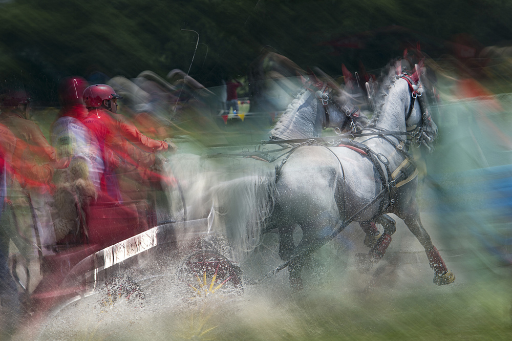
'Horse pair marathon race' by milan malovrh

'Skiring' by Dusan Ignac
'Braking' by Nicolás Merino
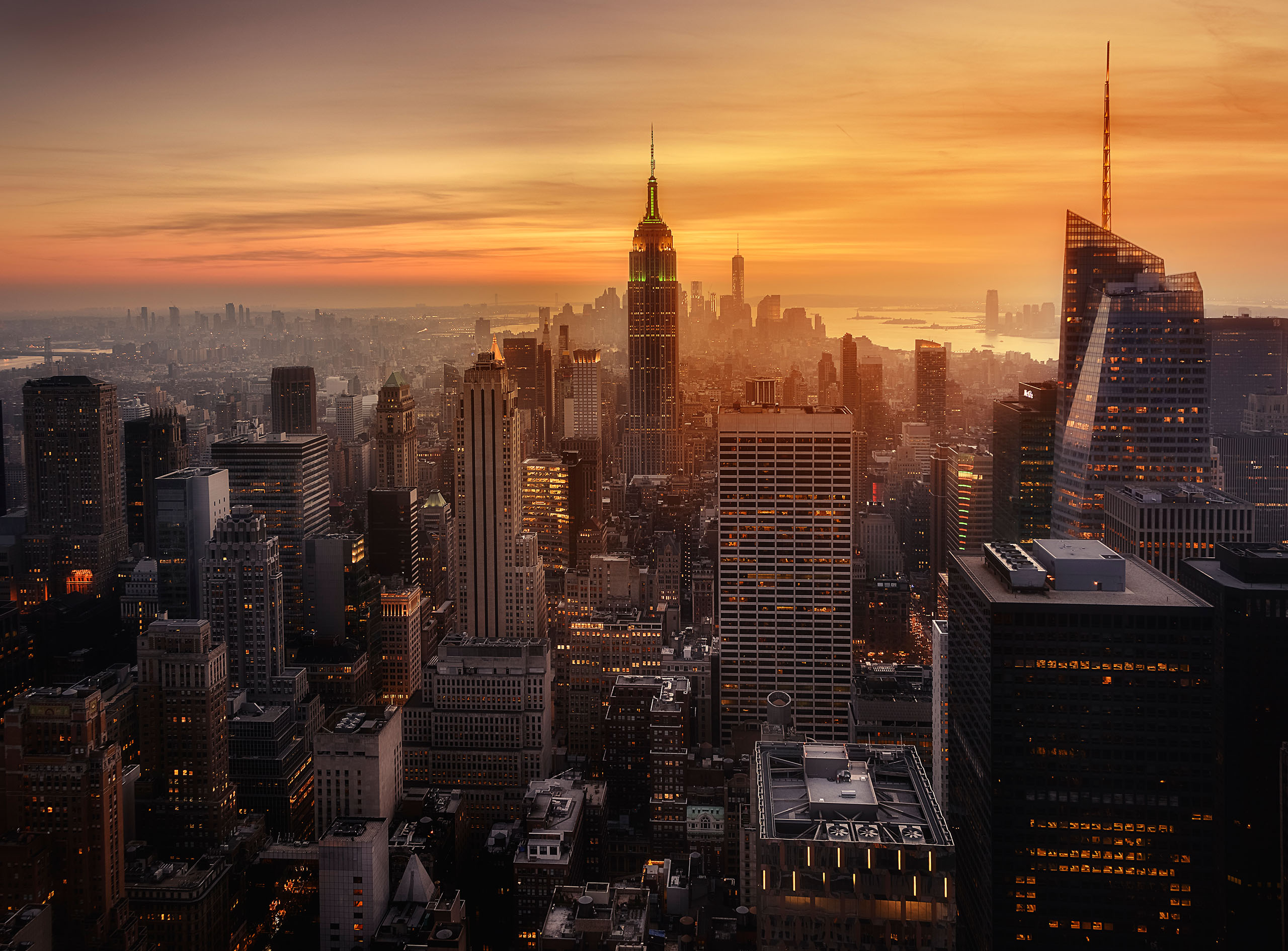
Contrast, Light and Shadows
We’ve all heard about the Golden Hour (the hour after sunrise and the hour before sunset) giving the best light for photography. This is true, but it does not stop you from photographing right through the day, depending on the subject.
* Buildings photographed with the sun high in the sky can show strong colours, highlights and shadows, making them very interesting.
* Black and white photography, in particular, can give excellent results when the sun is high, creating good contrast and intriguing shadows
* Overcast conditions provide beautifully diffused, soft lighting for landscapes
* When taking portraits outside on a sunny day, place the subject in the shade (or use a diffuser), otherwise there will be harsh shadows on the subject’s face, the eyes may be squinting, and there will be harsh highlights. Alternatively, go inside and place the subject near a window (preferably diffused with lace) to create softer lighting. Even then there is more than one option for the shot:
- Shooting from the shade side
- Shooting from the sunny side
- Shooting from the mid-point
- Using studio lighting to obtain different effects is a whole science of its own
- Backlighting often creates dramatic effects, especially during the Golden Hours
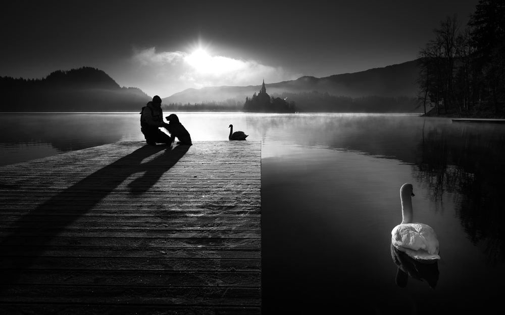
'A peaceful morning at the lake' by Sandi Bertoncelj
'Rustique' by hardibudi
Colour
Apart from the fact that warm colours approach and cool colours recede, there are a few other aspects of colour that are important to photographers. Let’s look at some of the basics.
There are three primary colours: red, blue and yellow.
These colours are normally very loud and can be a distraction in a background, so move around until you can find a better background.
Secondary colours are produced when the primary colours are mixed: red and blue give purple; red and yellow give orange; blue and yellow give green. A complimentary colour is the colour not used in this mix: so, red is the complimentary of green, and so on.
Complimentary colours are important, because the eyes always look for a little bit of the complimentary to balance a picture. Finally, tertiary colours are produced when further mixing occurs:
Some tips for using colour in photography:
- Primary colours can be very loud and distracting in a background
- Look for a better background if possible
- Keep contrasts to a minimum and use only a dash of complementary colour to balance the picture
- Try and use colour families, those that are adjacent to each other on the colour wheel

'Roofs' by Theo Luycx
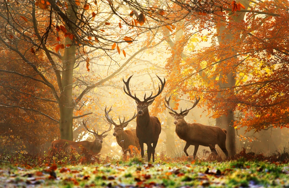
'Realm of the Deer' by Alex Saberi
by Tatiana Skorokhod
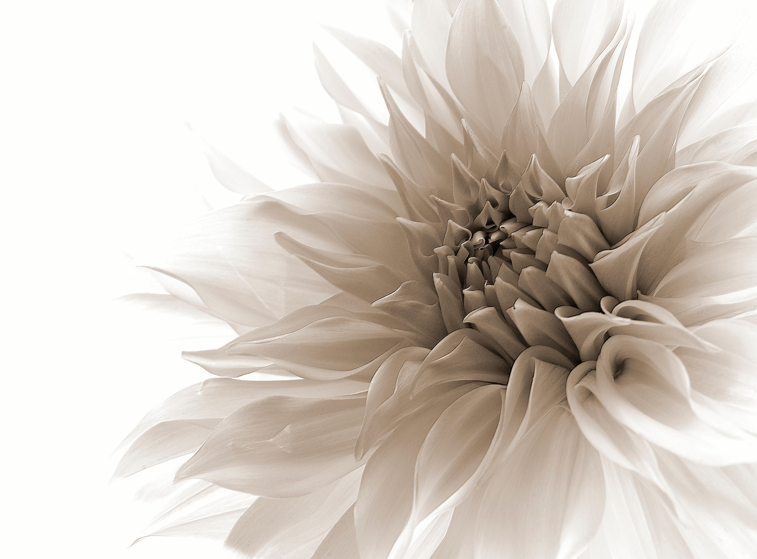
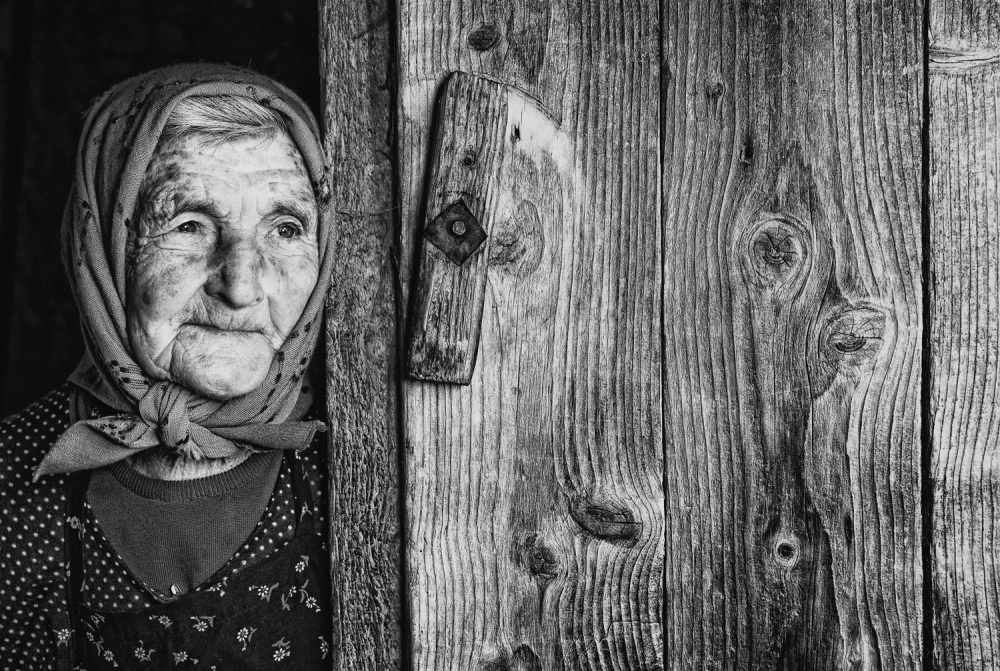
Texture
Textures may either be an asset or a hindrance.
An ugly wall may not be suitable as a background for a soft portrait of a bride but could be ideal for a more dramatic shot of a street kid, or for a powerful composite.
Texture gradient, as discussed earlier, can be useful in adding the illusion of depth in a photo. Think of the slats on a boardwalk appearing to be smaller and closer together as they recede into the distance.
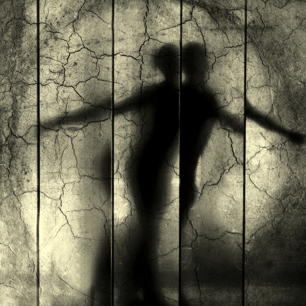
'Der sterbende Schwan' by Anja Buehrer
'Lifelines' by István Kerekes
Conclusion –Practice
These are the most important aspects of composition, and it is now up to us to practice them and to practice looking at things in a different way to see the pictures that make an award-winning photograph.
 | Write |
 | Knut Sander PRO Thank you very much, Lourens for that second part! Great again with all the variations of aspects and views. I'd love to see more of that! |
 | Cicek Kiral CREW Thank you very much...
|
 | Vladimir Asriyan To this beautiful article, I can add the following. On a bright sunny day, when shooting people on the street or other objects, try using the flash without changing the exposure. It often happens that the flash has to be used at full power. It will highlight the dark areas of the object and will not significantly affect the illuminated areas. Thank you Lourens . Thank you Yvette. |
 | Yvette Depaepe CREW You're welcome, VLad! |
 | Tatyana Skorokhod PRO I read the second part of the article The Elements of Art and Principles of Design applied to photography with great interest. I think that the article carries a lot of necessary information for those interested in photo readers. Thanks to the author of the article for the intelligible and competent presentation of material on the topic that is being considered. I am very glad that my photo was used along with other highly artistic photos in this article. Tatyana Skorokhod. |
| | Yvette Depaepe CREW Part 2 is as excellent and captivating as Part 1, Lourens... Thank you so much for these great articles and congrats to all the authors of the selected images. Cheers, Yvette |