|
|
|
|
by Editor Lourens Durand
Edited and published by Yvette Depaepe, the 9th of December 2022
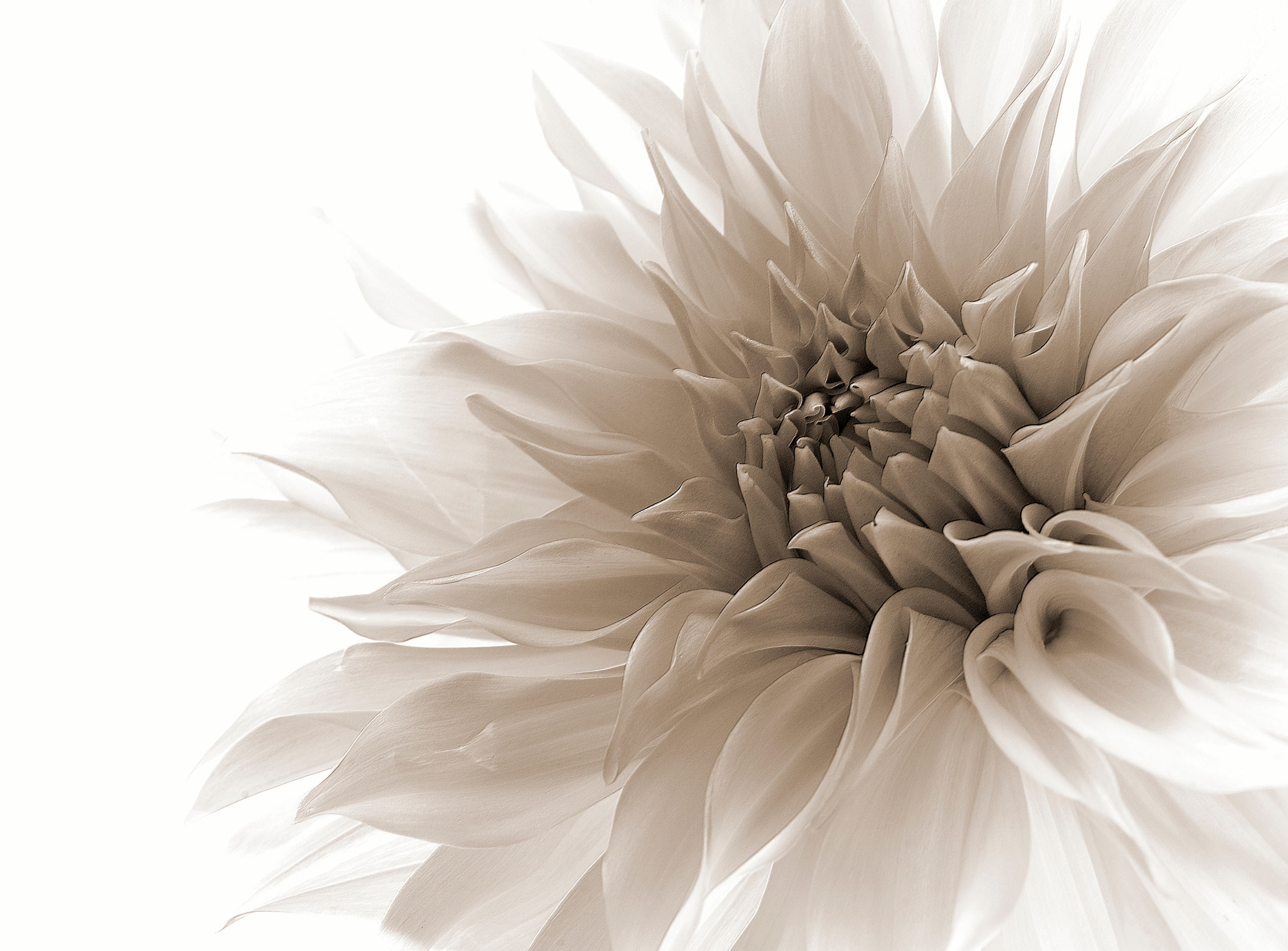
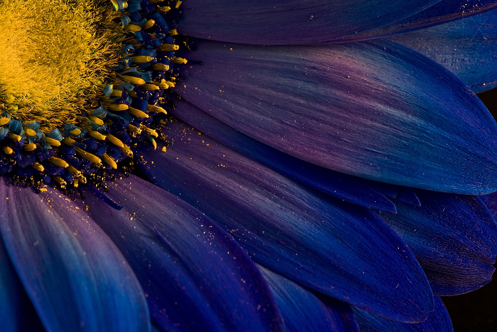
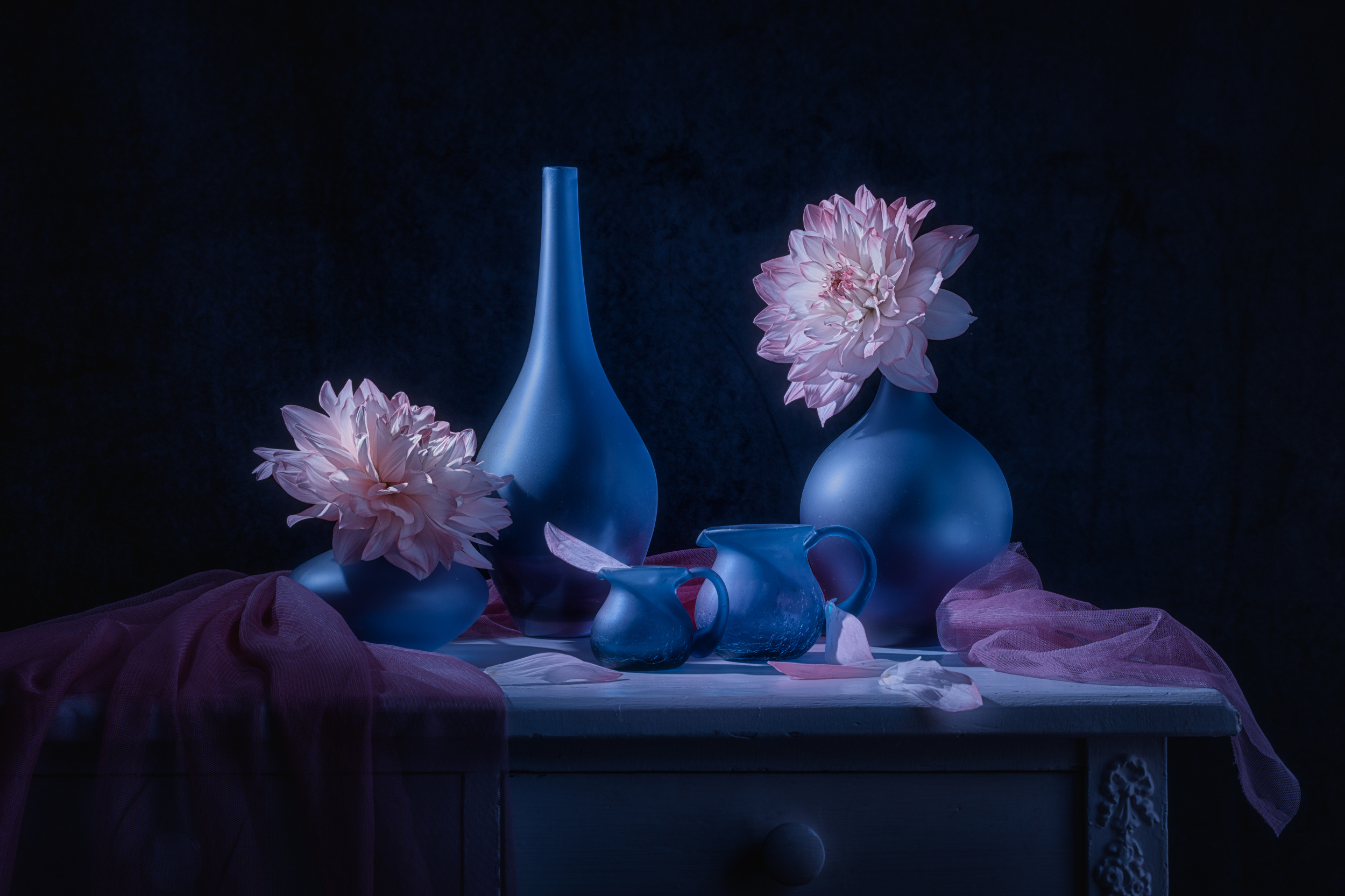 'Purple Dahlia' by Lydia Jacobs
In 1839, Michel-Eugène Chevreul, a French chemist known for his earlier research on fats and fatty acids and later work on dyes, wrote The Laws of Contrast of Colour, a book that introduced the idea of Simultaneous, Successive and Mixed Contrast and changed the face of French art.
Simultaneous Contrast is the effect observed when strips of two colours are placed side by side, in close proximity: the colour of the one appears to affect the colour of the other.
Successive Contrast has to do with after-images: if you stare at one colour fixedly for a time and then look away, an after-image appears in the complementary colour of the original.
Mixed Contrast takes the concept of Successive Contrast a little further: if you stare at one colour fixedly for a time and then look at another colour, as in a large painting or billboard, the colour of the after-image mixes with this colour to give yet another colour.
We have all seen interesting and fun posts on the internet demonstrating the apparent effects of colours on different backgrounds and so on, but Chevreul’s concepts are invaluable to artists and photographers. If we look more closely at the Laws of Simultaneous Contrast, we find many interesting interactions that may be useful in the composing, lighting and post-processing of photographs.
Here are some interesting examples
* When different colours or hues of the same colour are placed side by side, the contrast between them appears greater than when they are viewed separately
This increase in contrast is heightened when the colours placed together are complementary colours.
*When two similar colours are placed together, their complementaries will affect each other. For example, when Red is placed next to orange it will appear to approach a violet-red because of the influence of the blue complementary induced by the orange.
* When a light and dark tone of the same colour are juxtaposed, they both appear to be more contrasted, especially at the point of contact. If a series of lighter and darker tones are placed side by side, this phenomenon at the points of contact will make the picture look corrugated, so gradation is necessary to give a smooth effect.
* Contrast is increased if one colour is totally surrounded by another, so a dark background lightens a subject, a cool background warms the subject, a saturated background will desaturate the subject, and vice versa.
* The subject’s colour may also affect the background, so a red subject may appear to make the background more green, yellow makes it more violet, blue turns it orange, and so on.
Just a different way of looking at things- hopefully useful… Below is a selection of photographs taken by 1X.com photographers which embrace some of the principles of Simultaneous Contrast.
'Magic of the season' by Kiyo Murakami

'Illusion' by Heike Willers
'ahza' by Lotta van Droom
'Abstract – Caesarea industrial park' by Arnon Orbach
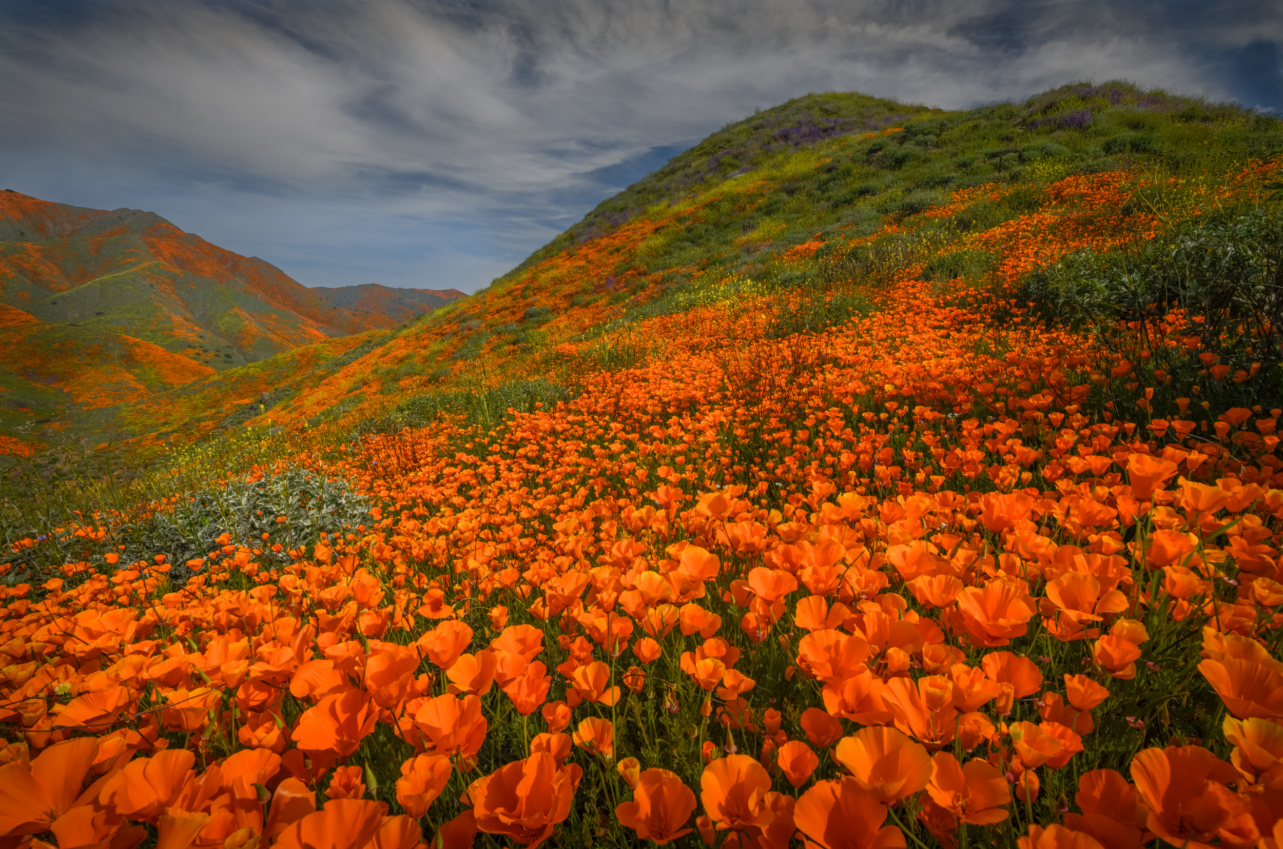
'Poppy Bloom – Walker cyn, CA' by Wanghan Li
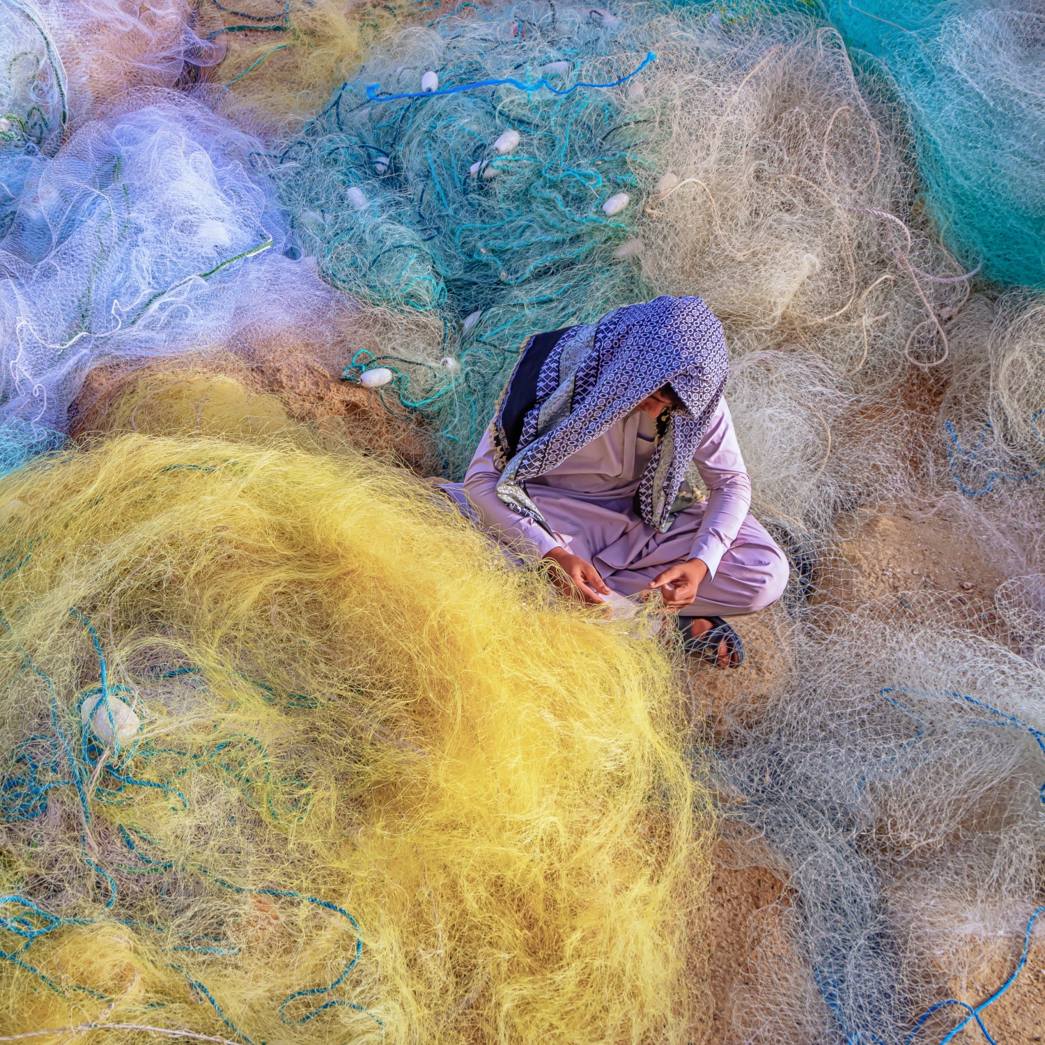
'Net Weaver' by Shahabeddin Montazeri AFIAP
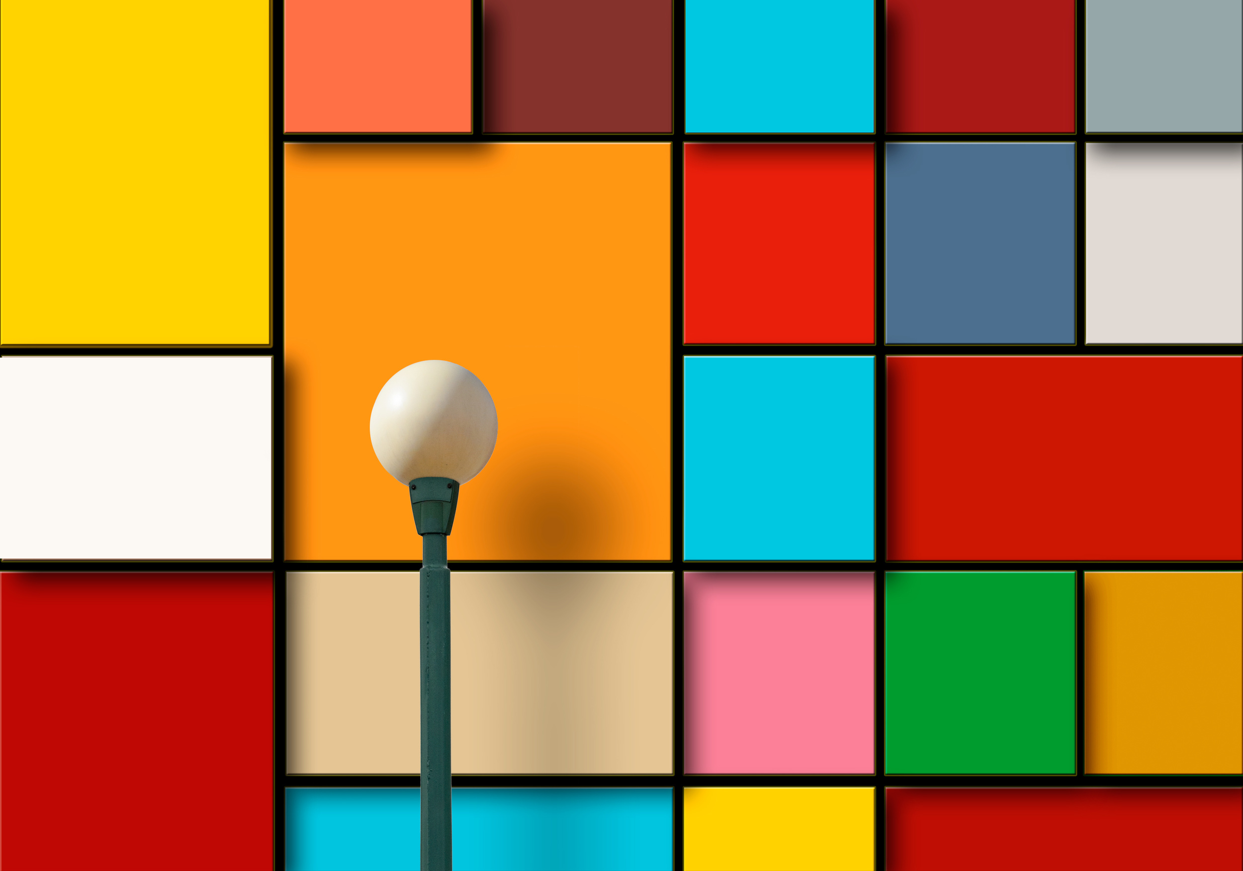
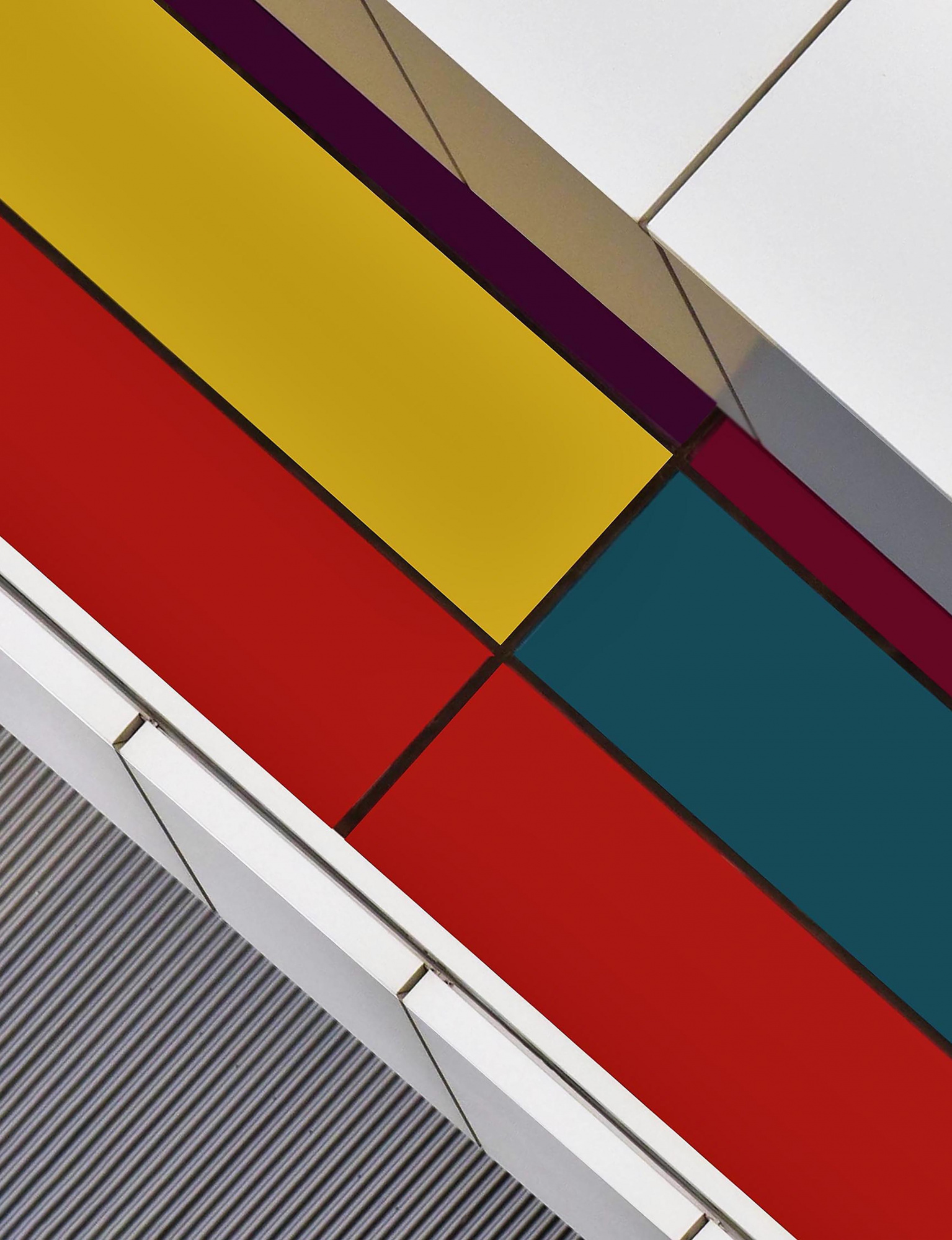
'Blocks' by Alfonso Novillo
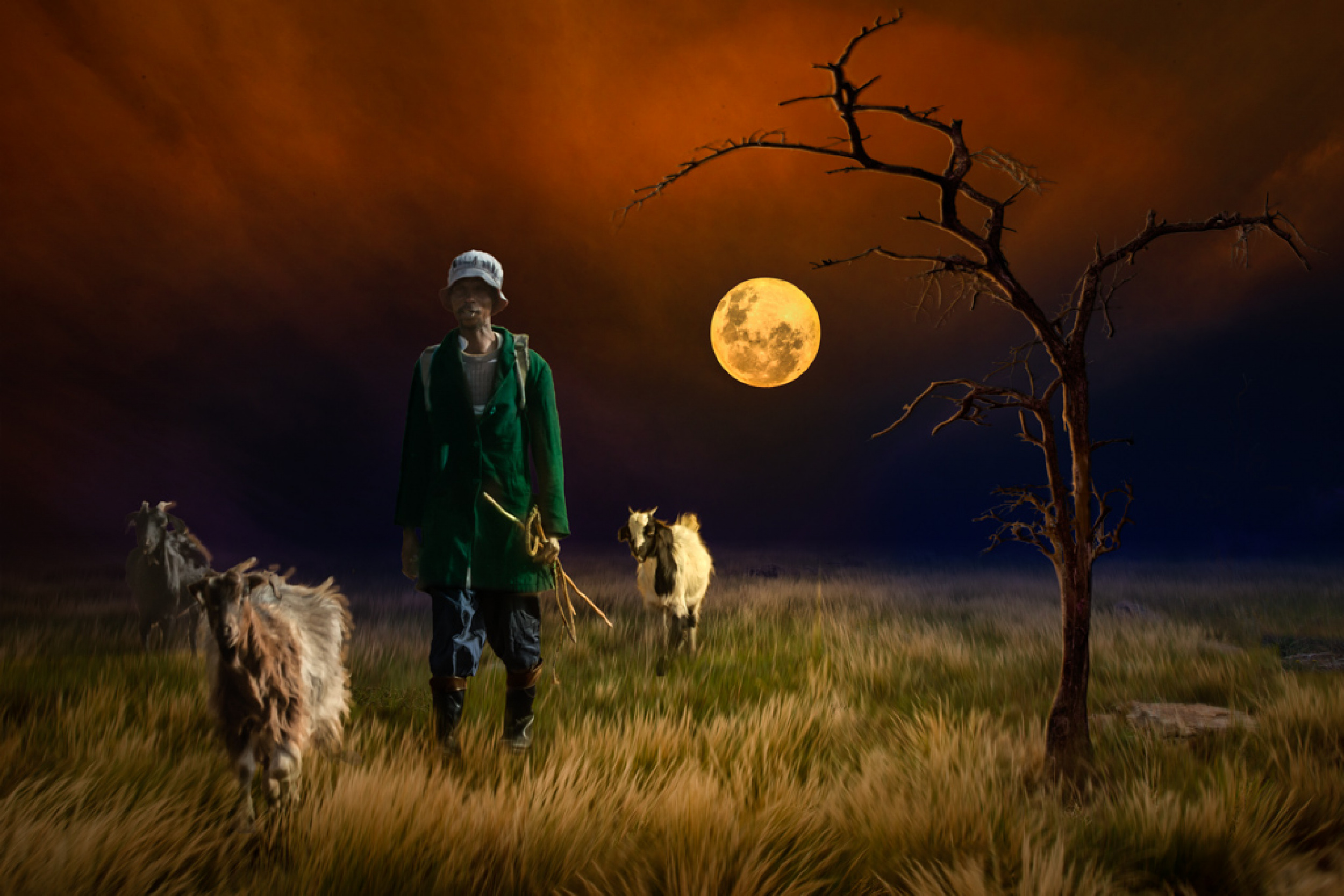
'...goatherd in the light...' by Charlaine Gerber

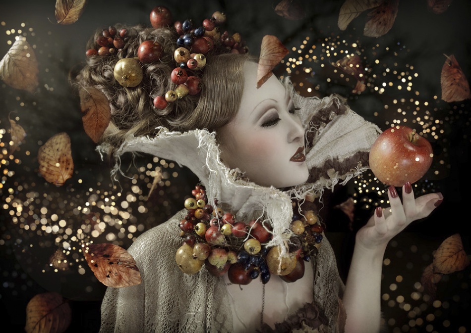
'Autumnus' by Bill Gekas
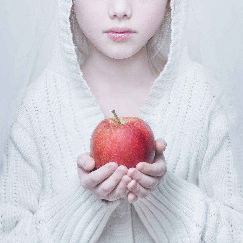
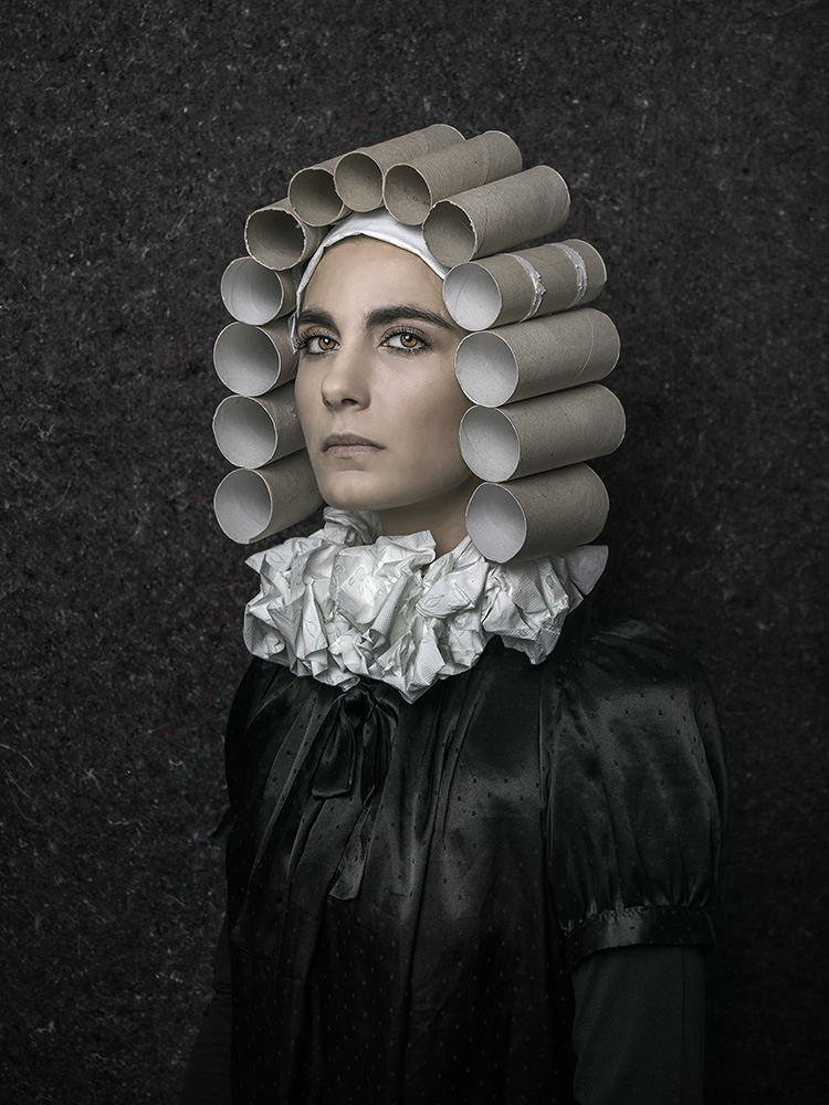
'Snow White' by Magda Berny
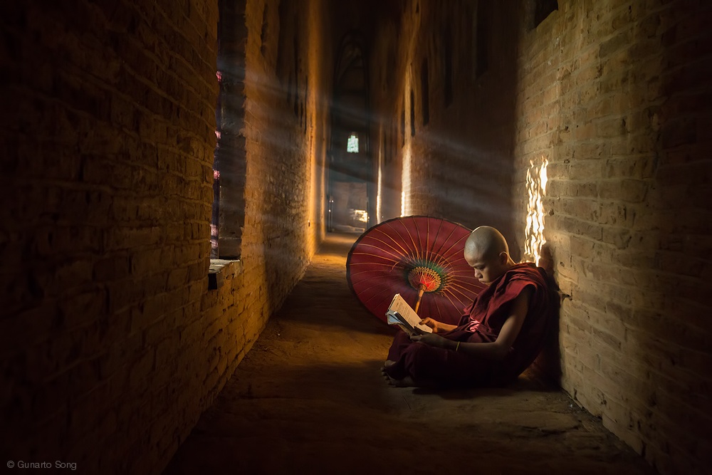
'Book and Monk' by Gunarto Song
'Face off' by Mikhail Potapov
'Blue Rays' by Þorsteinn H. Ingibergsson

'Symmetries' by Aida Ianeva
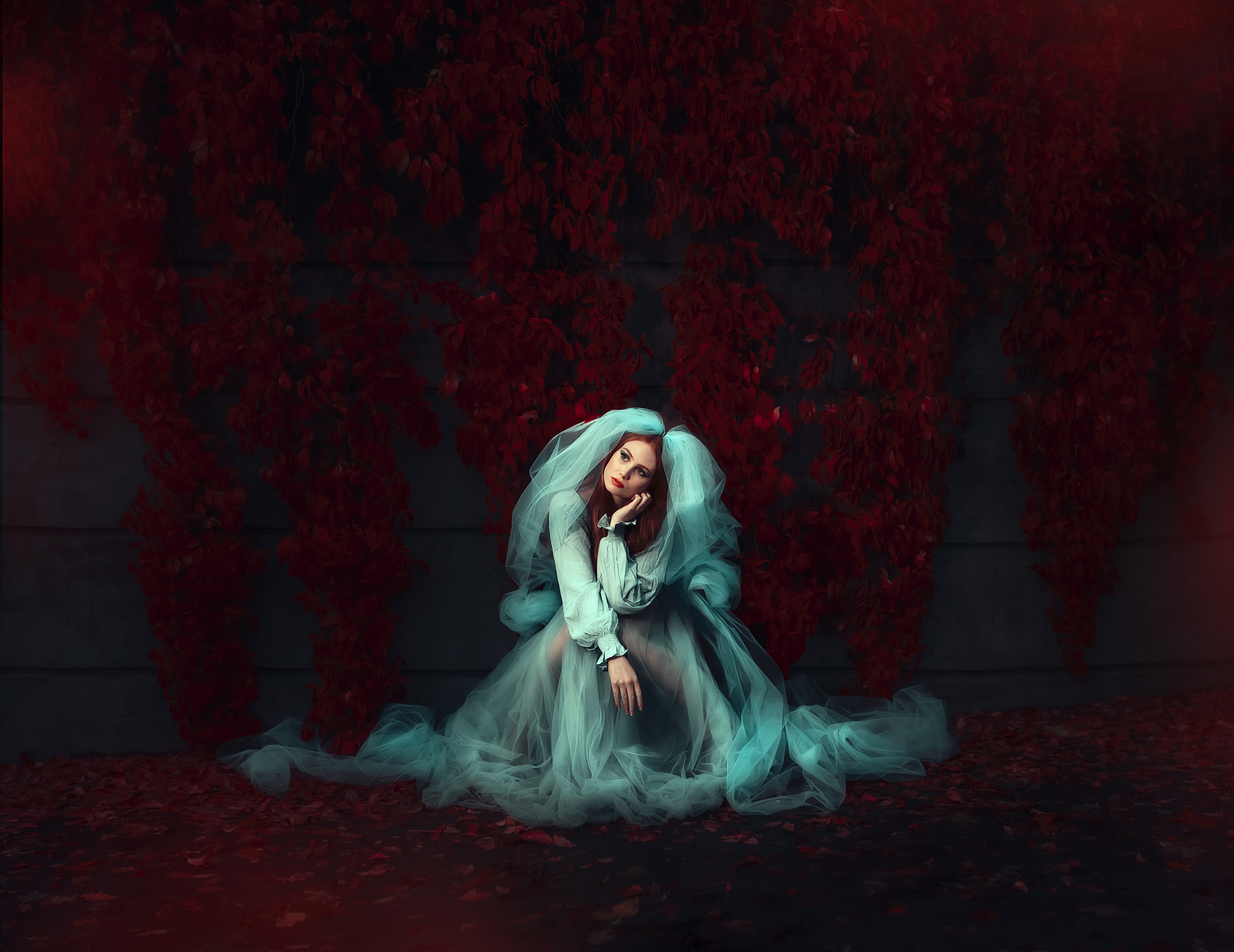
'The Brides Maid' by Lis DH Magnus
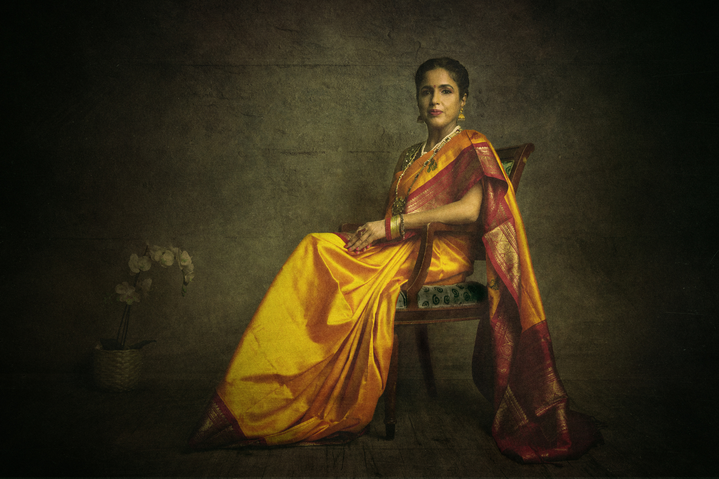
'Painterly elder woman' by Srikanth Gumma
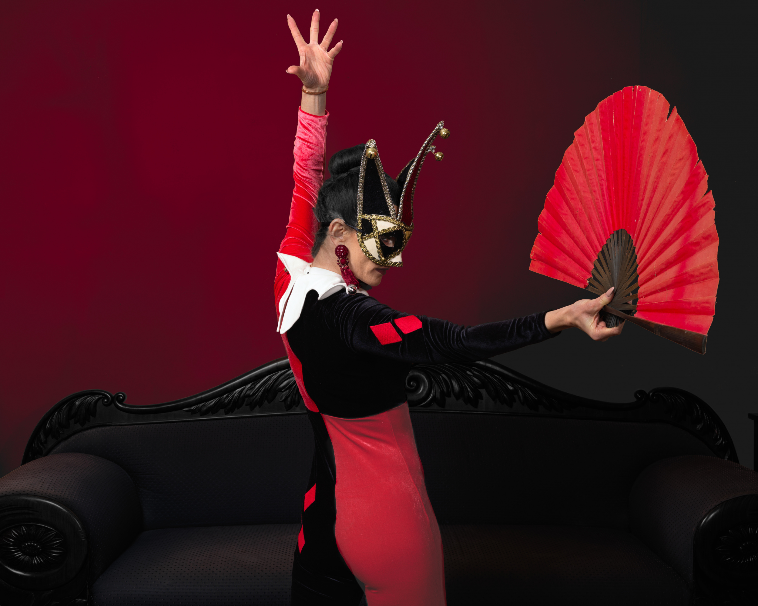
'Joker' by Melanie Haberkorn
'Ordering' by Marek Boguszak
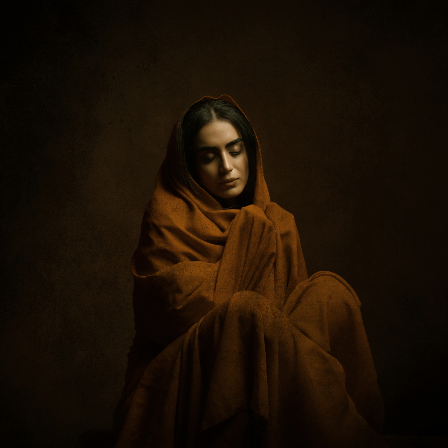
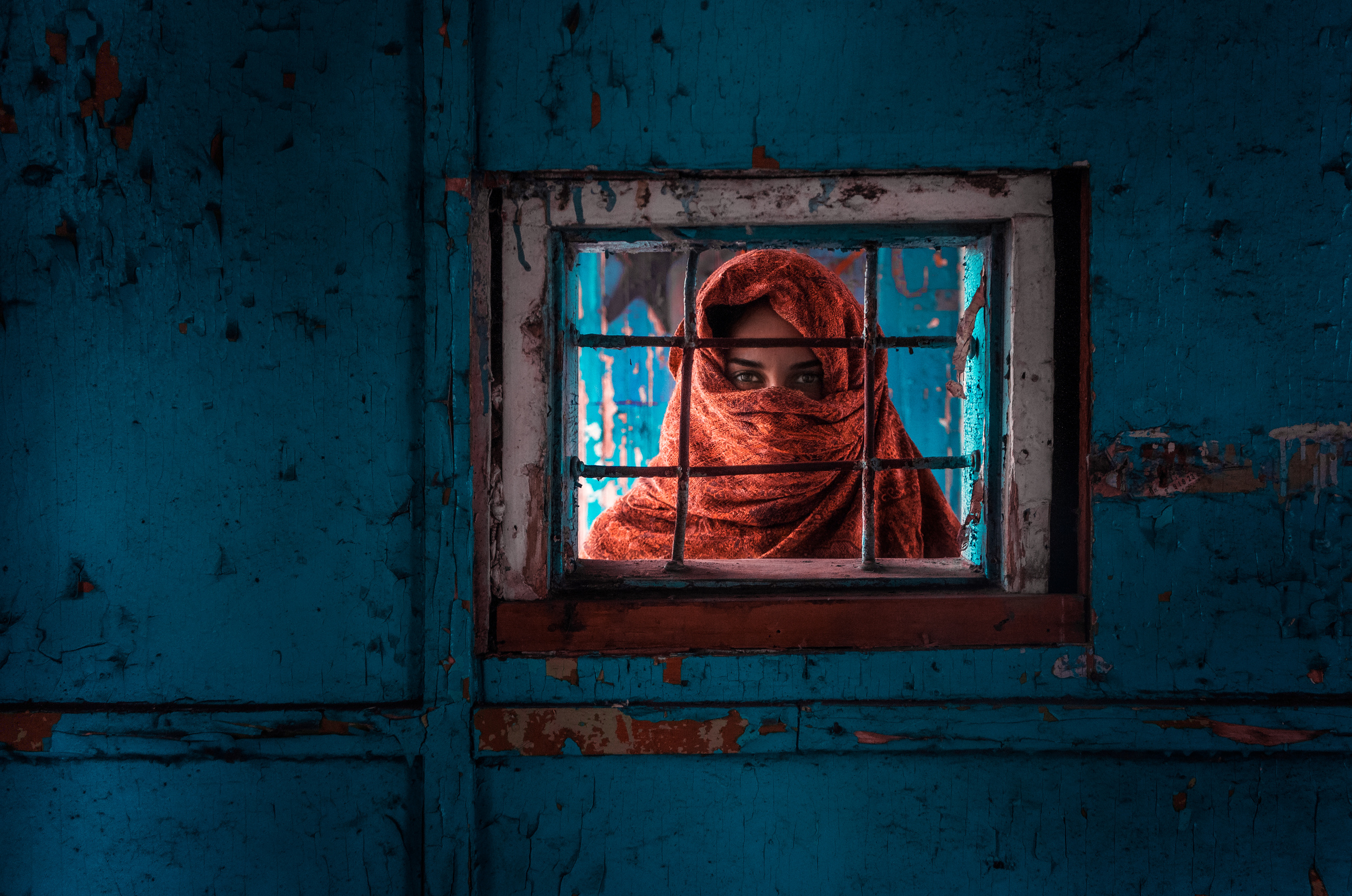
'Persian girl' by Moein Hasheminasab
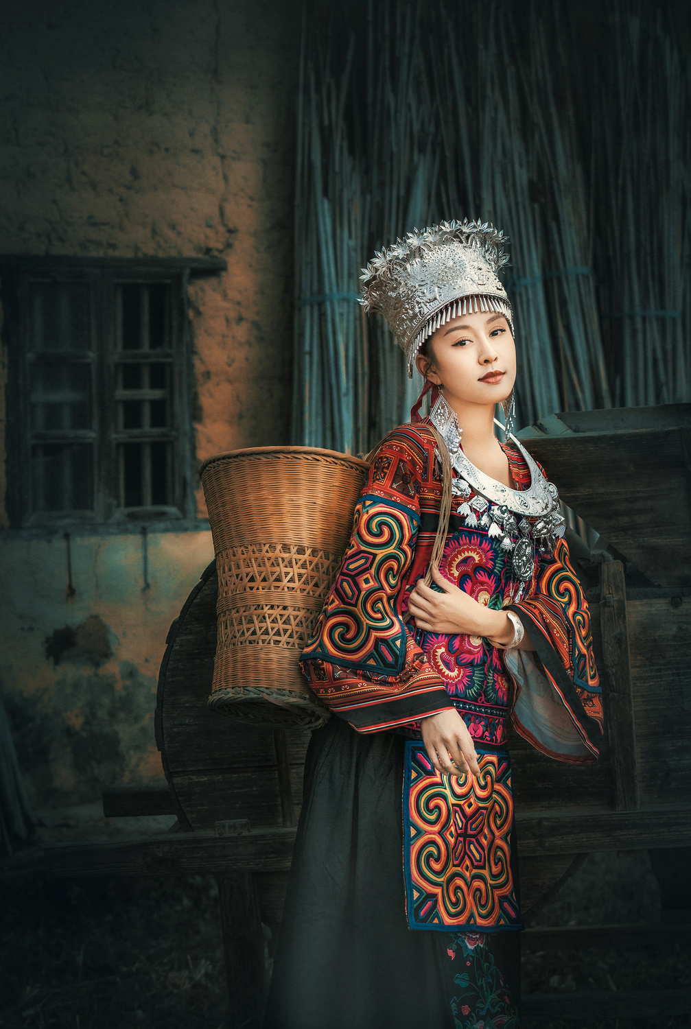 'Maiden' by Liu Xing
'At dawn' by Serhiy Fett

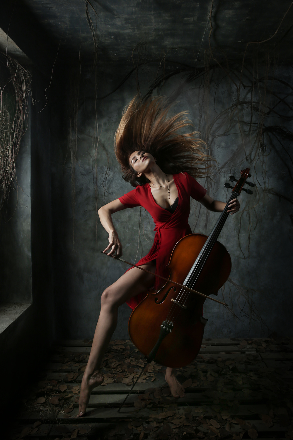
'Secrets' by Valentina Rabtsevich
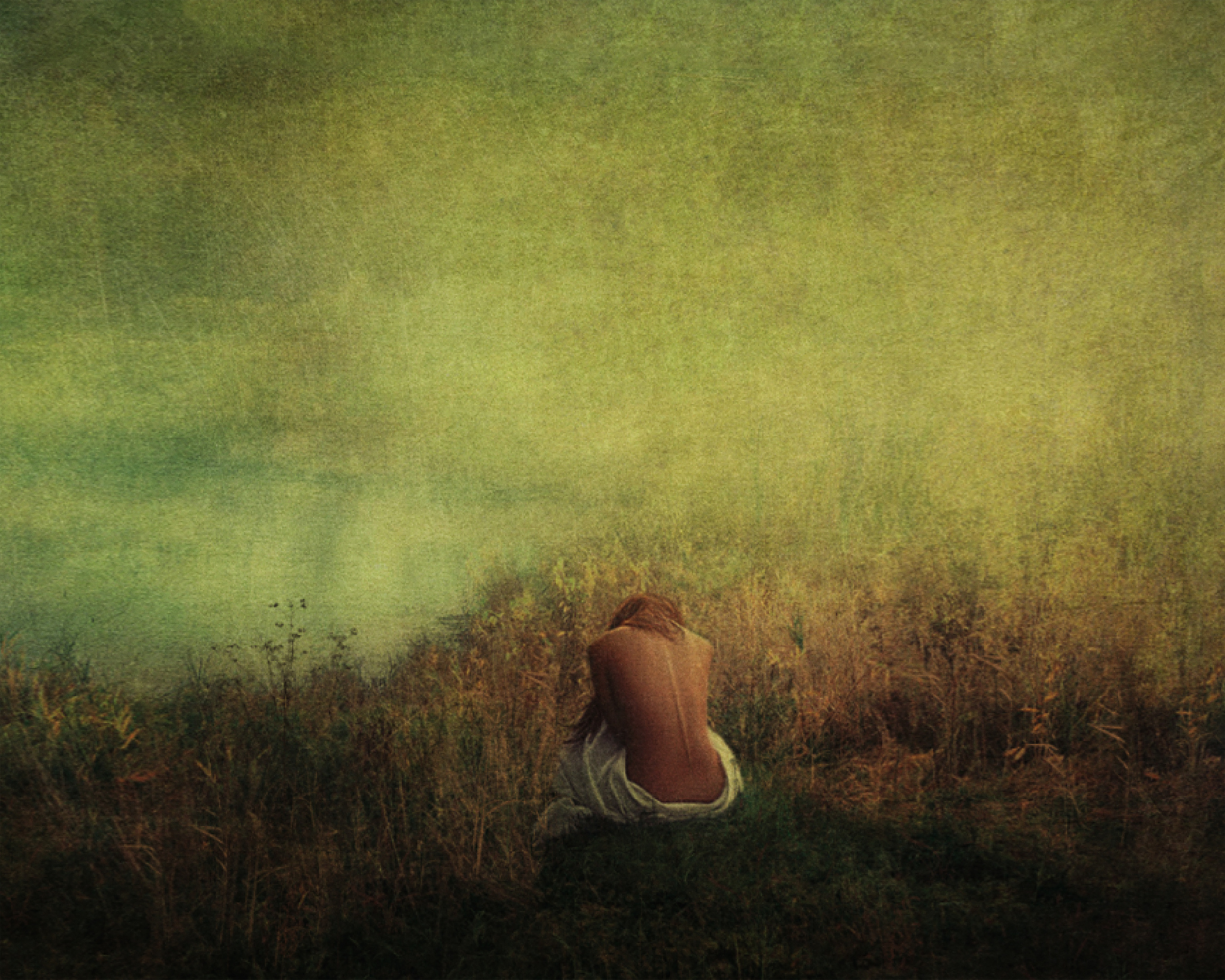
'The Rhythm of Sadness' by Sebastian Kisworo
'Persian girl' by Moein Hasheminasab
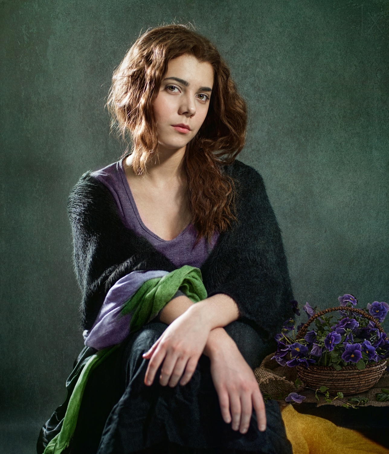
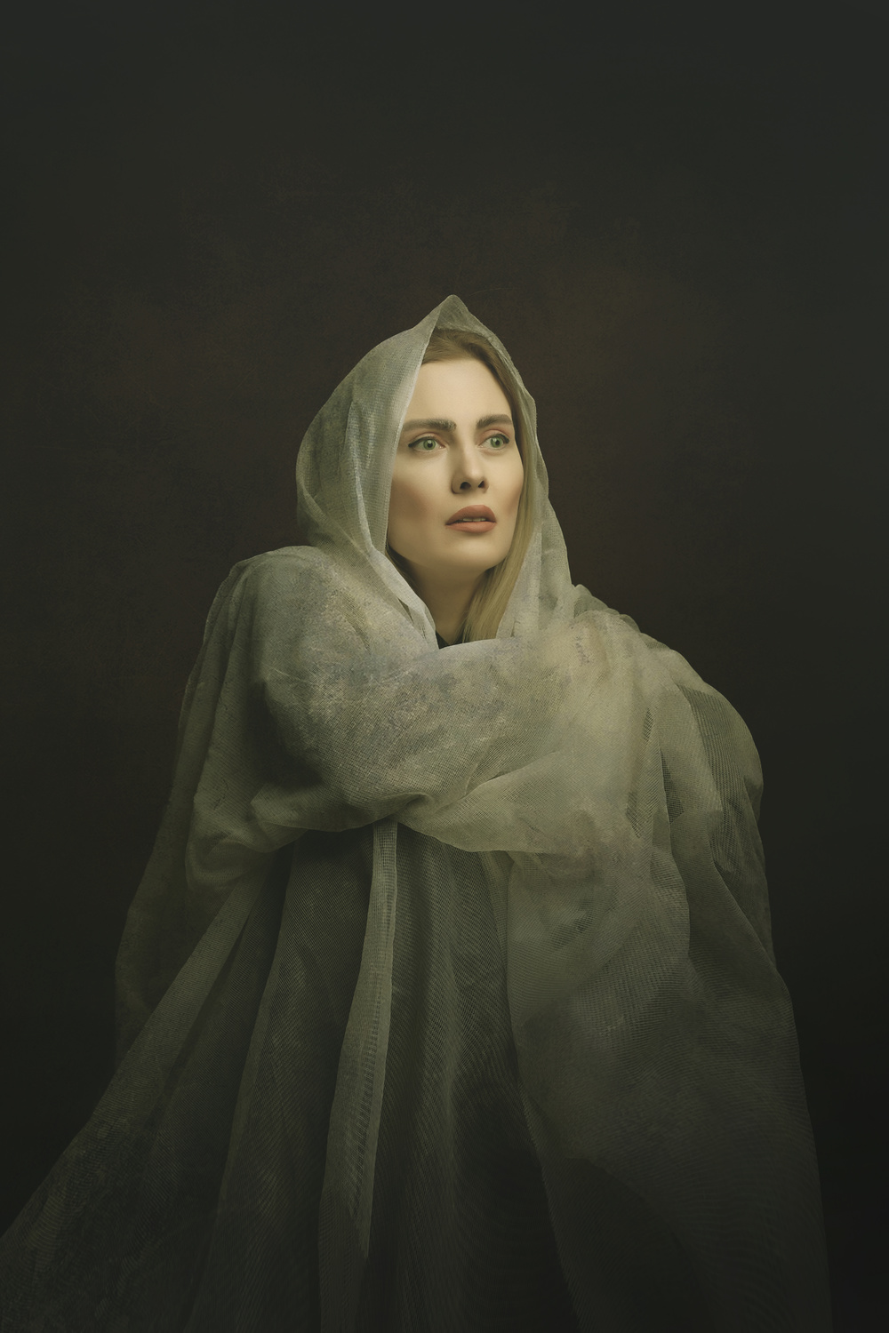
'… Violets' by Svetalana Melik-Nubarova
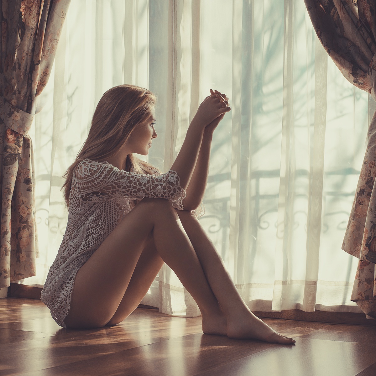
Waiting for love' by Kalynsk
 | Write |
 | Srikanth Gumma Great Collection, Thank you for selecting my photo |
 | Aida Ianeva PRO Great images! Thank you for selecting my photo |
 | Vladimir Funtak PRO Interesting... |
 | Vasil Nanev PRO Brilliant selection, wonderful article, many thanks! |
 | Thomas Hunger Abbott Very informative! :) |
 | Marius Surleac Very nice article! |
 | Gilles Benso PRO Merci pour cet article et ces superbes photos. Totale découverte de cette notion d'interaction des couleurs entre elles. |
 | Francisco Goncalves PRO Interesting work, creative and eclectic. High technical image quality. Well done |
 | Wanghan Li PRO Very educational article and the selection of the beautiful images. Appreciate very much the efforts of Lourens and Yvette so that we could learn something deep! |
 | Arnon Orbach CREW Impressive article with beautiful gallery. Thanks Lourens an Yvette for the intersting article and for choosing my photo. |
 | Lydia Jacobs CREW Great article and selections. Thank you for selecting my work. |
 | nebula PRO Great images. |
 | Colin Dixon CREW Great article with stunning images from all the authors !!!!! |