|
|
|
|
by Editor Michel Romaggi in collaboration with the author Ylva Sjögren
Edited and published by Yvette Depaepe, the 4th of October 2023
Dear Ylva, many, thanks for sharing some of your works with us. I am totally impressed by your water images. They immediately made me think about those painters who released colours in their paintings.
Please tell us first about your photographic journey?
My journey as a photographer began after a lengthy period of illness. Previously, I was painting with oil, acrylics and mixed media for many years. I had exhibitions in various parts of Sweden. When I recovered from my illness, I felt powerless and didn't have the required energy for large abstract works as I painted before. So, I bought a small Instamatic camera and one day I photographed an ant on a leaf. I was completely blown away by the result and thought it was the best picture I had ever seen! That was about 13 years ago but the very beginning of my commitment to photography.
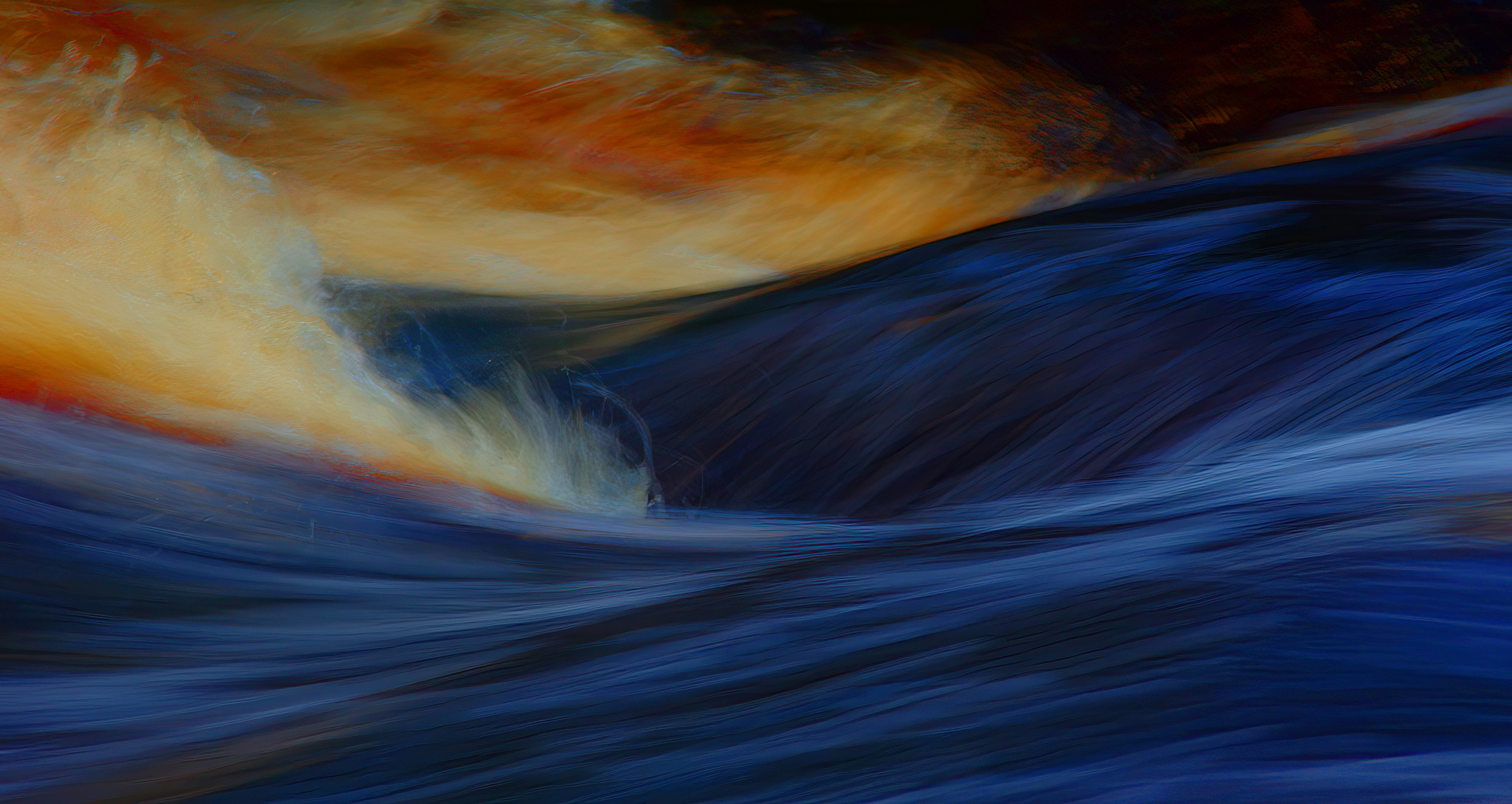
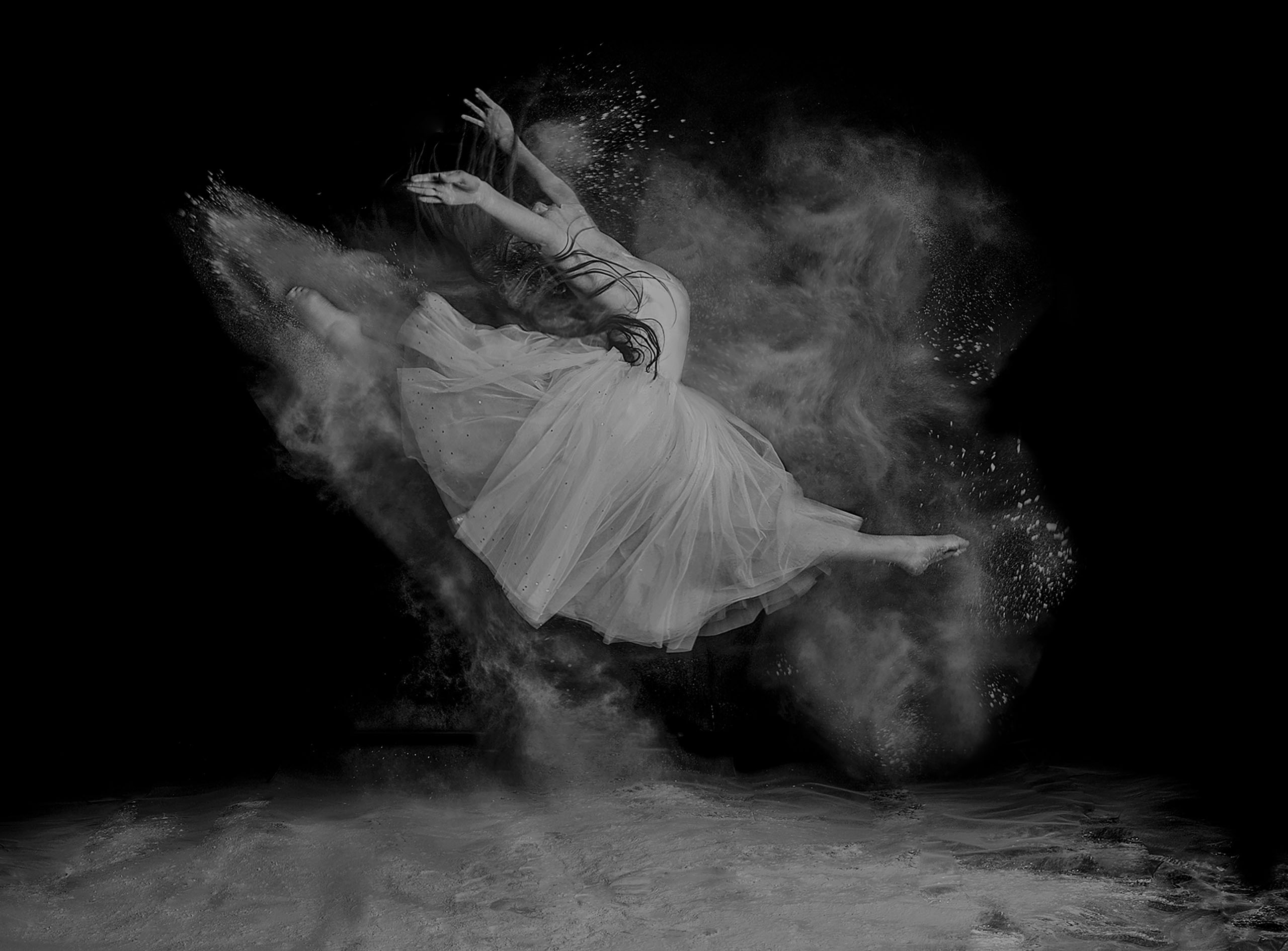
'Vid Floden' – By the river.
About 'Vid floden', can you explain how you achieve this result? What is the basic topic? What equipment did you use, and what settings?
Having the correct setting in the camera is important when photographing water to avoid burnt-out parts of the image. I never use a tripod and my camera is heavy. With the lens, it weighs over 2 kilos. I have a 70-200 lens. I always set the aperture manually and let the camera handle the shutter speed. In this case F4. I try to always have ISO 100 and noise reduction to get maximum sharpness.
The post-treatment is very marked. Can you explain the steps?
In my post-processing, I use Photoshop 7.0. For this image, I started by painting the entire image in jet black with the brush tool, and then I saved it as version 2. Then I took the original image, cropped it, and enhanced the colours in Hue, Master setting to about 45%. Then I saved it as version 1. Then, I took version 2 (the one painted black) and created a layer and set the opacity to 25-30% and overlay it over the original image. Then I merged them in Layer Flatten Image. This may seem strange, but it deepens the colour. It's something I don't know if others do, but I think it looks beautiful in the water pictures. After that, I intensify the colours a little again and increase the contrast. Finally, I sharpen the image in a sharpening program, Photo X Labs, where I may regulate how and what I want to sharpen. That's my editing process for “By the River” and some other water images. I think it's a fairly common processing procedure, except for the black layer.
Like the 'fauvist' painters, you seem to freely use colours both in their choice and in their intensity. What is your intention?
I was surrounded by imagery when growing up. My parents enjoyed art and all our walls were decorated with paintings. In junior high school, reproductions of modern art hung in the corridors. The nuances shone and spoke to me, and I felt the power of colour! Much later, I began to paint portraits and then made the acquaintance of Henri Matisse and Vincent van Gogh. I loved their strong, clear colours and disrespect for 'realism'. Their handling of colour reflected an inner reality and a joy for life while transcending boundaries. When I moved on to abstract painting and later photography, I brought all this into my creations. It works especially well for images of water. After all, water is both substantial and abstract, it is fleeting and light, poetic and beautiful, but also swirling and sometimes dangerous. My picture 'By the River' is an example of it. It is substantial, abstract, and colourful. I've highlighted a small part of a wave and accentuated the colour and shape. The river flows next to a waterfall and the surrounding land is moss land, rich in iron. Therefore, the foam turns reddish completely naturally.
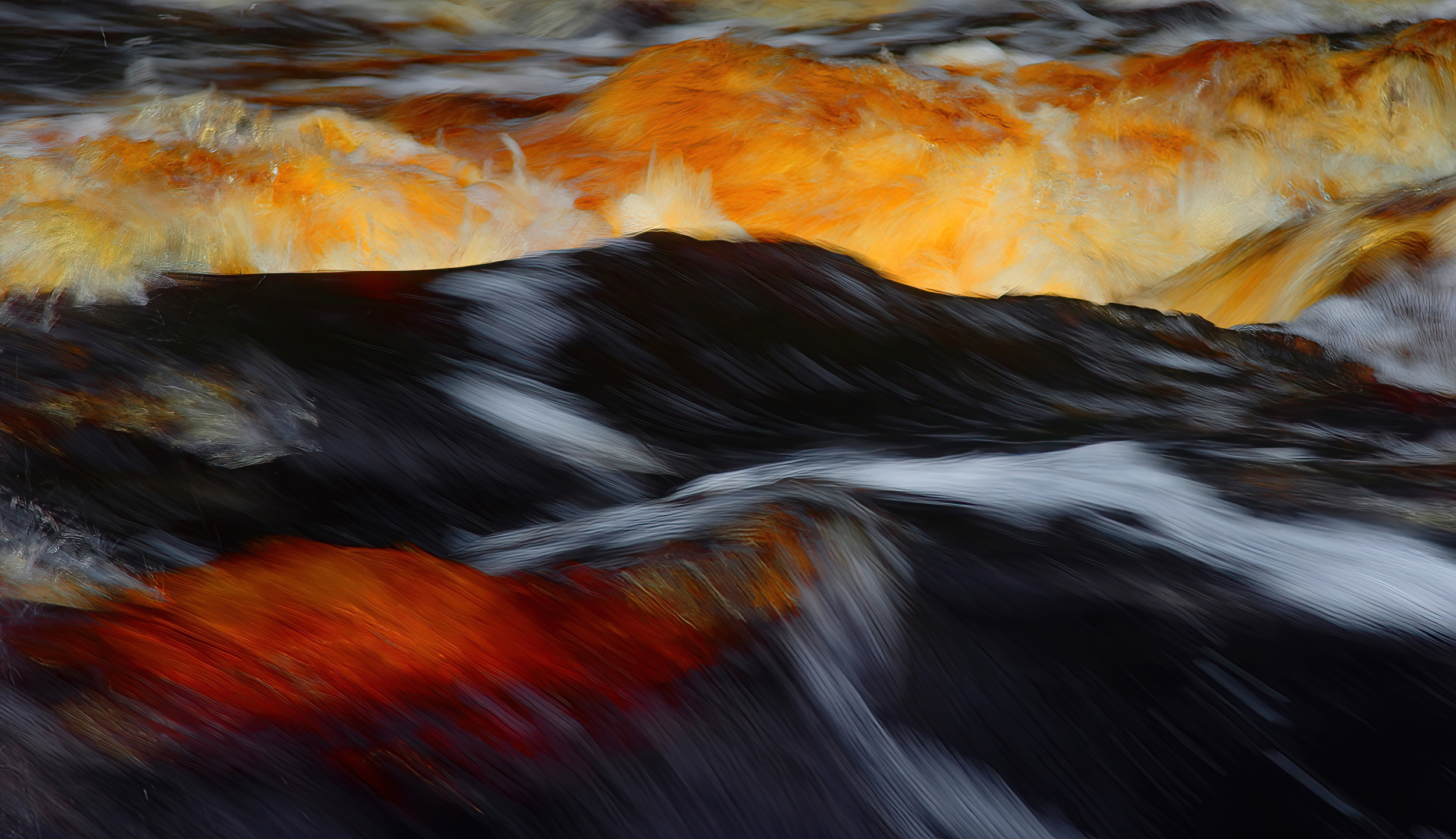
'Stormande vågor' – Stormy waves
After a long period of florals in soft colours, your latest 'paintings' are a real explosion of bright colours. What is your explanation for this radical 'mutation'?
If you look at the total body of my photos, the overall impression might seem contradictory – almost as if taken by two completely different persons.
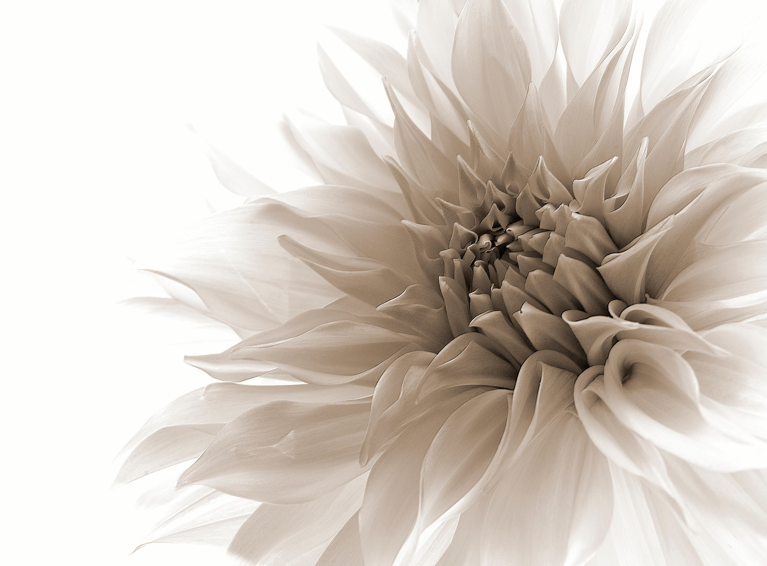
THE FLOWER IMAGES ARE BRIGHT AND CLEAR
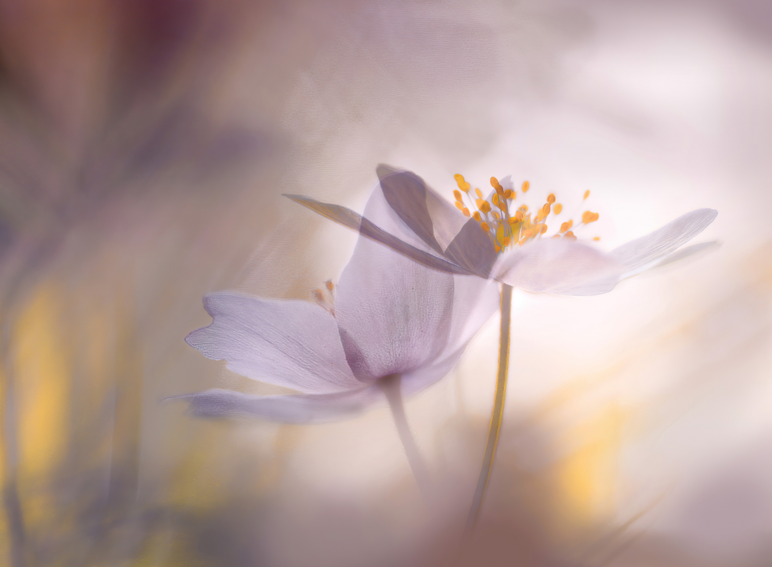
'Violet tones'
THE WATER IMAGES ARE COLOURFUL AND ABSTRACT
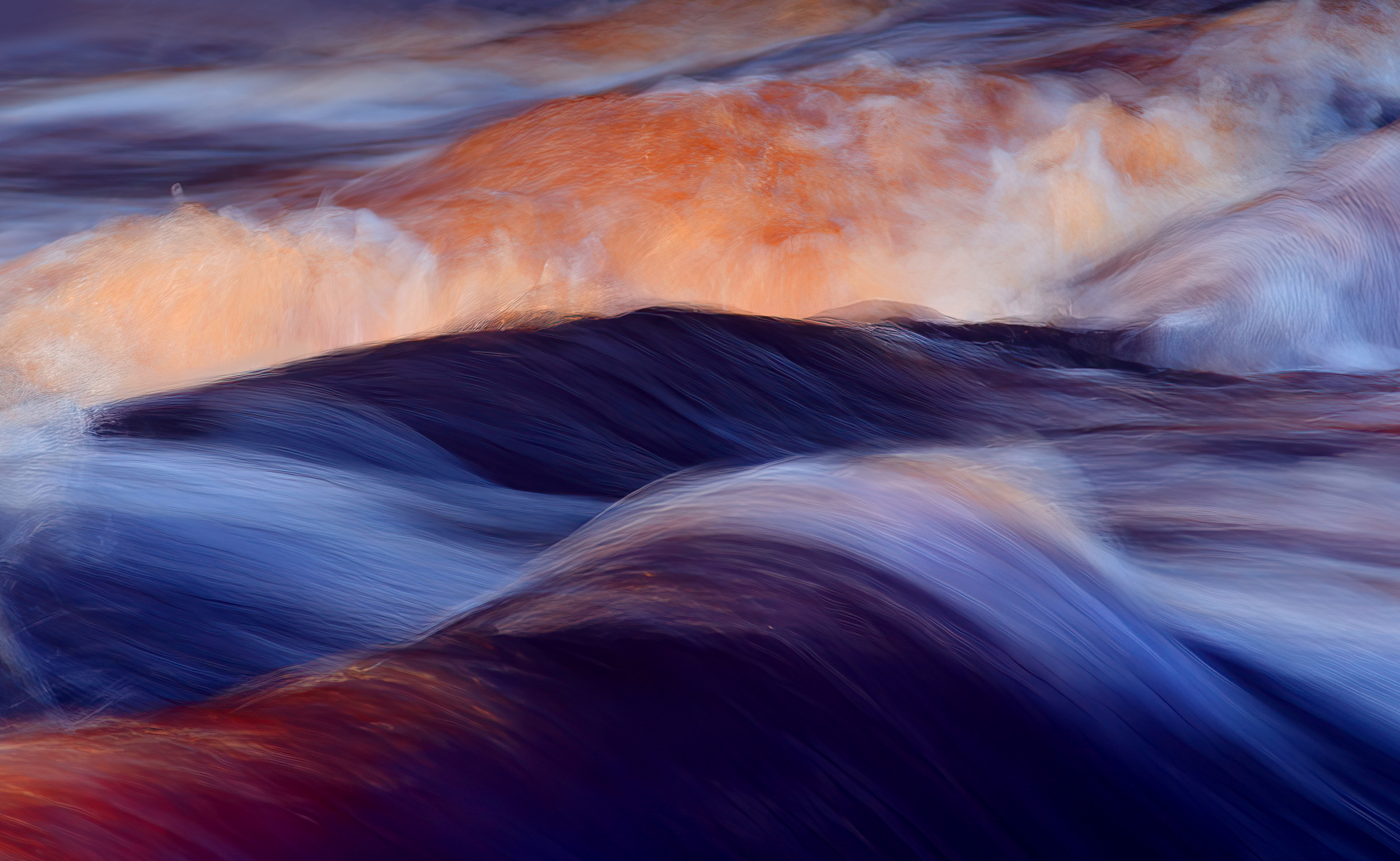
'Inre ljus' – Inner light
I have never really changed my style though; they are simply two sides of the same coin. Isn't it so that we humans are multifaceted beings who have bright, light thoughts and moods and sometimes real emotional storms that rush forward like roaring rivers within us? No matter how I shoot and process my images, it is always these two sides that I reflect.
 | Write |
 | Wanghan Li PRO Great and excellent! Love "No matter how I shoot and process my images, it is always these two sides that I reflect." |
 | Chris Hamilton PRO Great style and original looks, like the sense of movement and colour. |
 | Miharu † PRO What a beautiful and artistic world! I'm always impressed. I'm very happy to have your wonderful works featured, congratulations dear Ylva! |
 | Takiko Hirai PRO Thank you, Yvette, for always introducing us to your wonderful works.
I understand that her work is highly artistic.
Congratulations.
|
 | Ylva Sjögren PRO Tack för att du anser med na bilder vara konstnärliga. |
 | Bogdan Timiras PRO Mycket finfina bilder Ylva! Grattis för en fin artikel också! Fortsätt so! |
| Ylva Sjögren PRO Stort tack Bogdan! |
 | Elizabeth Allen CREW Congratulations on this feature of your beautiful work, dear Ylva. Your images are so creative and artistic. Thank you Michel and Yvette for publishing this wonderful article. |
 | Yvette Depaepe CREW Our pleasure, Elizabeth !!! |
| Ylva Sjögren PRO Tack Elisabeth för din fina kommentar! |