|
|
|
|
By Editor Marius Cinteza
Edited and published by Yvette Depaepe, the 23rd of February 2024
Colours plays a crucial role in influencing the viewer's perception of a photograph. It is often inspired by the photographer's mood during the moment of capture or at image processing, capable of either softening or intensifying the conveyed message.
This article below explores the deliberate choices photographers make regarding colour, examining the impact on message potentiation, composition, and the pitfalls of blindly following trends.
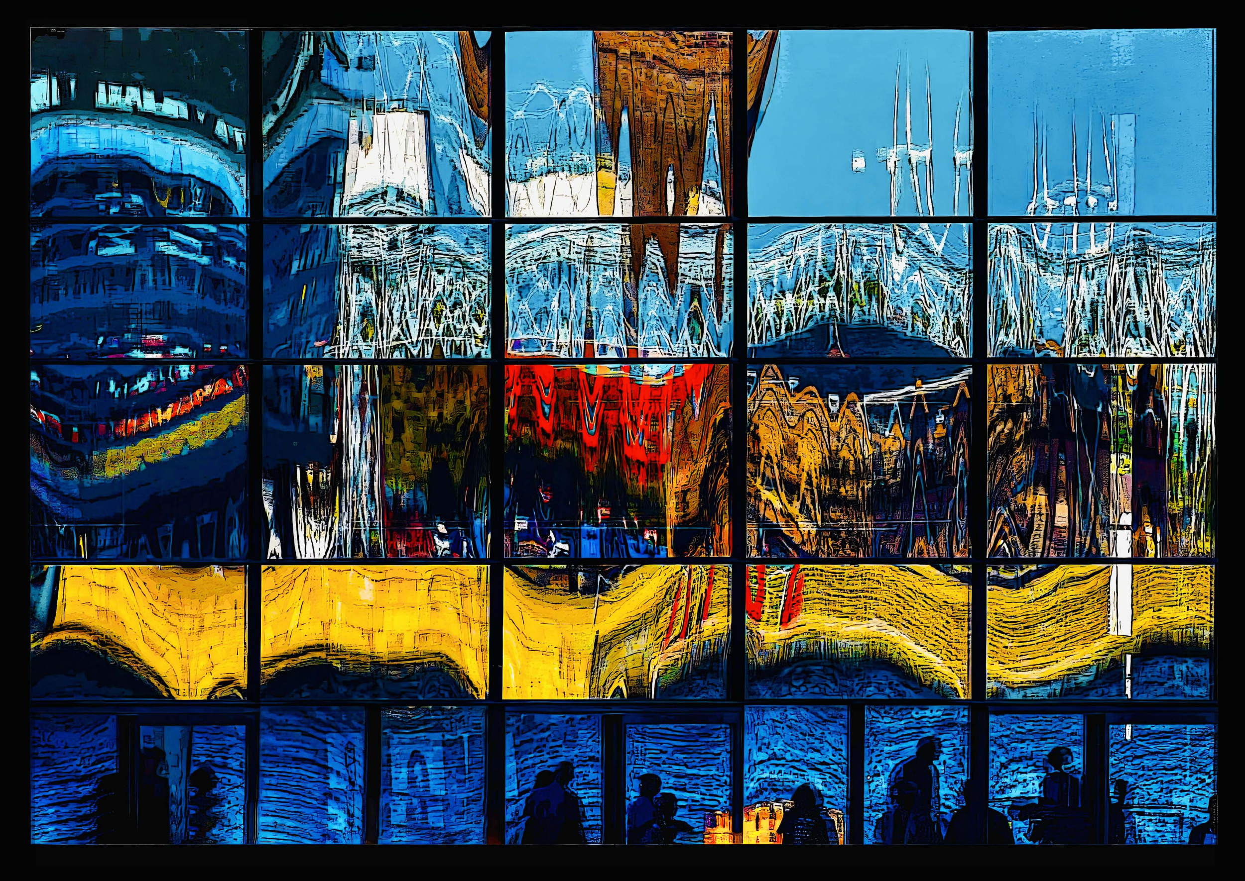
'Reflection - Copenhagen Denmark' by Arnon Orbach
Some photographers, (myself included) intentionally omit colour as it may distract from the intended message they want to convey. Conversely, others find black and white tones dull and lifeless. Extremes, such as the intense use of vivid colours or strong contrasts in black-and-white photography, can be easily observed but may lack relevance to the message or composition. In this realm, photographers often draw inspiration from renowned peers, occasionally adopting black and white inaccurately simply because their favourite photographer utilizes this style.
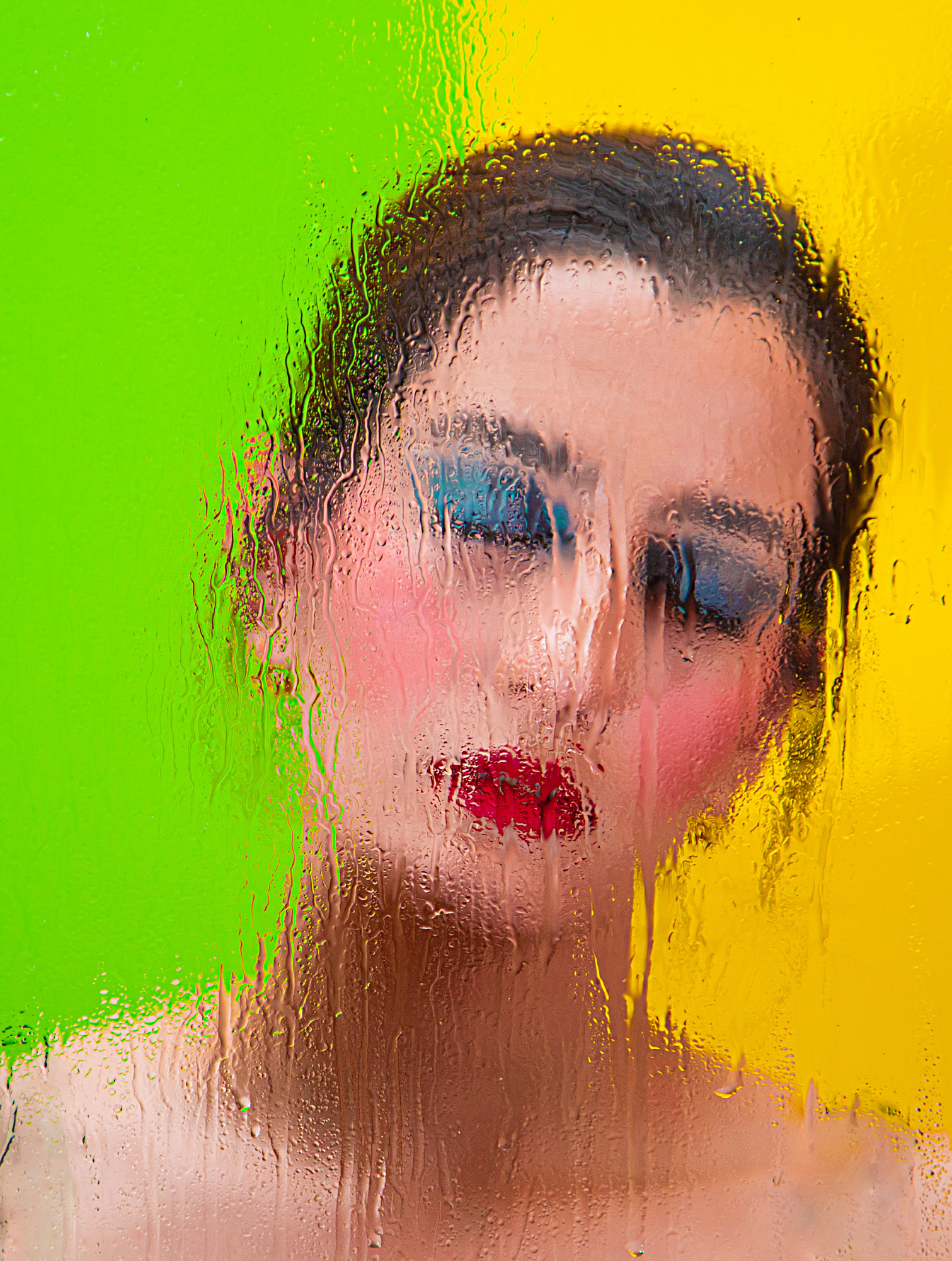
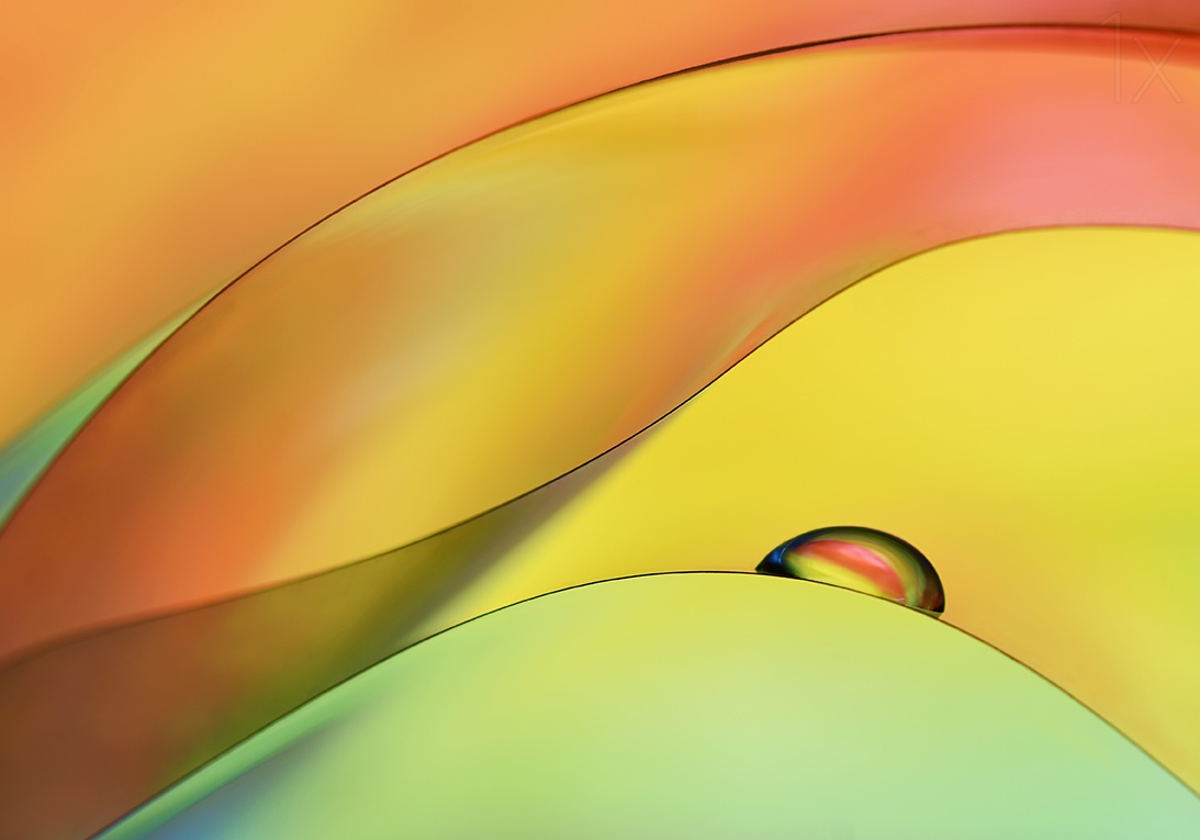
'Vivid Dream' by Amin Zand Miralvand
We, photographers, tend to stay loyal to our previous decisions, even when those may not align with the demands of the message or composition. Personal evolution in photography is a subjective choice and also a matter of comfort. However, just like in any other field, the progress and growth often come from pushing boundaries and avoiding stagnating in repetitive actions.
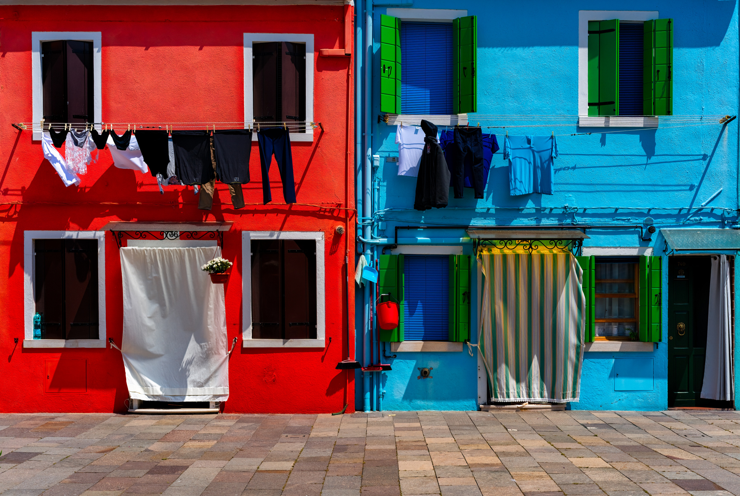
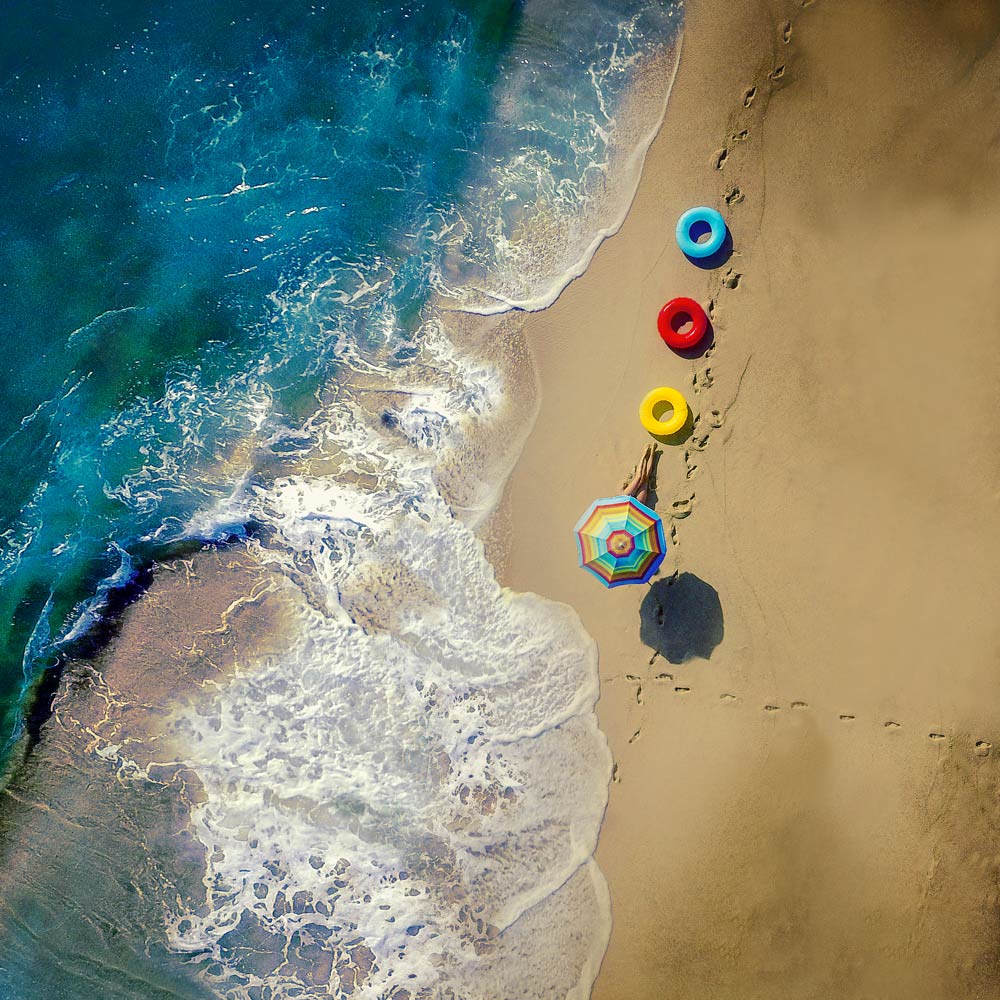
'The red bucket' by Tommaso Pessotto
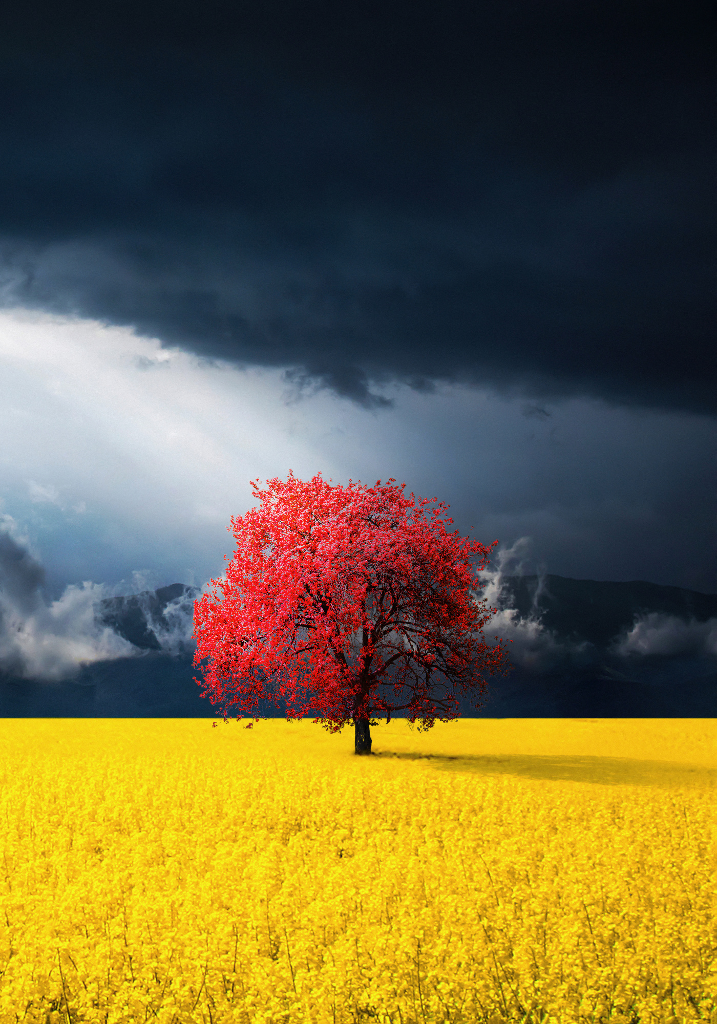
Colour balance is as crucial as composition in photography, yet few truly master it. Intense colours can enhance a minimalist composition and convey a strong message, but they can also ruin a photograph where softer, desaturated tones might be more suitable (e.g. portraits). The use of intense colours serves as an excellent means of attracting attention, creating specific atmospheres, conveying emotions, or adding realism and detail.
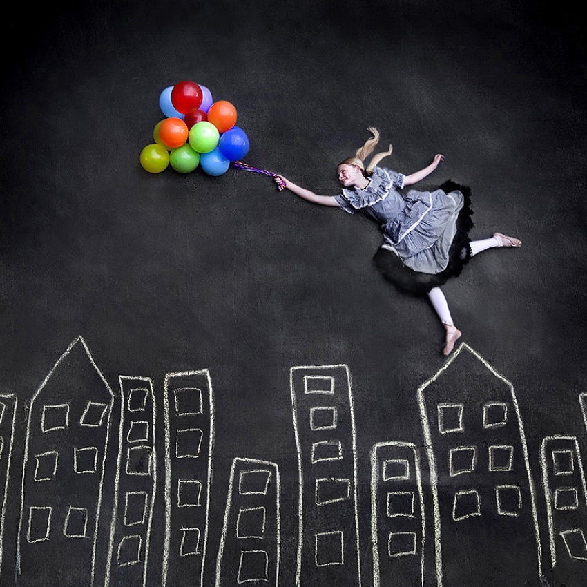
'Flying on the Rooftops' by Njsabs (Jennifer)
The human brain processes colours and black-and-white tones differently. People have familiar or preferred colours that influence their perception of a photograph's quality. However, artistic appreciation is ultimately a matter of personal preference and fortunately, individual differences contribute to diverse interpretations of art.
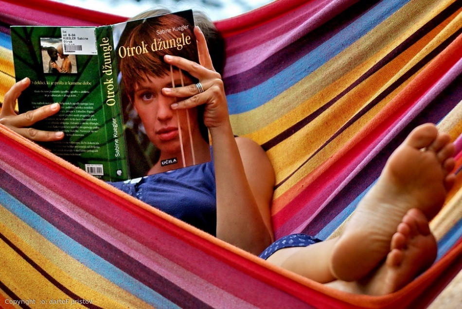
'in book' by :o: darteF pristov
Beyond personal preferences, the decision between colour and black-and-white should not be impulsive. It must align with the composition, narrative and desired emotional impact of the photograph. Therefore, every photographer should ask themselves: what message do I want to convey and how do colours or black-and-white tones help enhance it?
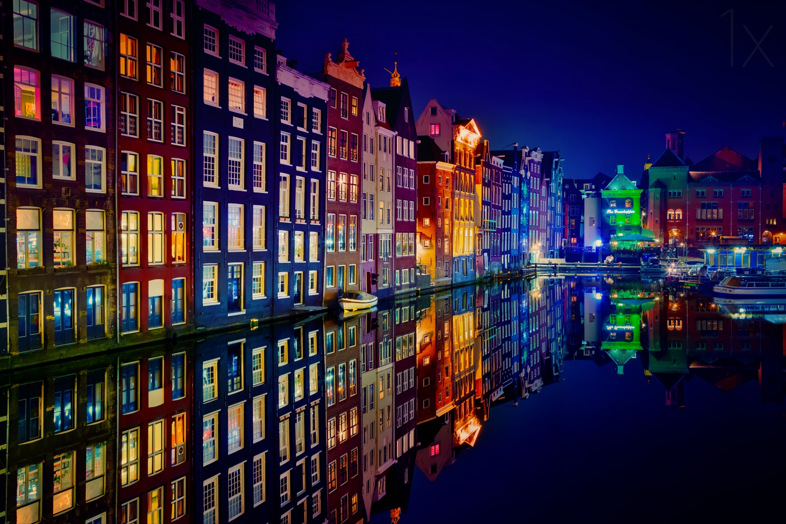
'Amsterdam' by Juan Pablo deMiguel
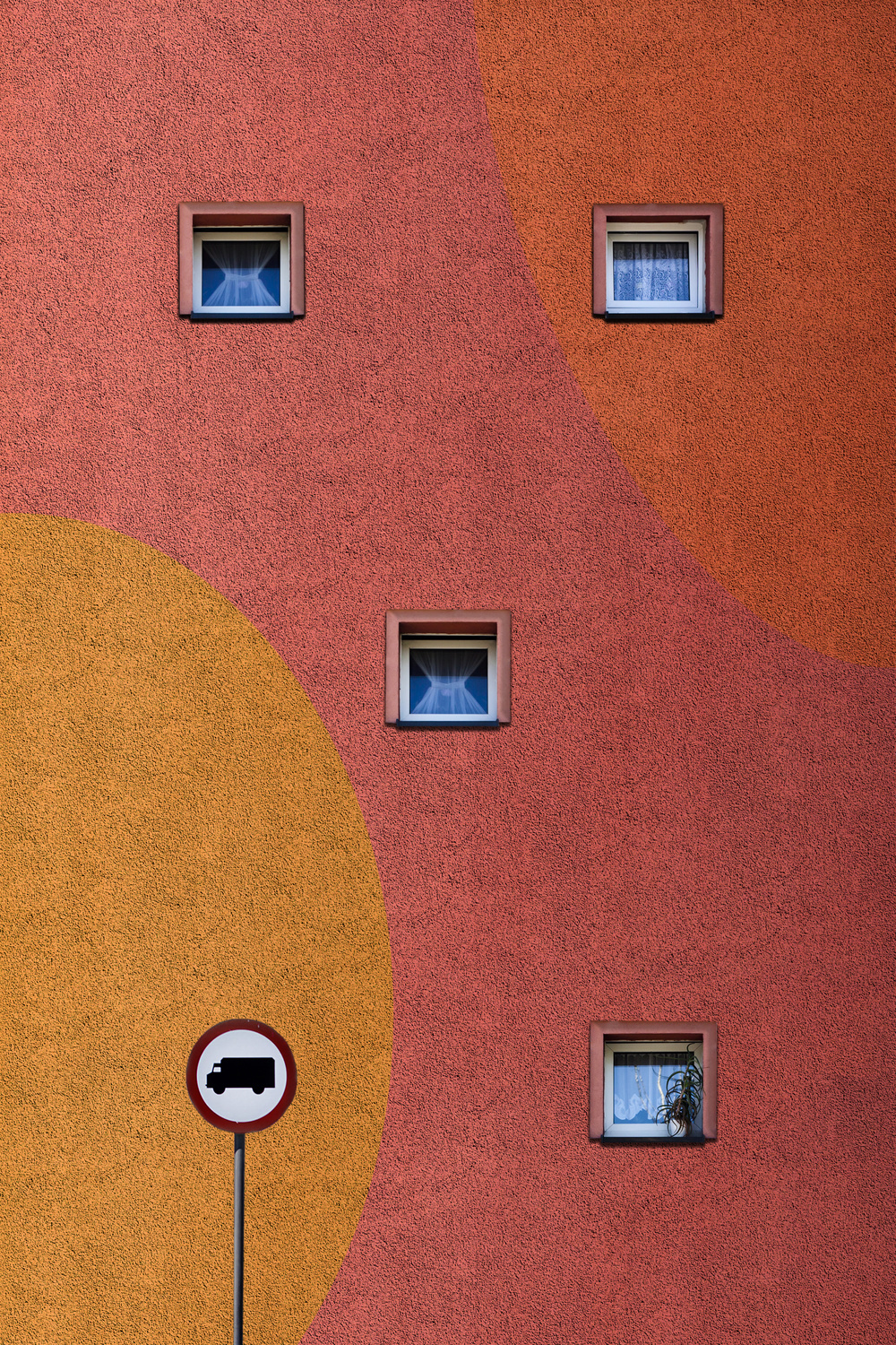
Incorporating powerful colours into photographs is similar to “speaking loudly” a captivating visual language that demands attention in a crowded landscape of imagery. The intense and bold hues serve as a magnetic force, drawing viewers into the photograph and leaving a lasting impression. The deliberate use of (vivid) colours goes beyond aesthetics; it is a nuanced approach to storytelling, infusing the images with an emotional resonance that transcends the limitations of black-and white. Through this intentional embrace of vibrant palettes, a signature style is established and the viewer is embarked on a journey of creative exploration, pushing the boundaries of conventional norms to shape a unique narrative of photographer.
'sera' by Leyla Emektar La_
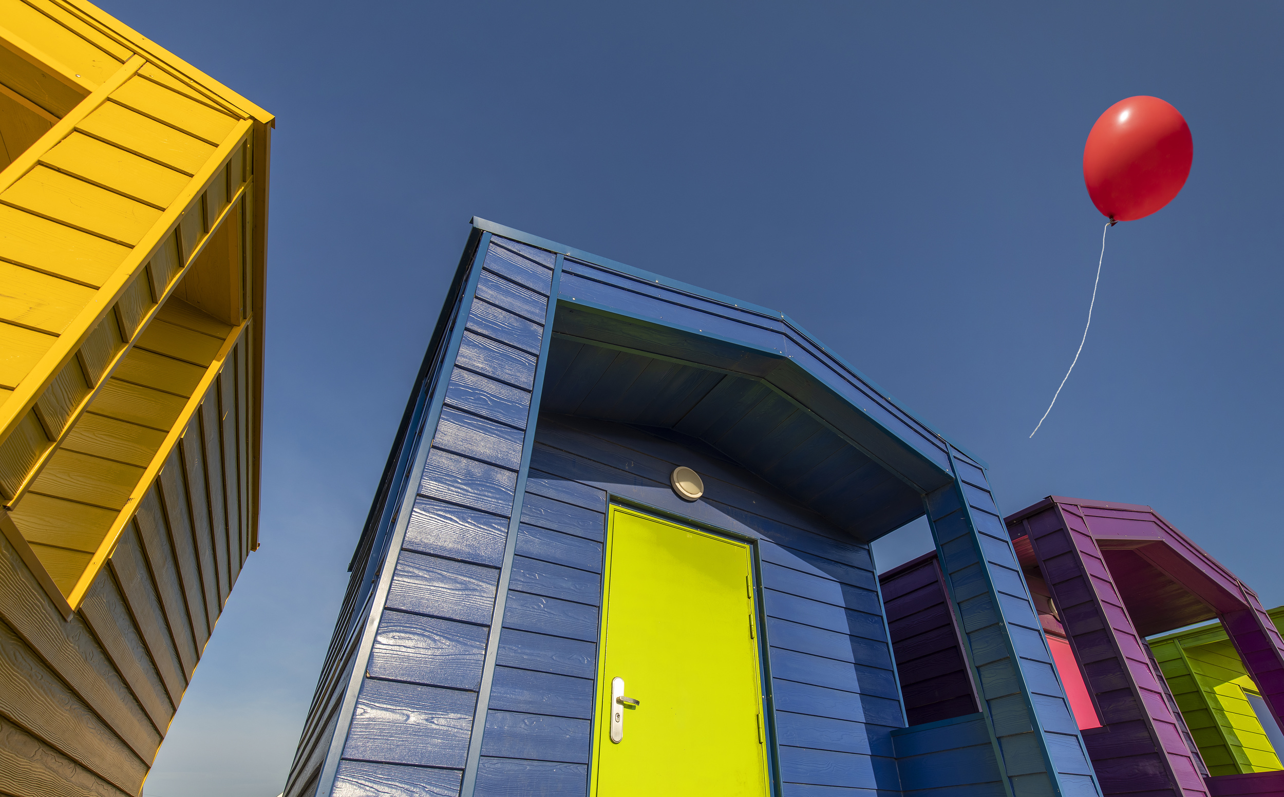
In the realm of photography, the choice of vivid colours is a deliberate one, requiring thoughtful consideration. By aligning this choice with the intended message and composition, photographers can elevate their art and create a more impactful visual narrative. As you embark on the photographic journey, consider this: what emotions do intensive colours evoke in you and how can they enhance the stories captured through your lens? The interplay of colour and emotion is a personal and powerful connection that can elevate photography to new heights. What vivid tales will your palette tell?
'Flying Colours' by Sulaiman Almawash
'hi summer!' by ambra
'Waiting' by Heidi Westum
'street lights' by Carmine Chiriacò
'Miami Sun' by Hans-Wolfgang Hawerkamp
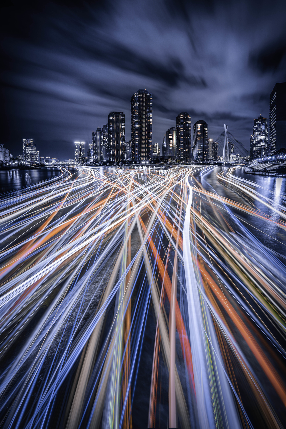
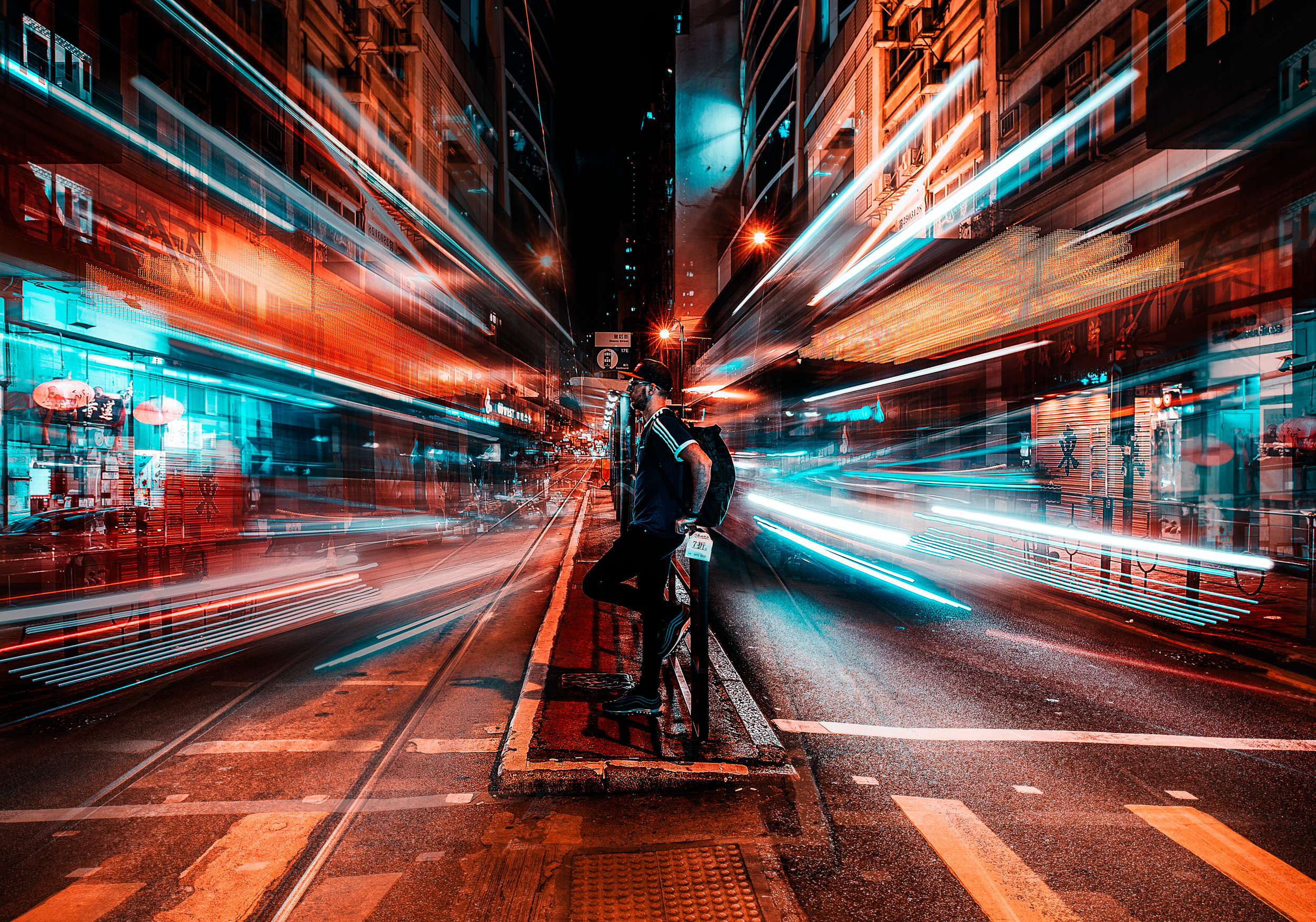
'Light Trails of Tokyo' by Junya Watanabe

'the wave' by Gerard Jonkman
'Palette' by Phillip Chang
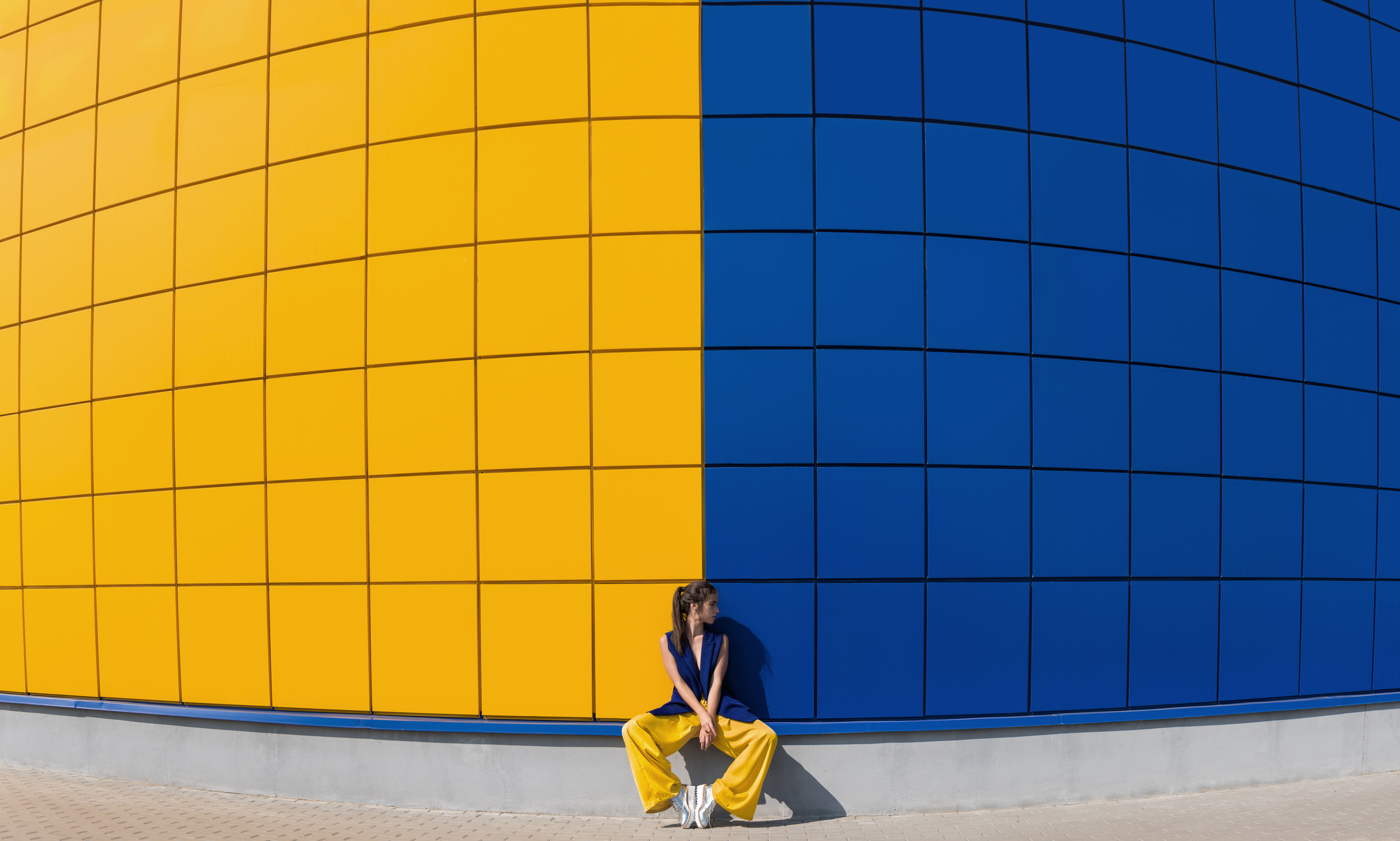
'yellow and blue' by Anna
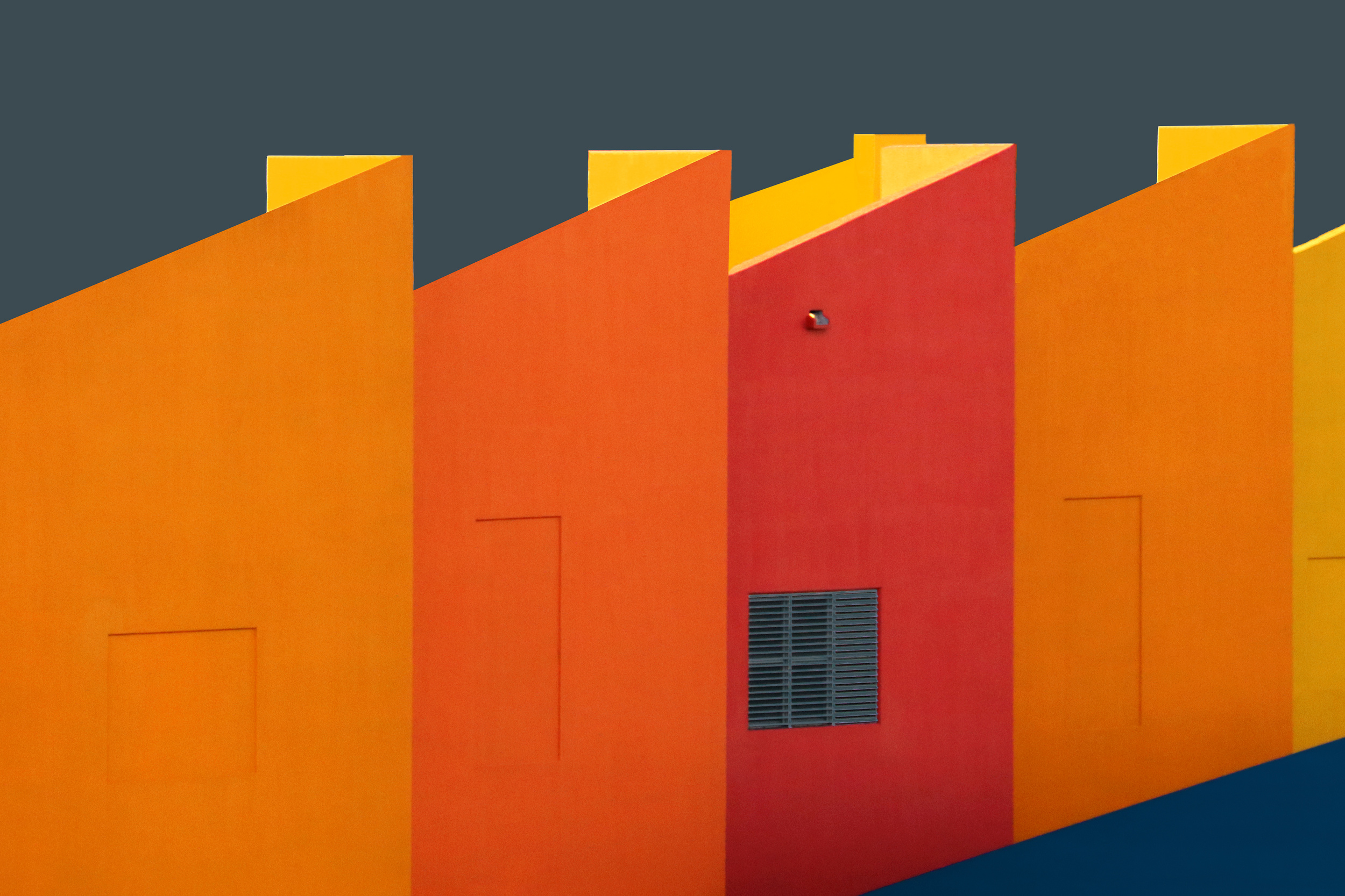
'The House' by Alfonso Novillo
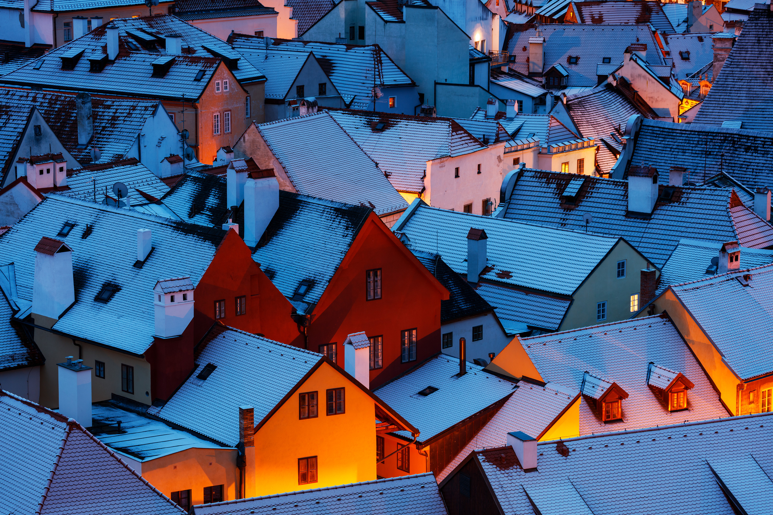
'Snowy Rooftops' by Martin Rak
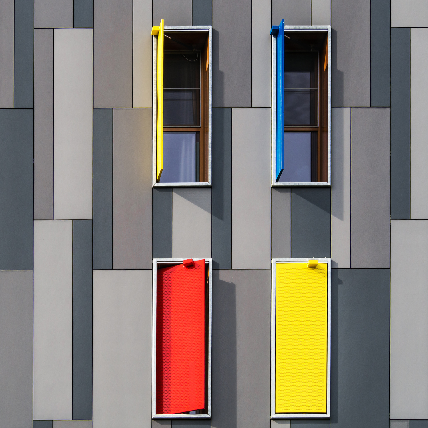
'Shutters' by Luc Vangindertael (laGrange)
'red' by Josefina Melo
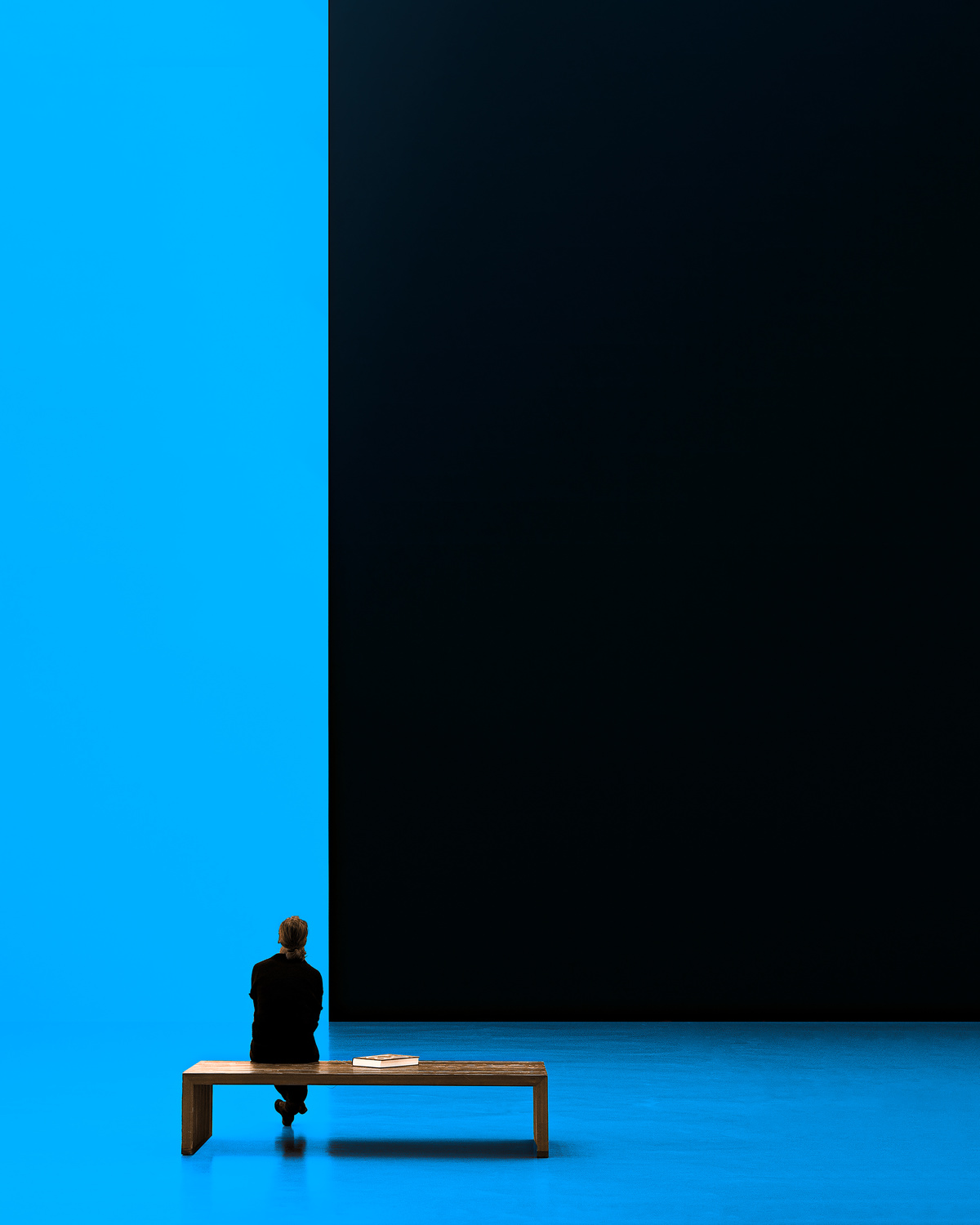
'Woman on bench' by Inge Schuster
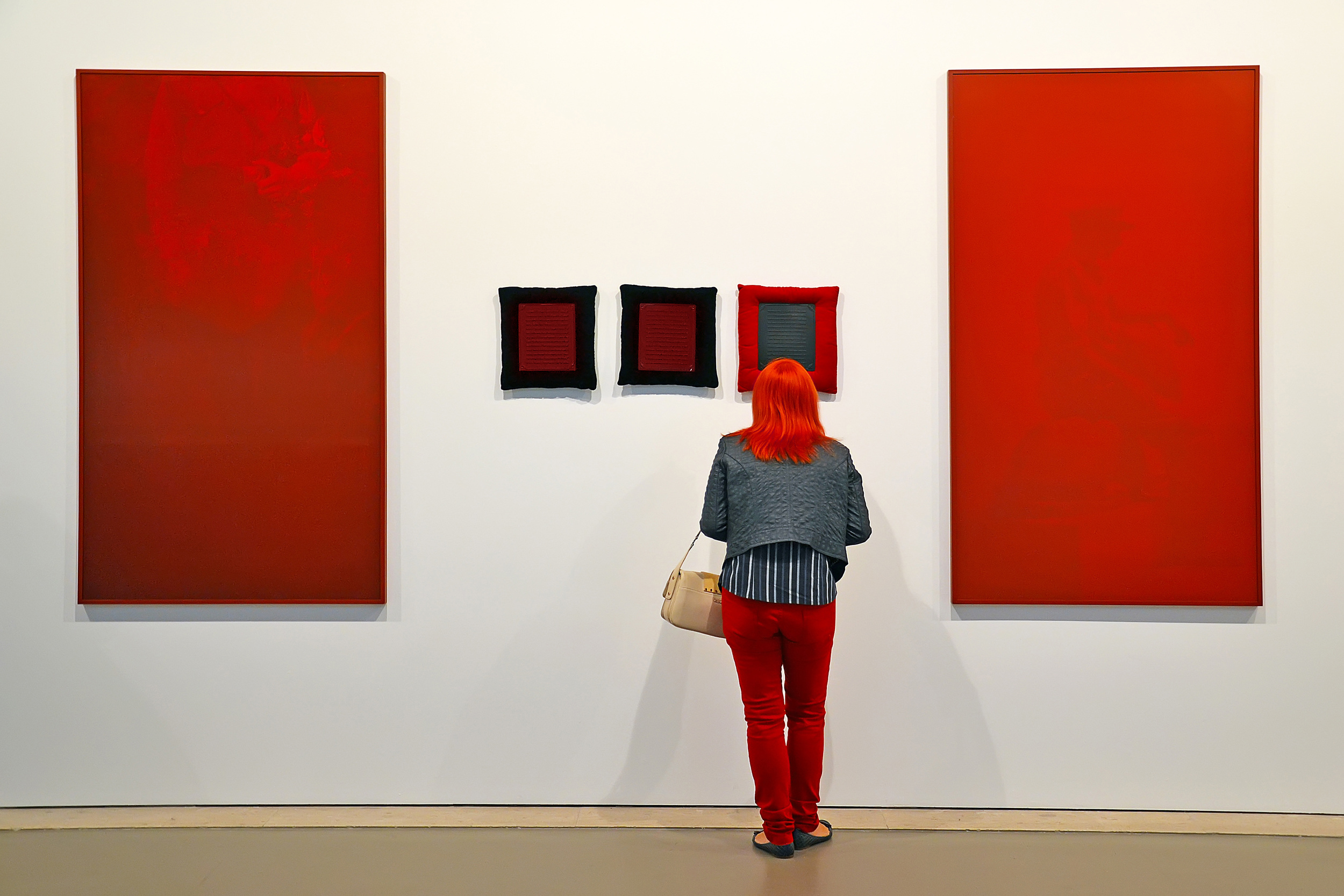
'4plus1' by aRRO
'Red tree' by Bess Hamiti
'Summertime Blues' by Daniel Springgay
 | Write |
 | Ludmila Shumilova PRO Such an amazing gallery! Thank you so much for this delightful article! |
 | Marius Cinteza CREW Thank you so much, Ludmila!! Really appreciate it!! |
 | Tessa Schack PRO Great article and impressive images. Thank you so much. |
| Marius Cinteza CREW Many thanks, Tessa!! |
 | Uwe Kobold PRO Interesting article with great illustrations, would be nice to read more! Thank you! |
| Marius Cinteza CREW Thank you very much, Uwe!! |
 | 大山 儀高 PRO 大変勉強になりました。ありがとうございます。 |
 | Ineke Mighorst PRO Such a nice article again. Thanks for this |
| Marius Cinteza CREW Thank you, Ineke!! |
 | Olivier Schram PRO Great article and impressive images to illustrate your topic! Congrats to you Marius! |
| Marius Cinteza CREW Many, many thanks, Olivier!! |
 | joanaduenas PRO Excellent article!!! |
| Marius Cinteza CREW Thank you so much!! |
 | Stephen Clough PRO Very interesting article. Congratulations to the authors!!! |
| Marius Cinteza CREW Many thanks, Stephen!! |
 | Raceala Elena PRO Congratulations on the article! The images are incredible!
|
| Marius Cinteza CREW Elena, thank you so much!! |
 | Heidi Westum PRO I thank you so much for being chosen among these beautiful photographs :) |
| Marius Cinteza CREW I thank you for your great picture, Heidi!! |
 | Luca Roveda PRO This article is very interesting! |
| Marius Cinteza CREW Thank you, Luca!! |
 | Phillip Chang CREW Great collection. A lot of thanks much appreciated Marius and dear Yvette!
|
| Marius Cinteza CREW Many thanks, Phillip!! |
 | Alfonso Novillo Incredible article, LOVE It!!! Congratulations!! |
| Marius Cinteza CREW Thank you, Alfonso!! |
 | Miro Susta CREW Festival of colors, wonderful photo selection, congratulations to all authors, many thanks to Marius and Yvette for introducing it to us. |
| Marius Cinteza CREW Thank you very much, Miro!! |
 | Arnon Orbach CREW Interesting and thoughtful article about coloring with beautiful gallery to to enhance it. Thanks so much dear Marius and Yvette for your work👏🏼🙏🏽 |
| Marius Cinteza CREW Many thanks, Arnon! Really appreciate it! |
 | Izak Katz PRO Interesting and beautiful "show" of colors !! .
|
| Marius Cinteza CREW Thank you, Izak!! |
 | Carmine Chiriacò CREW Wonderful collection of spectacular photos and it is an honour to be a part of it. Many thanks to editor Marius and to you dear Yvette. |
| Marius Cinteza CREW Thank you so much, Carmine!! |
 | Hans-Wolfgang Hawerkamp PRO much interesting article and a wonderful collection of images. Thanks a lot to the editor Marius and to you dear Yvette |
| Marius Cinteza CREW Many thanks, Hans-Wolfgang!! |
 | Daniel Springgay CREW Amazing collection of wonderful images of pure colour and quality. First Class thank you all involved great work.... |
| Marius Cinteza CREW Thank you so much, Daniel!! |